
Clinical skincare · DTC
INNBEAUTY Project
Redesign & Campaign System
A redesign of a clinical skincare storefront, extended into a campaign system. I started by measuring the brand from the live site: every colour, type size and spacing value, taken from the theme stylesheets and computed styles. The storefront was rebuilt on that documented system, then scaled across email, retail and social.
Scope A written design system, four responsive storefront pages, two campaign directions and thirty-two campaign artboards. Every screen and asset is exported by an automated pipeline, so the case study regenerates from source in one command.
01, Storefront
The redesign
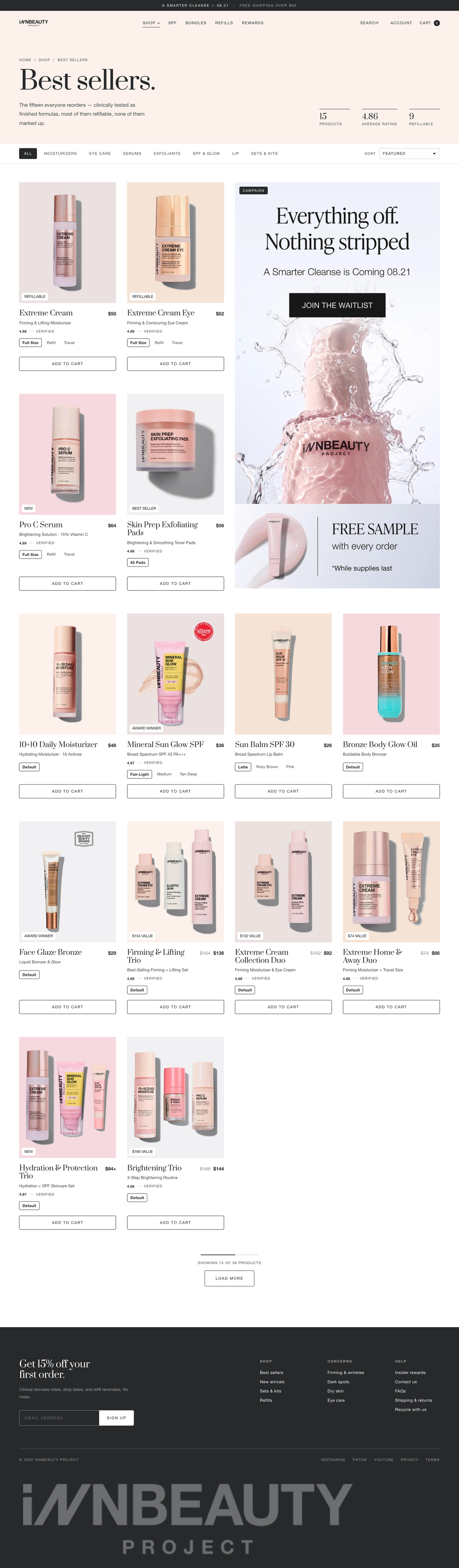
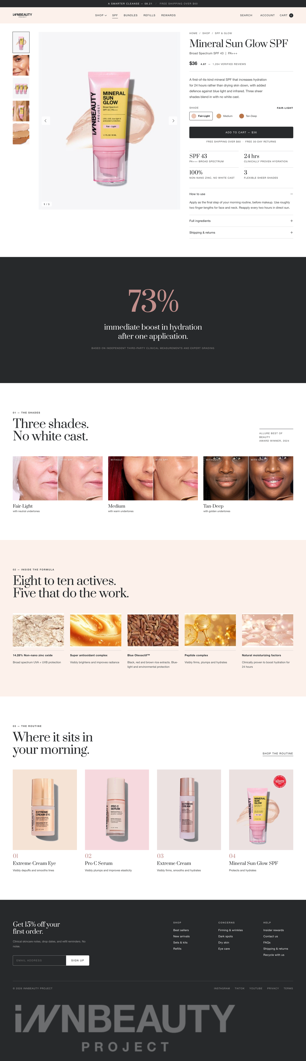
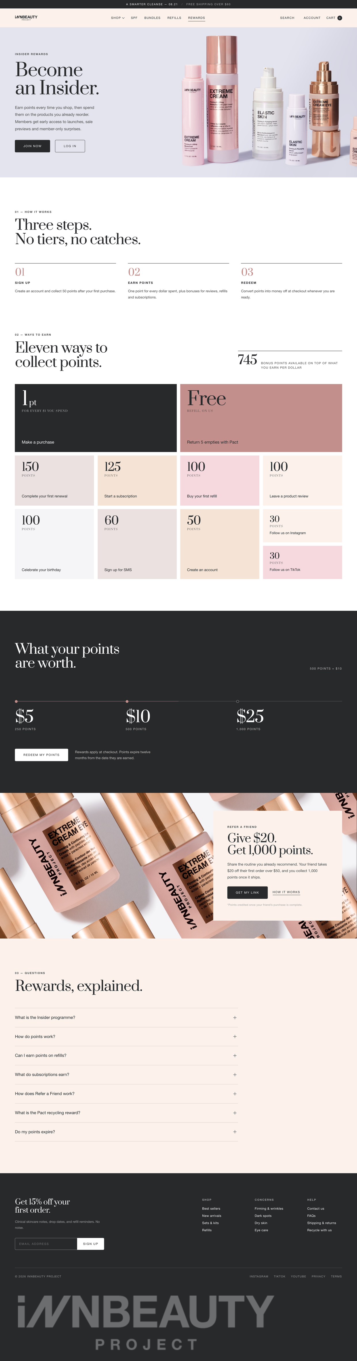
The brand runs on one rule: serif for feeling, uppercase sans for fact. The live site followed it inconsistently. Here it holds throughout, alongside square cards, no shadows, a single 4px radius on interactive chrome, and warm neutrals used as full-bleed bands rather than component tints.
View the live buildStorefront, desktop
1440px · full-length capture
HomeScroll
Best sellersScroll
Serif for feeling, sans for fact
The one rule the live site half-followed. Display serif carries the emotional line; everything functional, nav, price, badge, CTA, is uppercase Helvetica. Applied consistently, it is what makes the pages read as one brand.
Bands, not boxes
Warm neutrals run full-bleed as section grounds rather than tinting cards. Cards are content on white: no border, no radius, no shadow. Separation comes from colour blocks and whitespace.
Numbers as proof
Ratings carry two decimals, actives are stated as 8–10, price as $28+. Precision is the brand's credibility device, so the numerals are set in the display serif and given their own hairline rules.
ProductScroll
RewardsScroll
Storefront, mobile
390px · full-length capture
HomeScroll

Best sellersScroll

ProductScroll
Reordered, not reflowed
The desktop hero paints display type over the image. On mobile that collapses, so the image sits above and the type below, a different composition, not a squeezed one.
Two-up product grid
One product per row makes a 15-item collection unreadably long. The grid holds two columns to 375px, which is what beauty commerce actually does.
Nothing below 11px
Type was audited at production size. 202 instances sat under 12px; the floor is now 11px, with body copy at 15–16px and 52px CTA targets.
02, Campaign
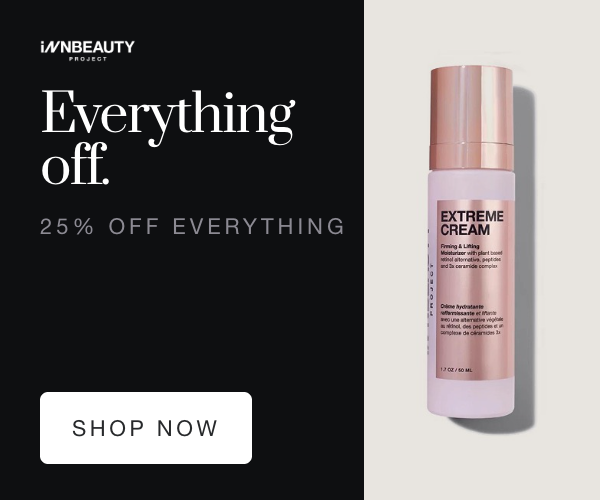
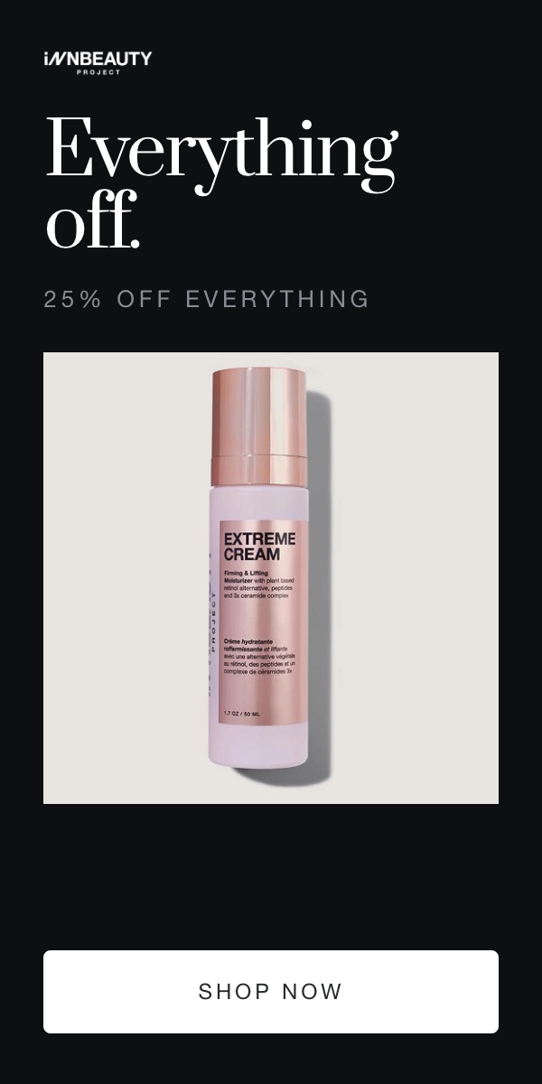
Black Friday: Everything off.
The brand's own hero line, read literally. A company built on the promise of pro-level results without the markups cannot run an ordinary sale, so the campaign frames this as the only markdown of the year. The palette inverts to near-black. The brand declares one highlight pink and spends it once on the live site; each email spends it once, on the offer.
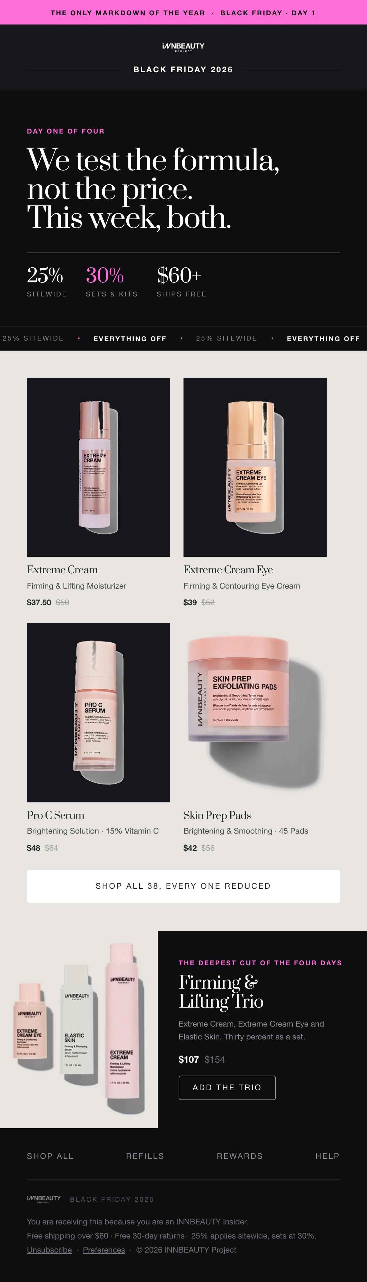
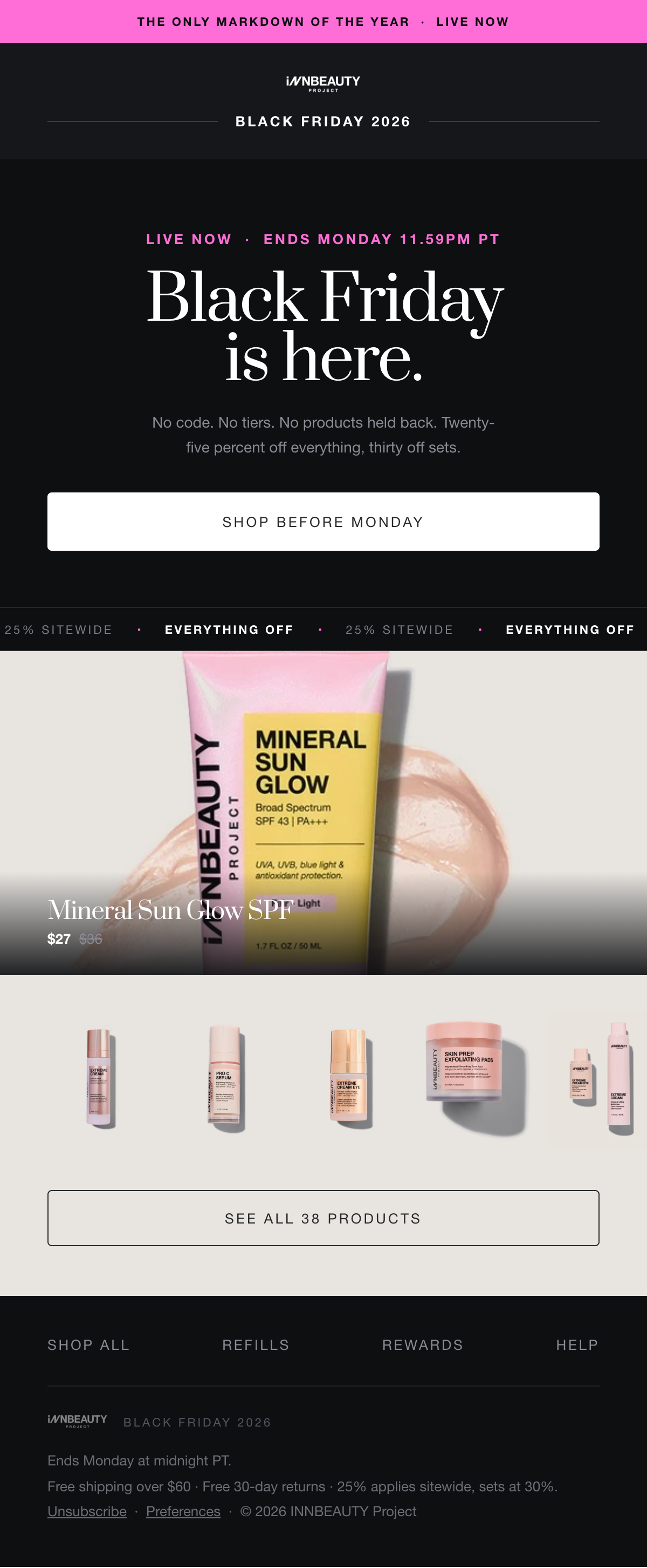
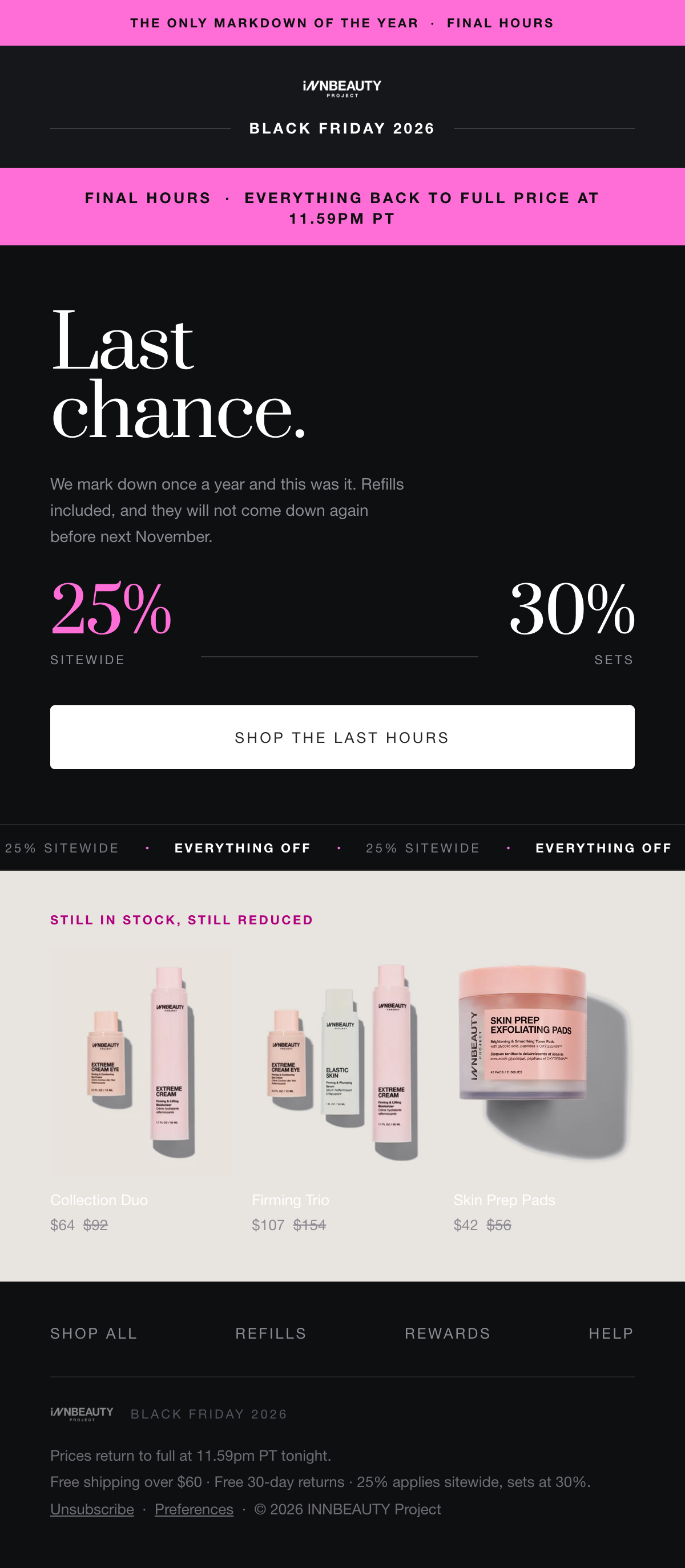
Four sends Launch, offer, reminder, last chance. Urgency escalates across the flight. One device carries all four: the site's proof ticker, re-cut to read as a promotional strip.
Black Friday, CRM
600px container · 4 sends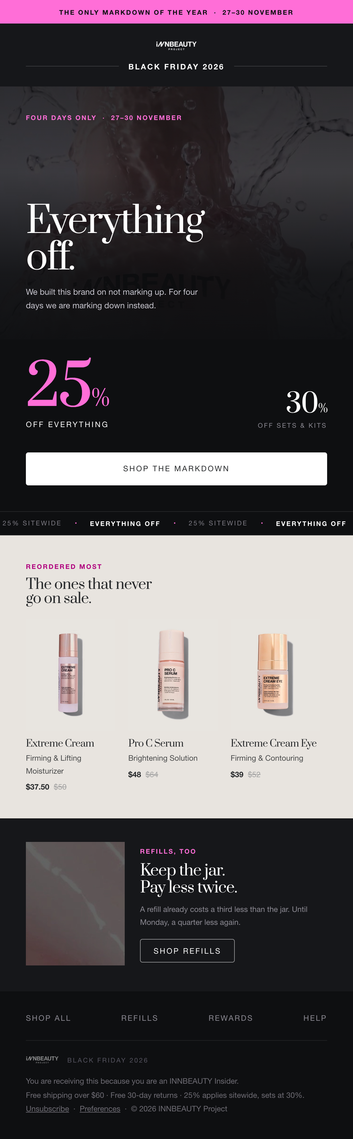
01, LaunchScroll
02, OfferScroll
Black carries the message, bone carries the product
The hero and offer sit on near-black for drama. The product shelves lift to a warm bone, because a packshot and its contact shadow need a surface to read against, on black they went muddy.
One pink, once
The brand declares a single highlight pink and uses it once on the whole live site. Each email spends it once, on the offer. On the bone shelves it steps down to a deeper magenta to hold contrast.
The ticker as campaign device
The site's proof ticker, re-cut to read EVERYTHING OFF · 25% SITEWIDE. It repeats between sections in all four sends, so the campaign is recognisable before you read a word.
03, ReminderScroll
04, Last chanceScroll
03, Campaign
Christmas: Give what works.
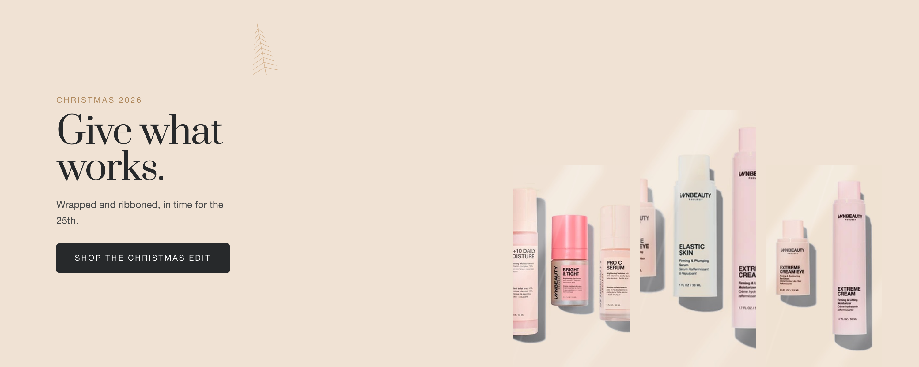
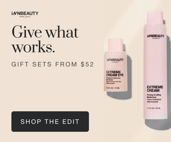
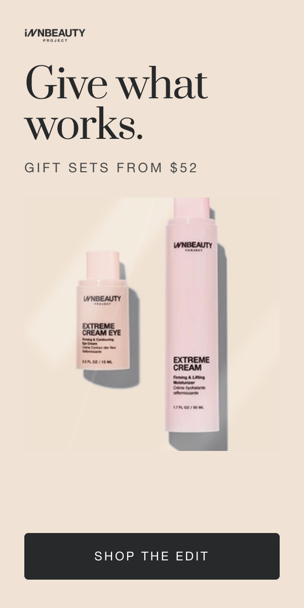
No red and green. The season comes from the packaging instead: deep fir against the brand's warm neutrals, with a champagne foil taken from the rose-gold caps. A pine sprig and a bell, both drawn hairline, act as the seasonal signature. The campaign gifts rather than discounts, so sets lead and the offer reads as from $52 rather than a percentage.
Open the artboard previewChristmas, DTC site modules
1920×800 hero · 1440 banners · 1080 tile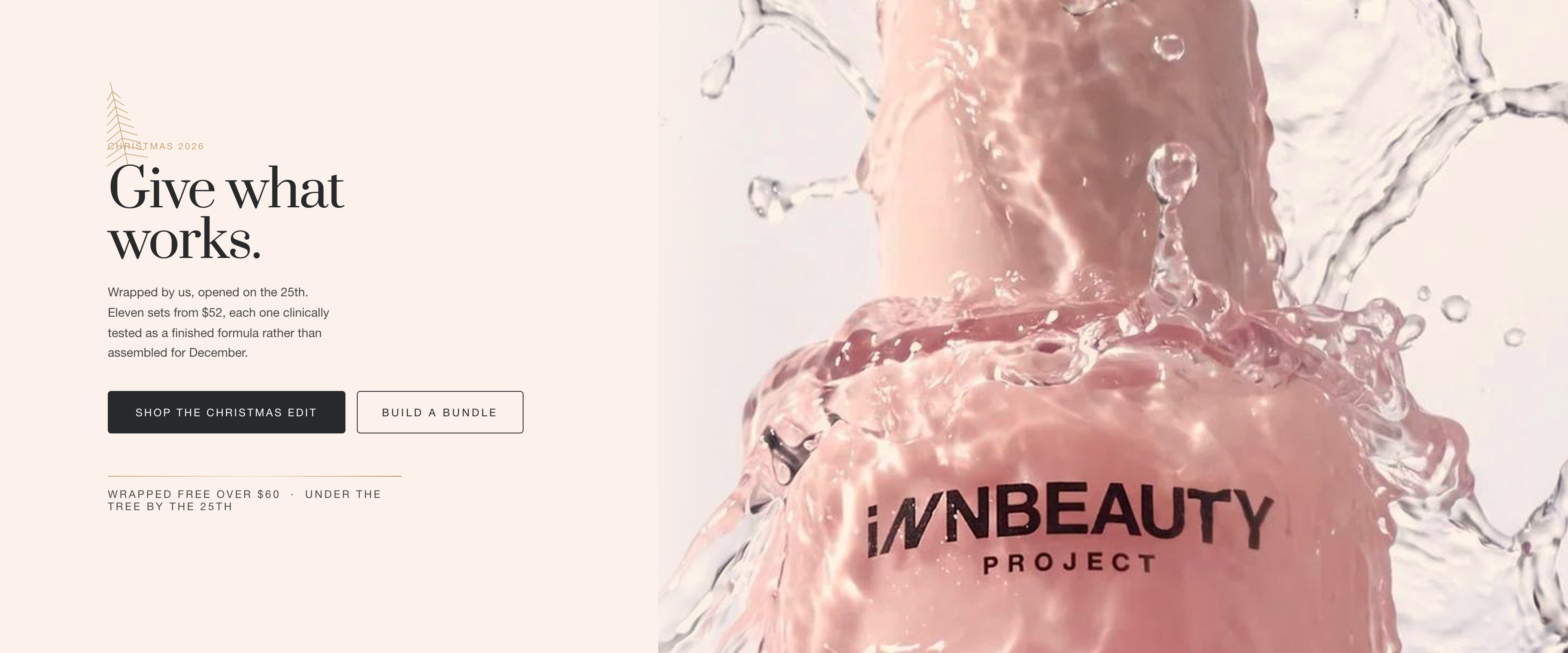
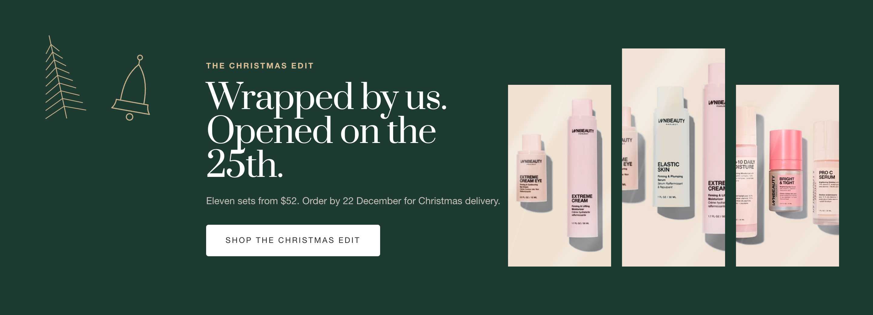
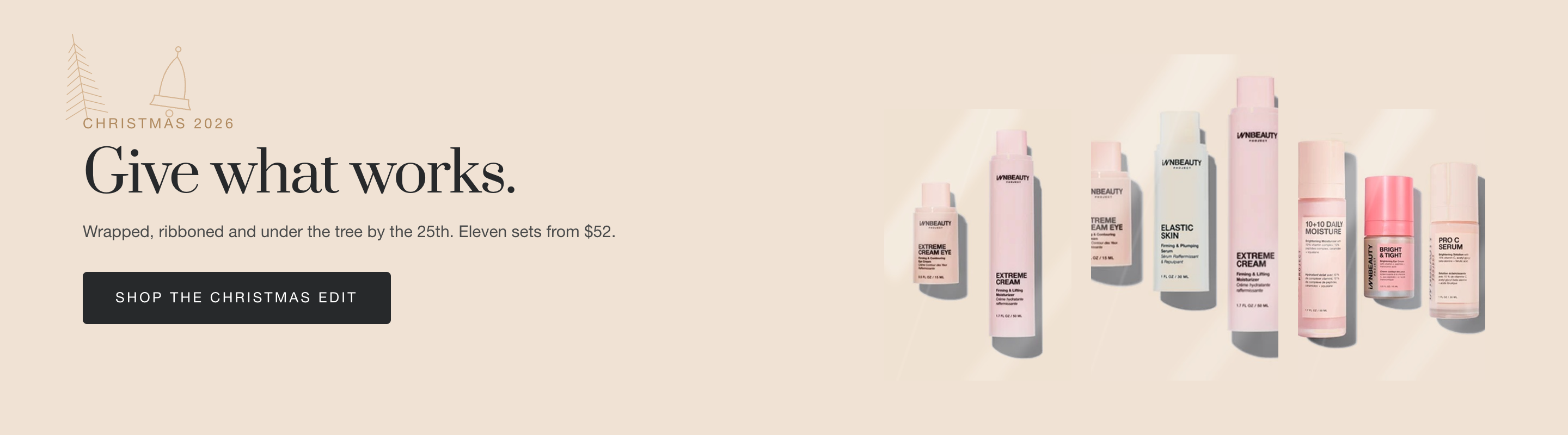

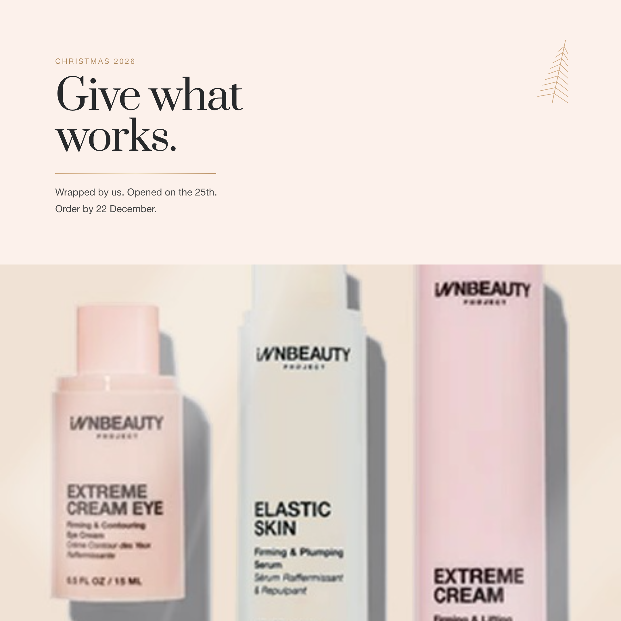
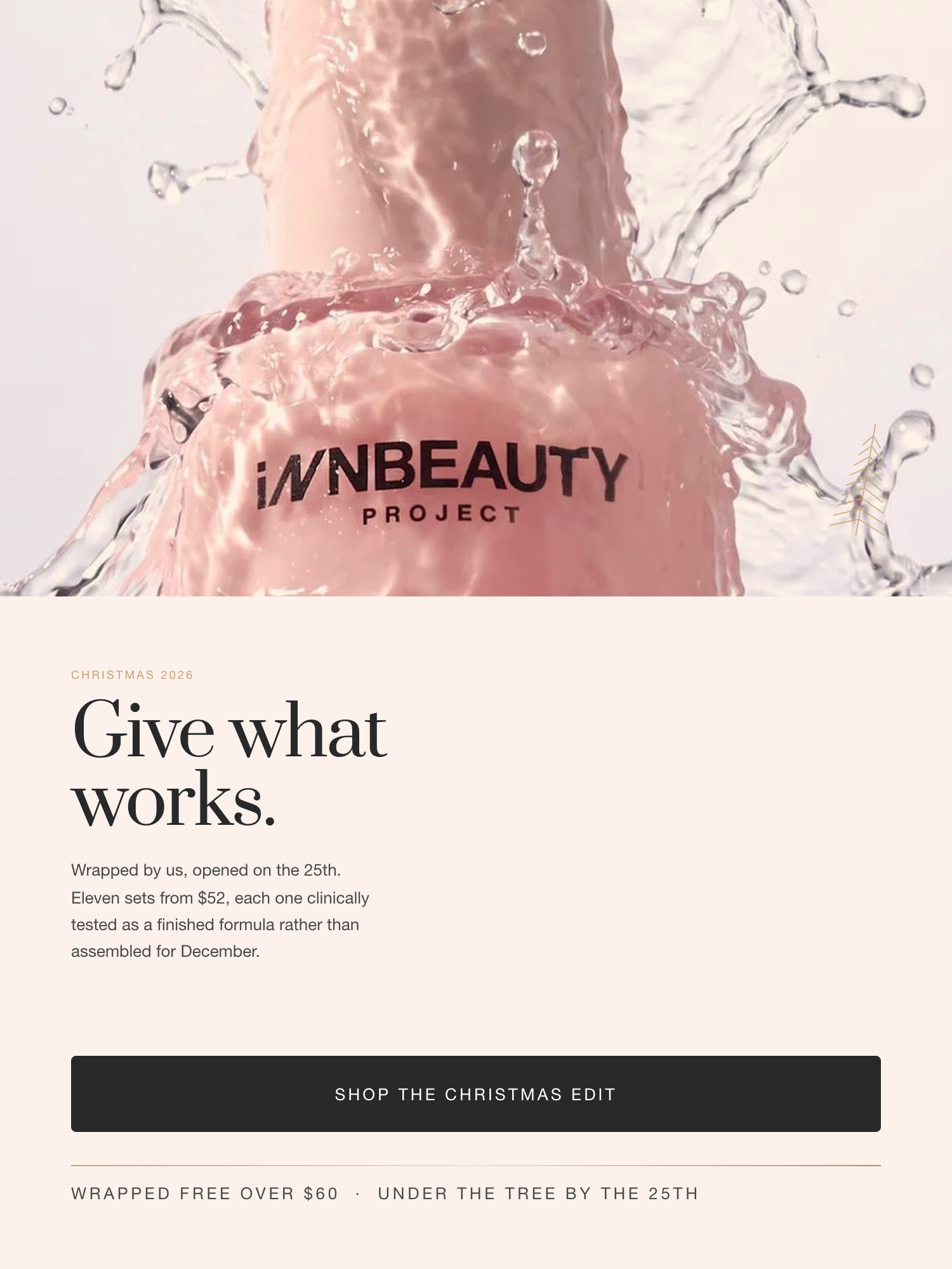
Christmas through the packaging
No red and green. The season is carried by deep fir against the brand's warm neutrals, with a champagne foil lifted straight from the rose-gold caps.
Two marks, drawn hairline
A pine sprig and a bell, both reduced to line and blocked in foil. They behave like a signature, one or two per composition, never scattered.
Gifting, not discounting
The brand's guardrail is value framing over percentages. Christmas states sets from $52 and a 22 December cut-off; the only campaign that discounts is Black Friday.
Christmas, retail & marketplace
3000×1200 store banner · safe-area composed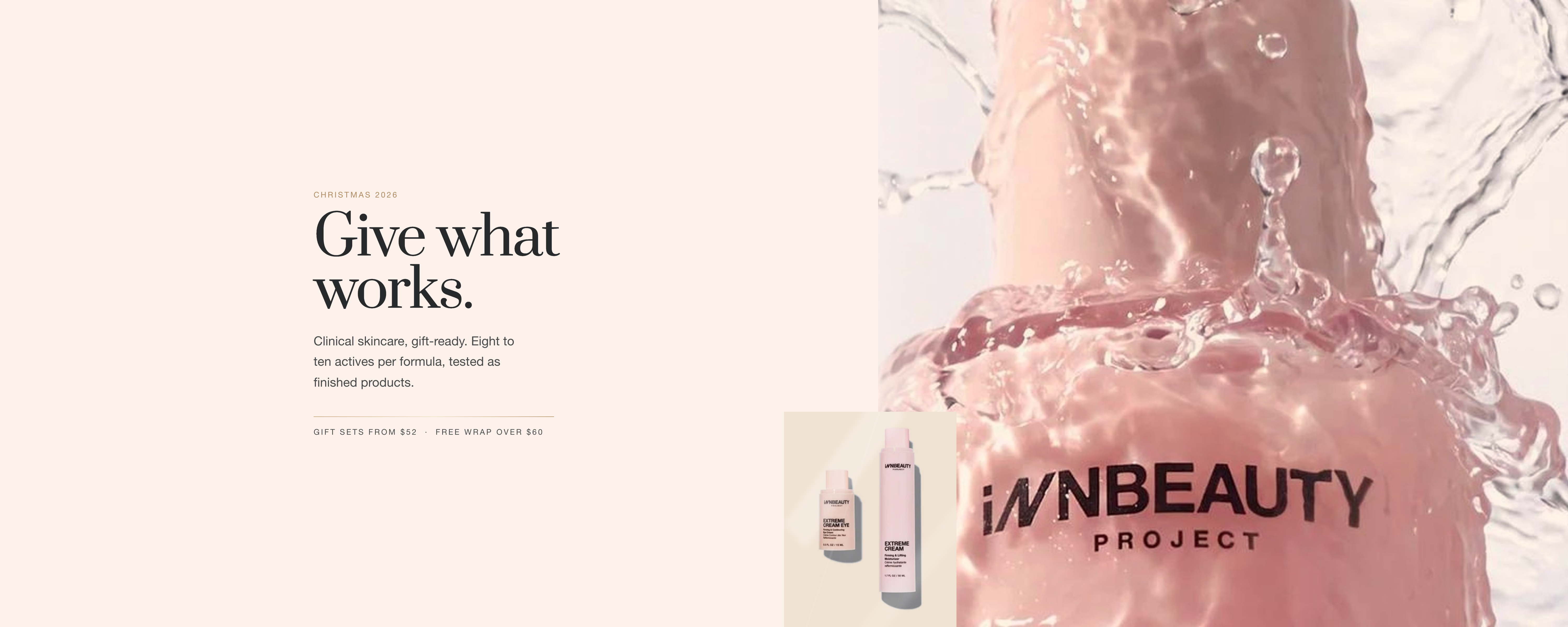
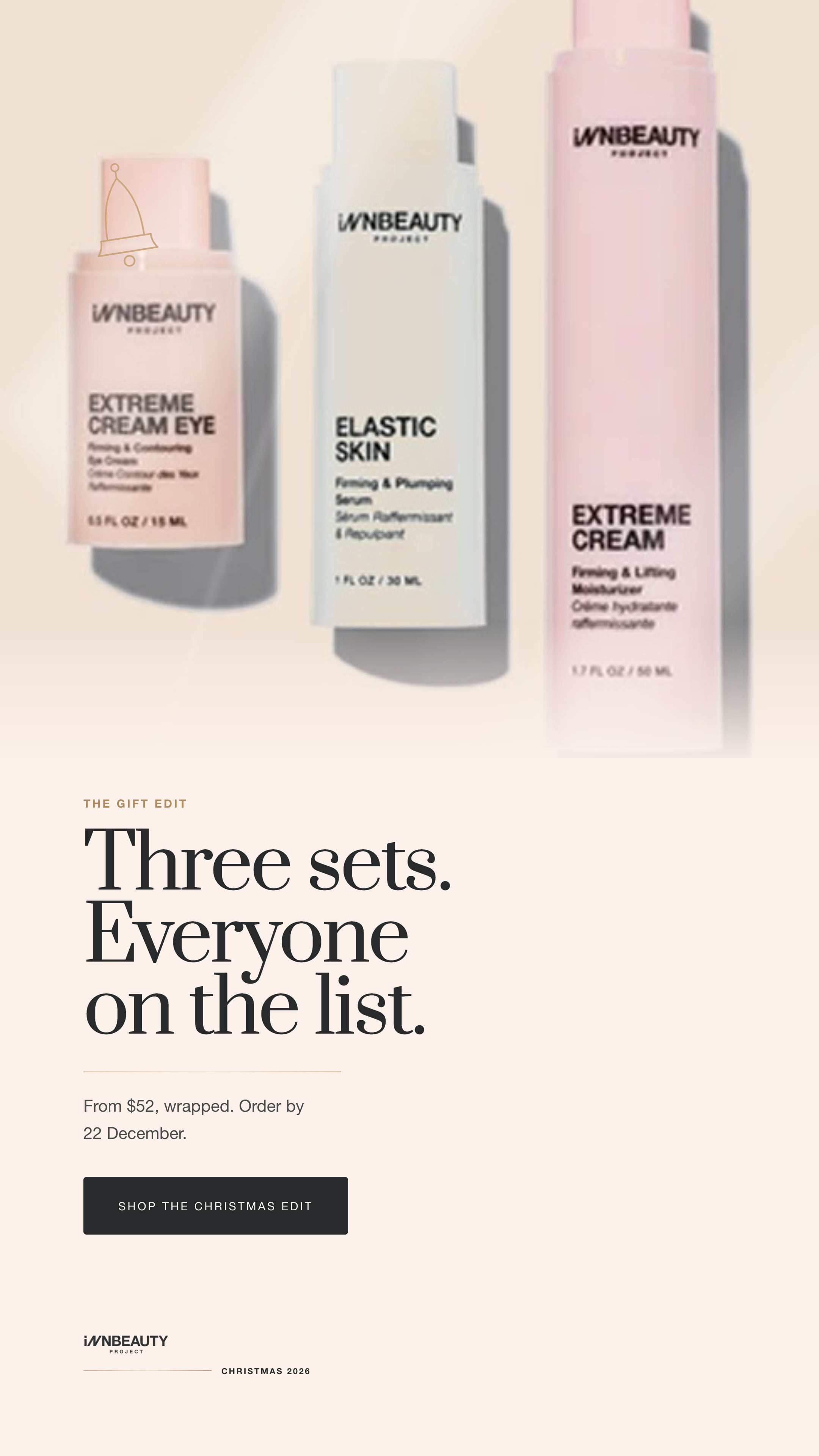
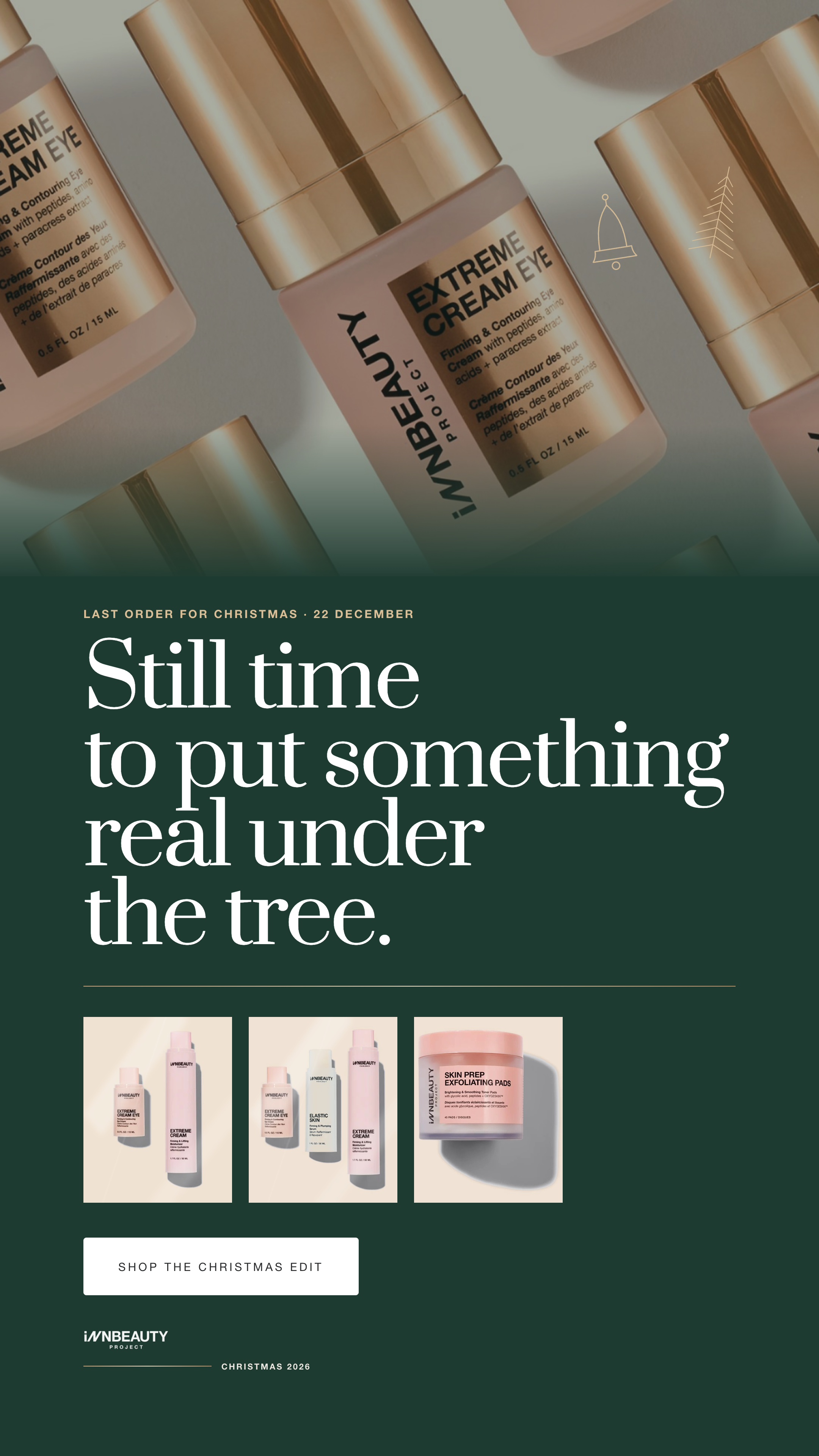
Christmas, social
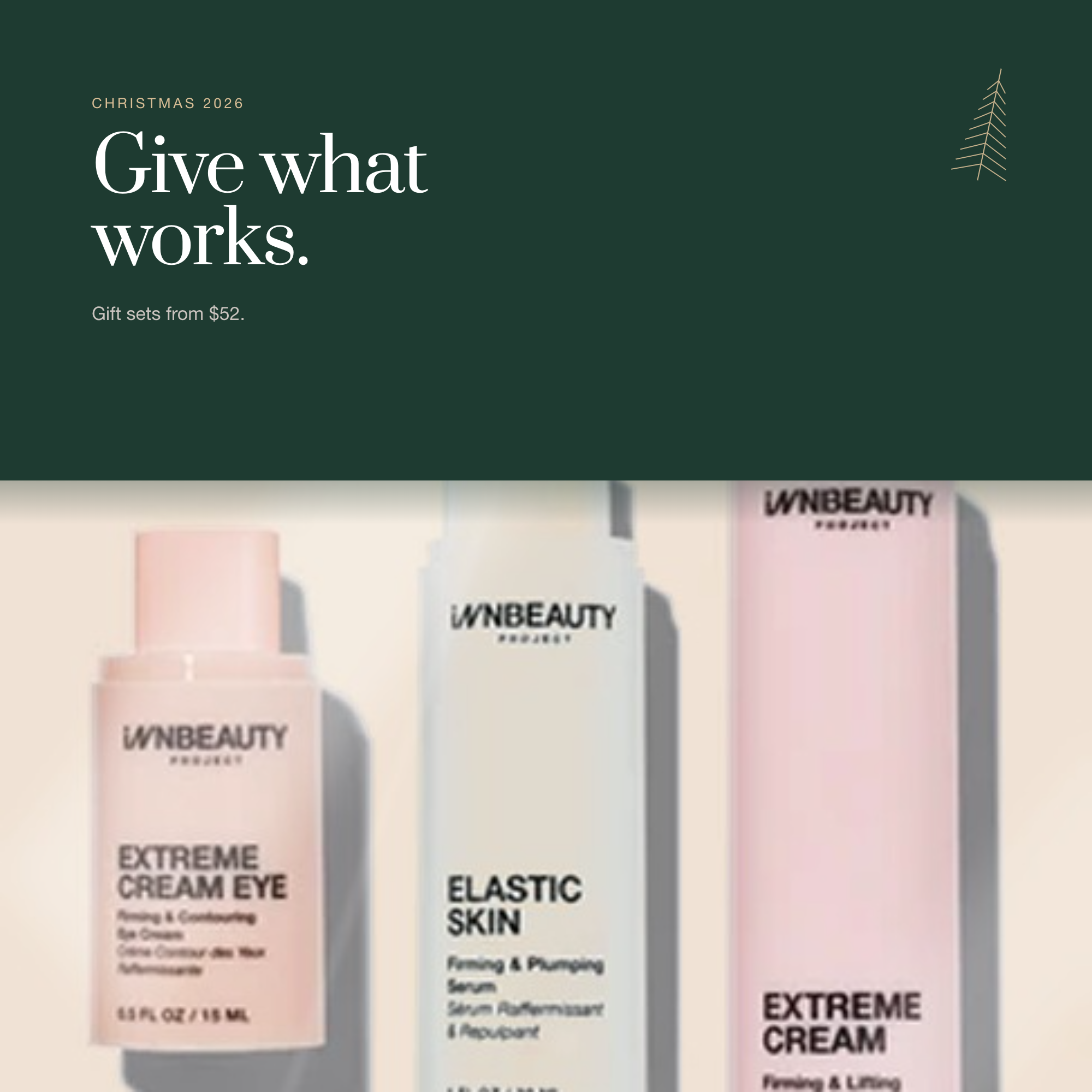
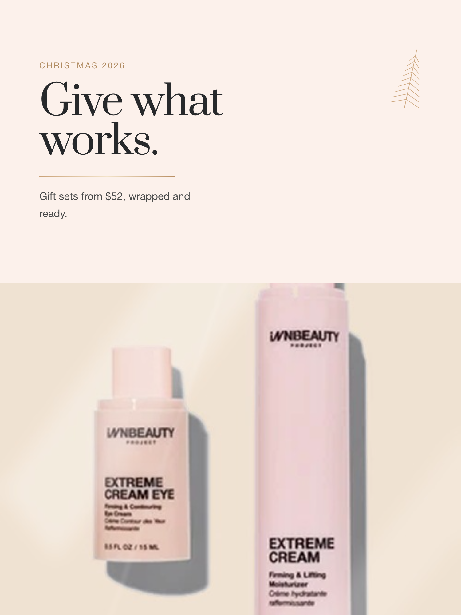
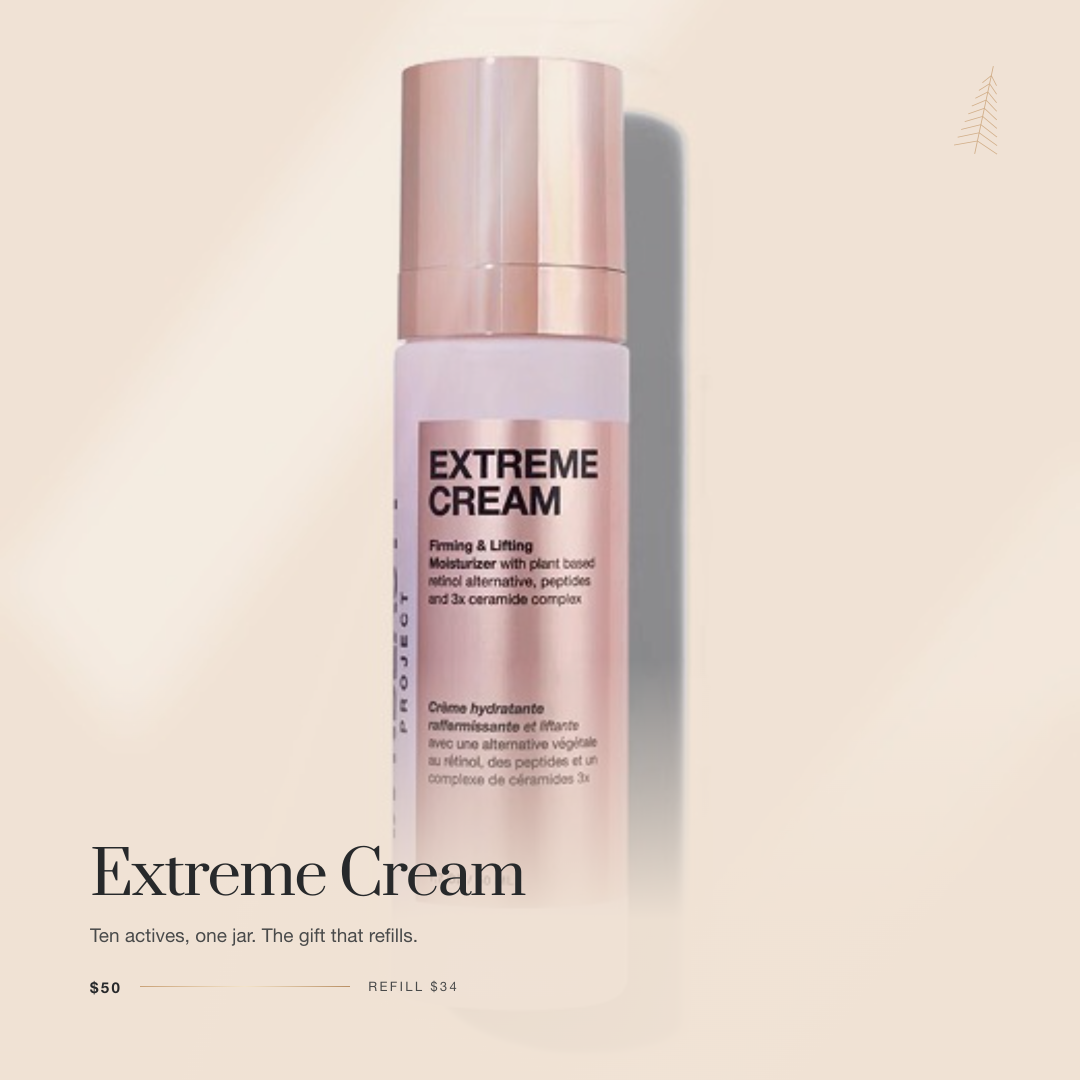
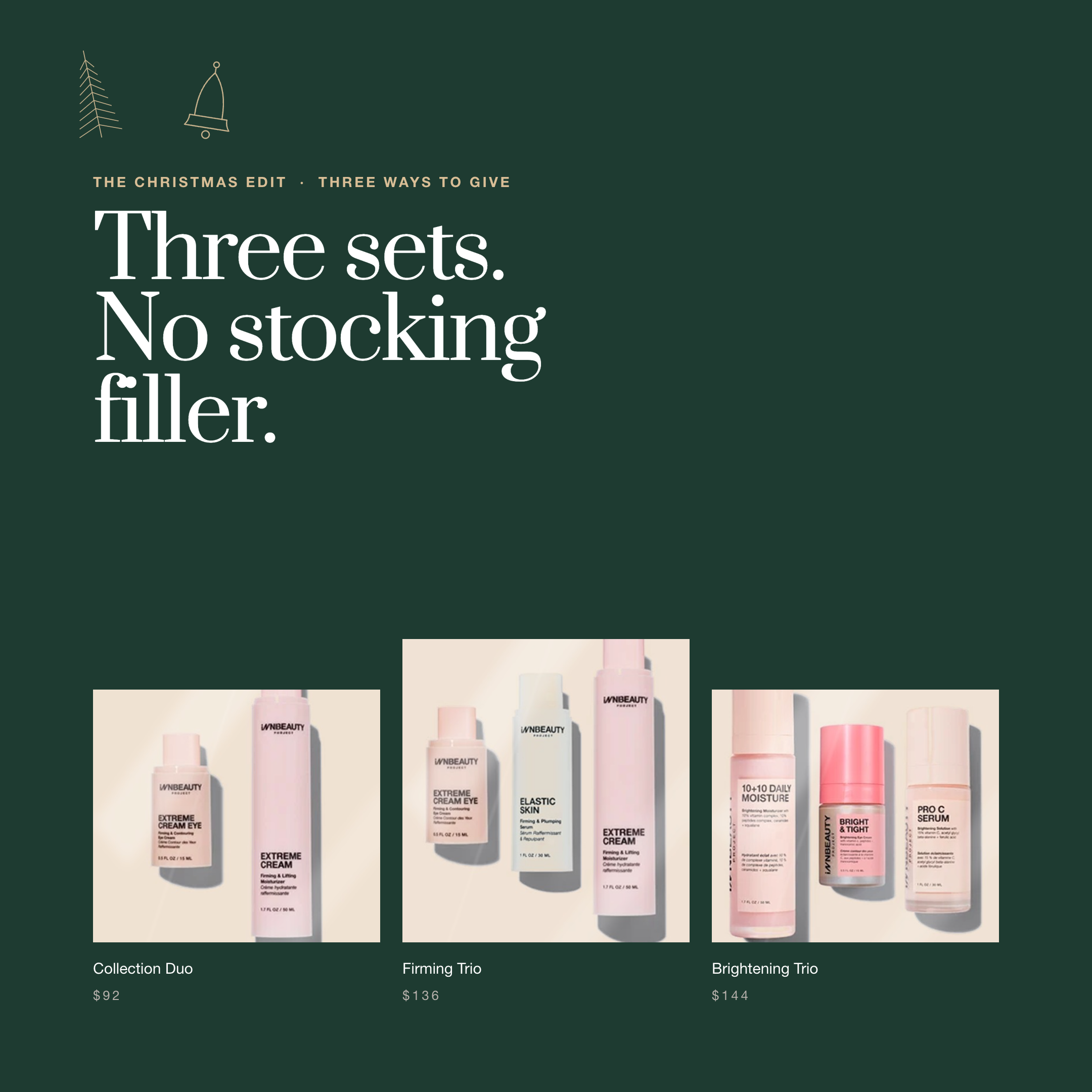
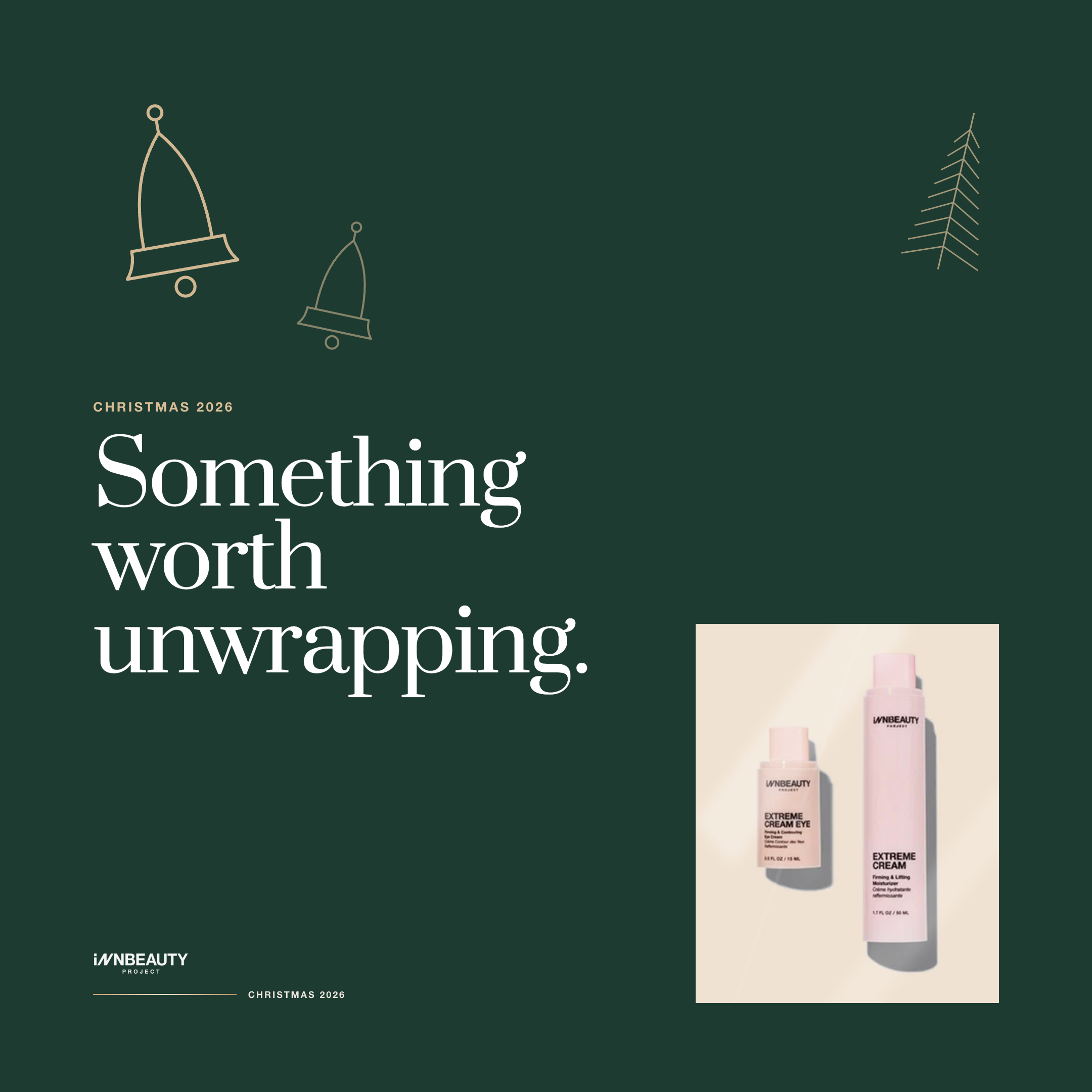
Feed 1:1 & 4:5 · Story 9:16 · Landscape 1.91:1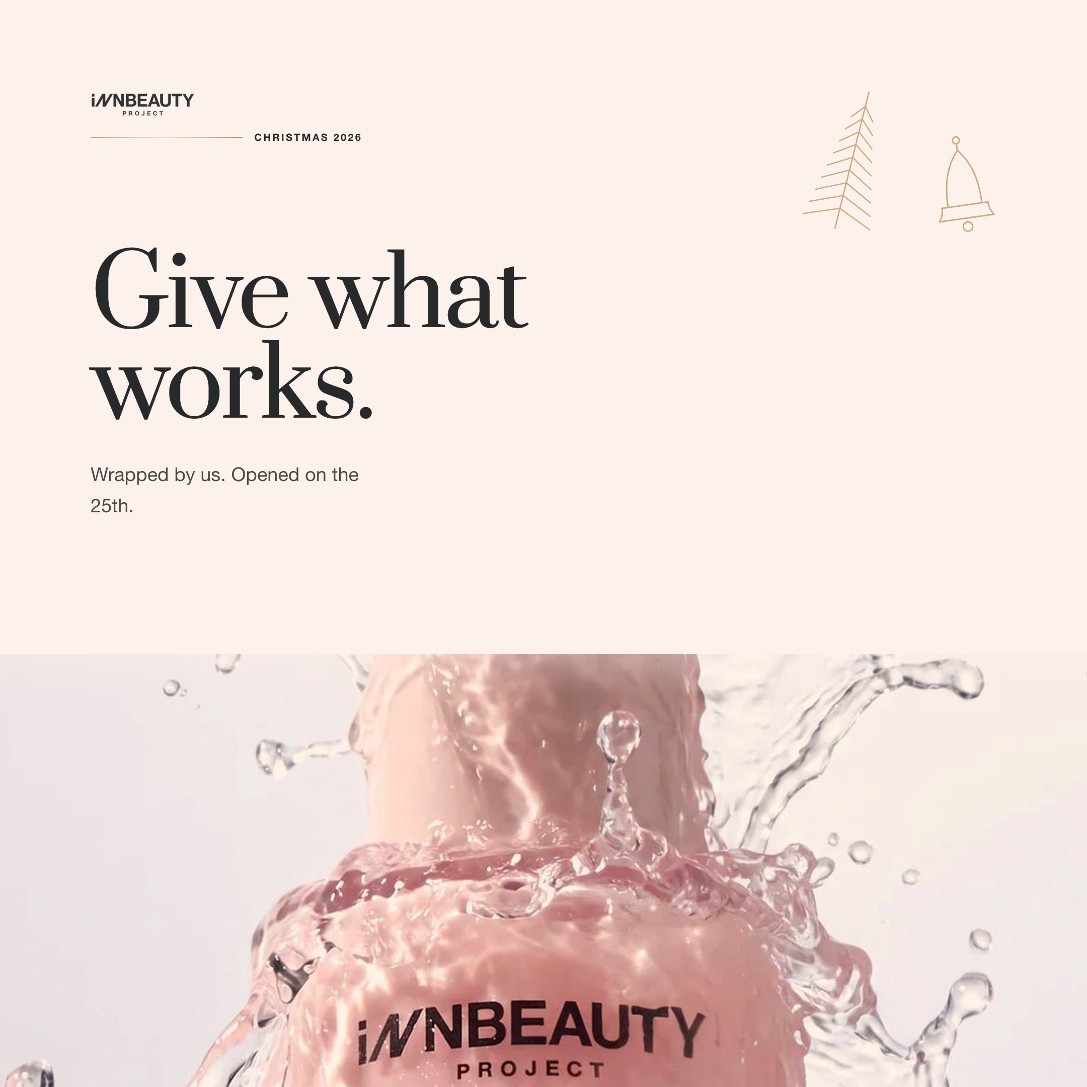
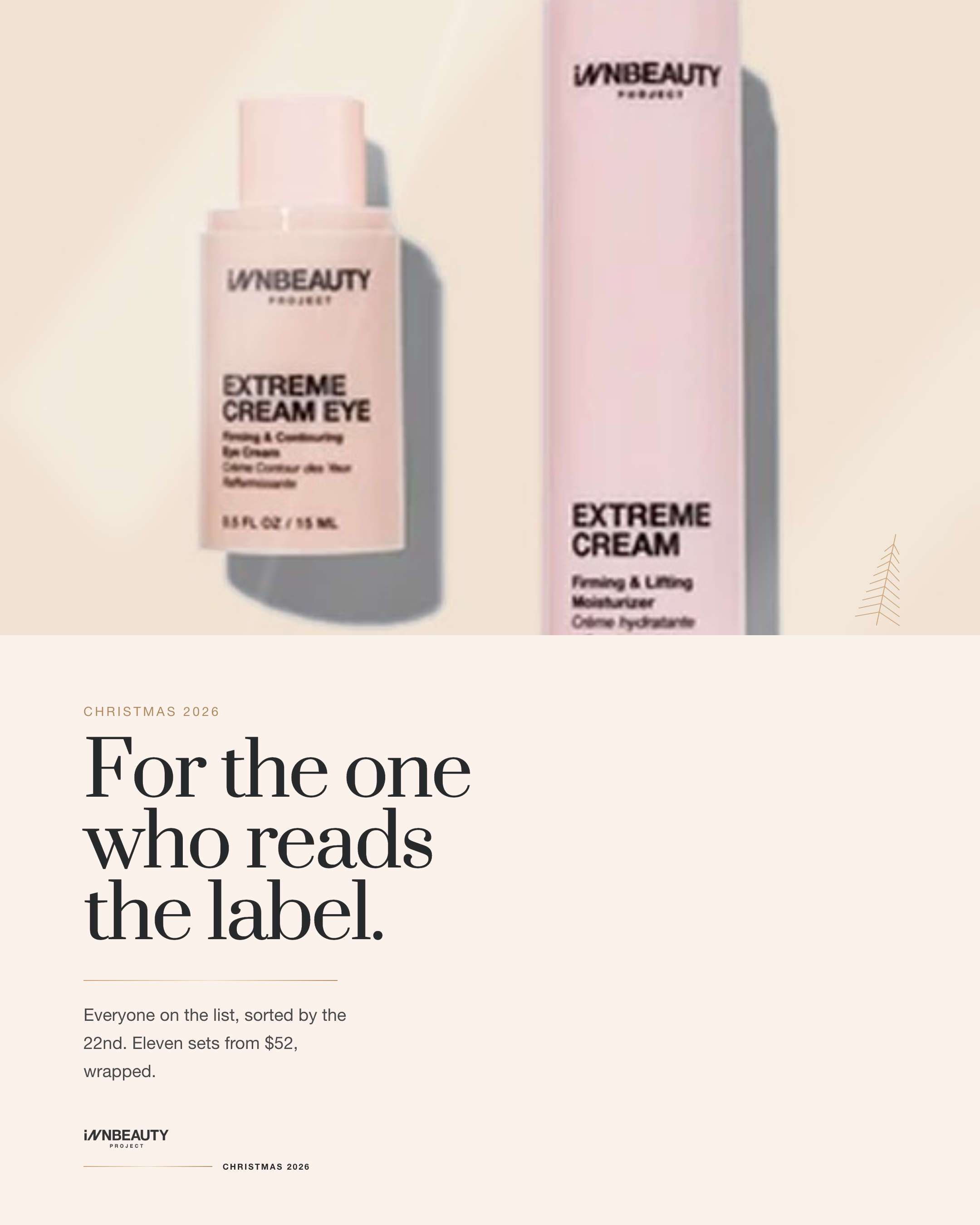
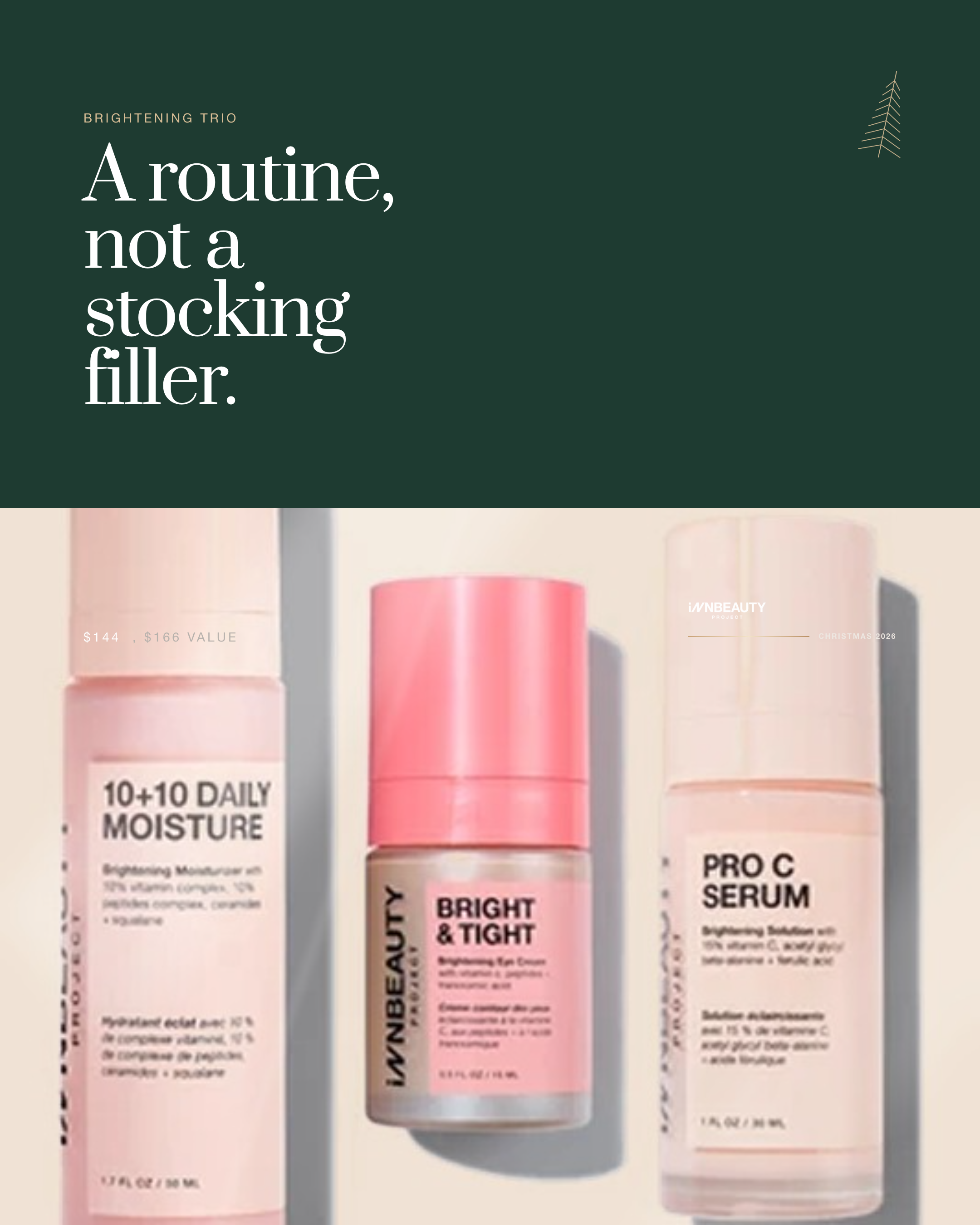
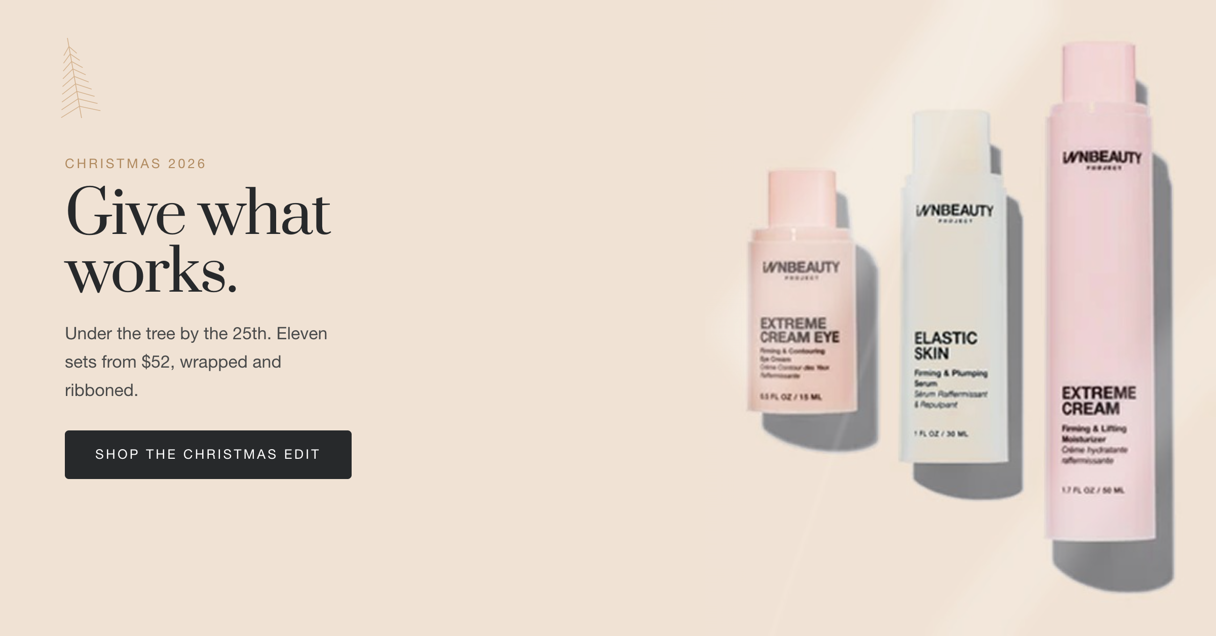
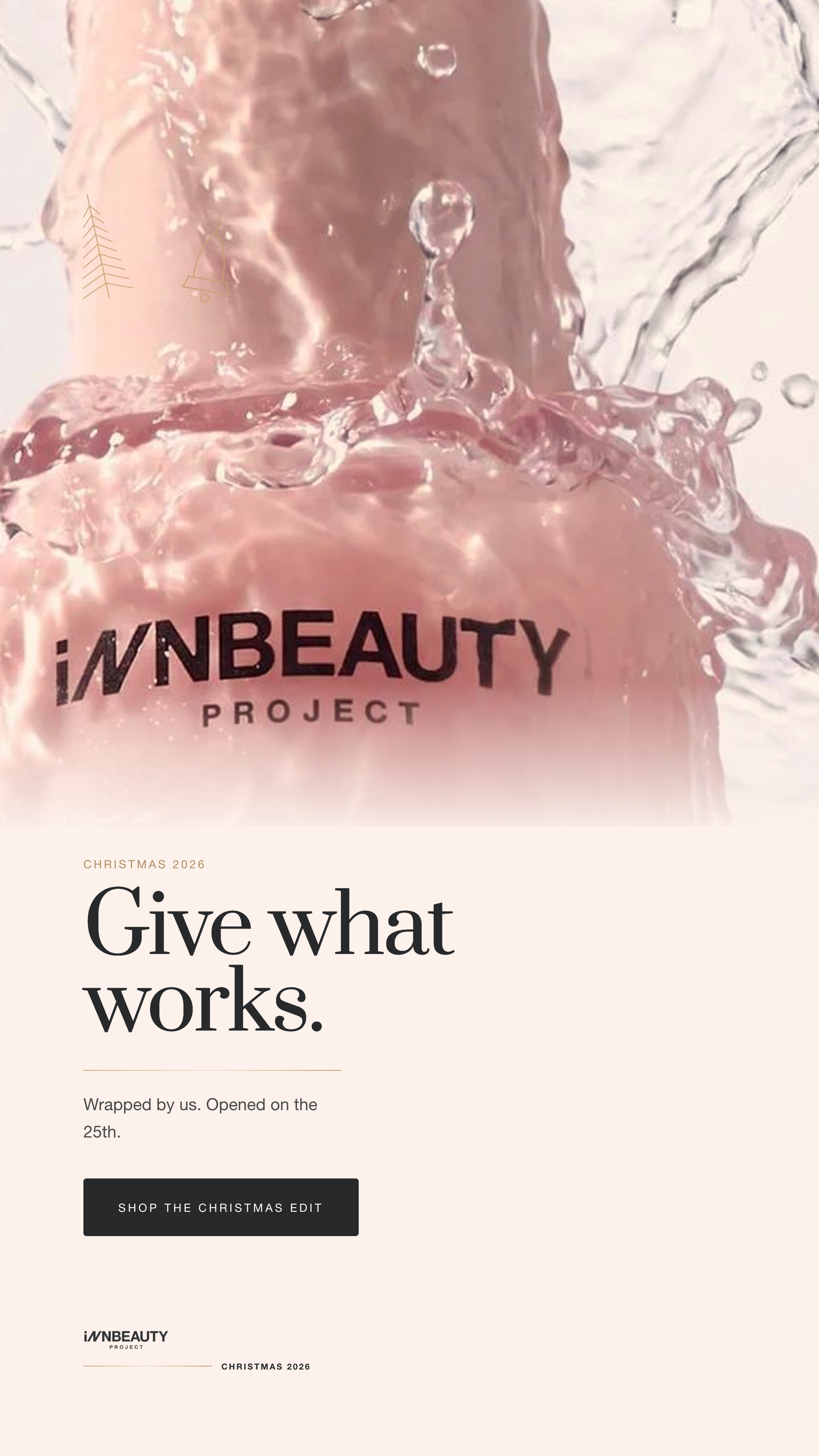
Recomposed, never resized
Each ratio gets its own hierarchy. The square leads with type, the portrait leads with product, the story leads with image and lands the CTA inside the safe zone.
Fir as the seasonal ground
Deep fir against pale packshots is what makes the set read as Christmas at thumbnail size, before any copy is legible.
One idea per post
Announcement, product, gift edit, unwrapping, last-minute. Five angles rather than one layout repeated ten times.


Client
INNBEAUTY Project, concept redesign. Clinical skincare, direct to consumer.
Scope
Design system audit, storefront redesign, campaign identity, email, retail and social creative, automated export pipeline.
Built with
HTML, CSS, SVG. Prata and Helvetica Neue. Playwright and Pillow for asset preparation and export.
Deliverables
4 storefront pages, 4 campaign emails, 25 campaign artboards, 54 exported PNG and PDF assets, one written design system.