Case Study
Philly Truce
Peace Patrol.
Overview
Philly Truce is a Philadelphia nonprofit that runs Peace Patrol - a program of trained Peace Patrol Officers (PPOs) who patrol neighborhoods to de-escalate conflict and respond to incidents before they escalate. As the program scaled, the team was coordinating routes, shift schedules, PPO availability, and incident reports through group texts, paper sign-ins, and the memory of a few key people.
I led UX for Phase 4 of a multi-phase volunteer engagement through Tech Fleet. The goal: design a dispatcher-facing desktop platform and evolve the mobile experience so PPOs could view routes, claim reports, submit updates, and close out incidents - all in one system.
Problem Statement
Dispatchers were coordinating routes, schedules, and PPO availability through fragmented, manual workflows.
Phase 4 Design Brief · Philly TruceRoutes were shared via group chat. Schedule changes happened reactively. Report intake and assignment lived across texts and sticky notes. When an incident came in, there was no single source of truth for who was on duty, who was closest, or what had been assigned to whom. The Phase 4 brief: design a desktop dashboard for dispatchers while evolving the mobile experience so PPOs could see their schedule, claim reports, and reflect real-time operational changes - without adding cognitive load during active patrols.
My Role
I was Product Design Lead across mobile and desktop for Phase 4.
Phase 4 Responsibilities
Research synthesis from prior phases, scope negotiation with stakeholders, design direction across both platforms, design-decision calls under pressure, engineering handoffs.
Two cross-functional design pods (Mobile and Desktop) alongside researchers, content designers, volunteer engineers, and nonprofit stakeholders.
Phase 4 · 8 weeks · Tech Fleet (pro-bono) in partnership with Philly Truce and Penn Injury Science Center DATA Lab.
Research Foundation
Building on what came before.
I didn't start with a blank page. Phases 1-3 had already produced substantial research, and my first move was to read all of it before committing to a direction. What I inherited: a field study that shadowed actual patrols, a round of usability testing with Philly Truce operational leads, stakeholder interviews with the Executive Director, and a DATA Lab session at Penn that reframed patrol routing as a spatial-coverage problem.
Three insights carried through and shaped Phase 4:
Field study notes documented PPOs adjusting routes mid-shift based on local knowledge - a friend's text, a rumor about a block. Any system that overrode that instinct would be ignored. The tool had to surface information, not dispatch against it.
Every conversation circled back to incident reports - how they got created, who got assigned, how they got closed out. Reports, not shifts, were the thing the product had to get right.
Dispatchers think in schedules and coverage. PPOs think in routes and reports. The system had to respect both - which meant the mobile and desktop apps shared data but not interaction patterns.
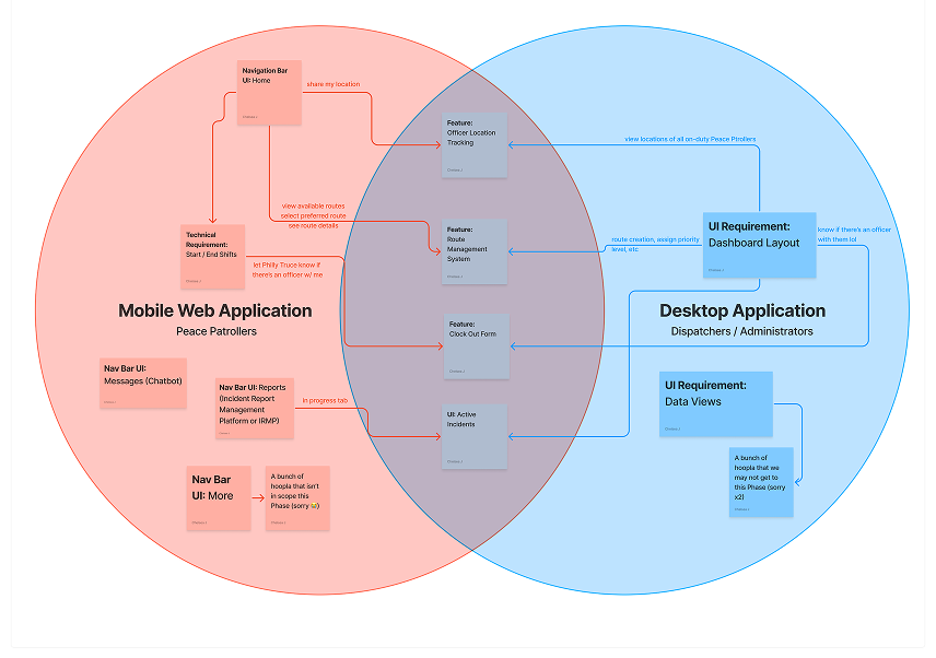
Mobile to Desktop relationship mapping: shared primitives, platform-specific interactions.
Define & Scope
Eight weeks. Two pods.
I made the scope call in week two alongside the Tech Fleet leads and Philly Truce stakeholders.
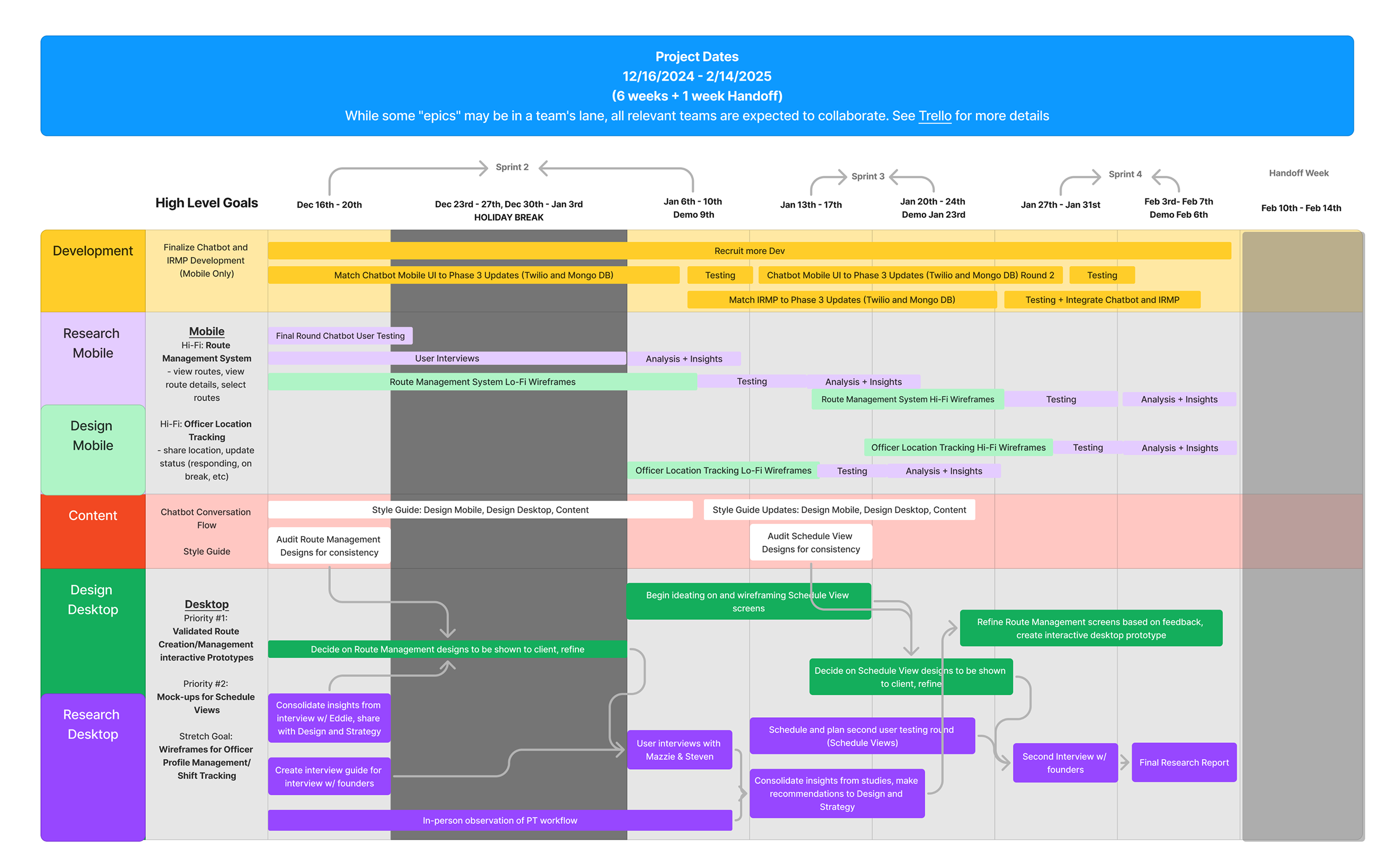
8-week delivery window.
What we committed to - and what we didn't.
- Desktop scheduling dashboard (publish/unpublish)
- Report lifecycle on mobile: Unclaimed to In Progress to Resolved
- Admin-side report assignment
- PPO-side report claim and update
- Route management foundation
- Design system for both platforms
- Calendar and list views on desktop scheduling
- Report edit flow
- Chatbot-generated vs manually-created report paths
- PPO-side create-new-report flow
- Real-time coverage map
- Cross-platform messaging
- Live location tracking
- Predictive routing from the DATA Lab framework
- Full spatial-coverage map
- Automated payroll
- In-app comms beyond report notifications
- Live GPS tracking
Live patrol tracking was cut on day one of scoping.
Live patrol tracking was the single most requested feature internally and the one I cut fastest. A live-location tool for people doing safety work in their own neighborhoods - disproportionately people with records - becomes a surveillance tool if the permissions model is wrong. We did not have eight weeks to design a permissions model I'd stake the safety of real PPOs on. I wrote up the concern in the handoff doc for the next phase.
Chapter 01 of 02 · Design Process
Design Process
Nine decisions across mobile and desktop - from information architecture to the consolidation that made the product usable.
Design Process
Reports at the center.
I revised the mobile IA based on usability findings from the prior phase to reduce friction during critical moments: report claim, update, and close-out. The architecture intentionally put Reports at the center - it's the PPO's primary workspace during an active shift.
Independent exploration, collective alignment.
Each designer on the mobile pod explored the report experience independently. We reviewed patterns collectively through critique and dot-voting - surfacing edge cases early and aligning on the strongest ideas without top-down hierarchy.
Built for field use, not a demo environment.
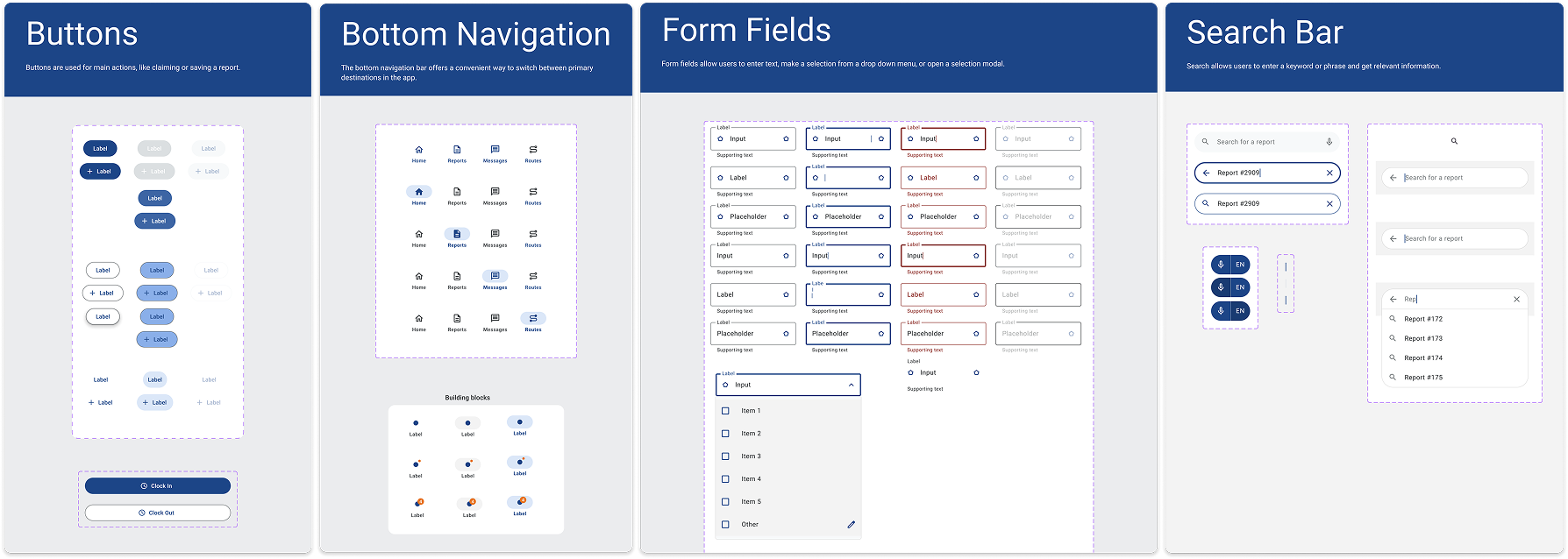
We built the mobile components to handle real-world field use: report cards, status states, availability toggles, alert patterns, and feedback flows - each optimized for glanceable interaction during active patrols.
Multiple legitimate paths - all of them designed.
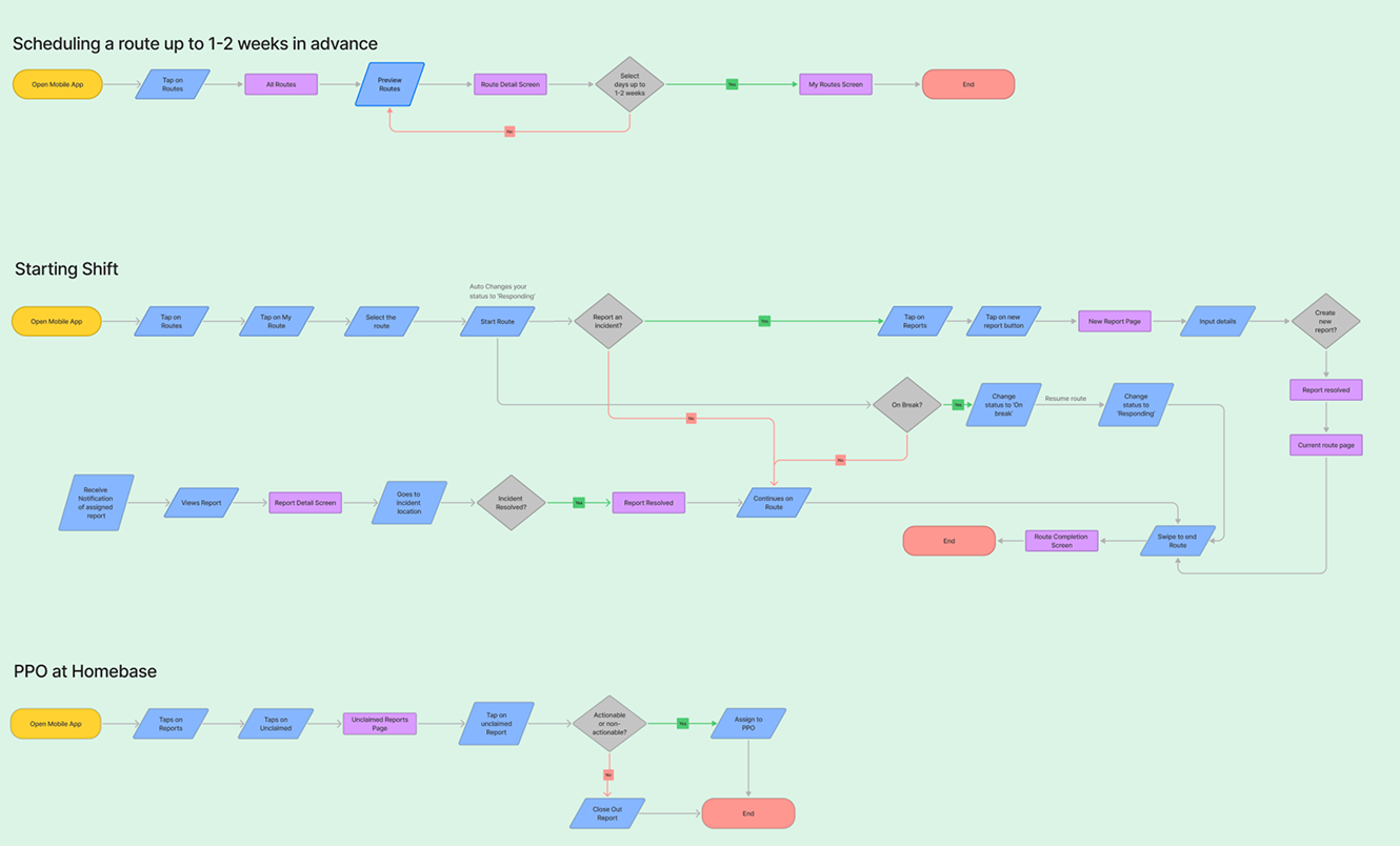
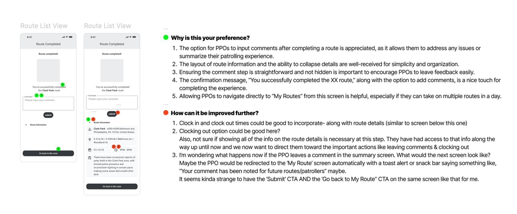
A single report can get into the system four ways: chatbot-generated from the Philly Truce public tip line, manually created by a PPO on the ground, manually created by an admin based on a phone call, or auto-created from a related incident.
Once in the system, it can get closed out three ways: resolved by the assigned PPO, resolved by an admin directly, or marked as chatbot-handled without PPO involvement.
I could have forced a single canonical flow. I didn't - because the real operation runs on all of them, and forcing uniformity would have pushed work back into group texts. Instead, we designed visual state that made the resolution path legible from the report card itself.
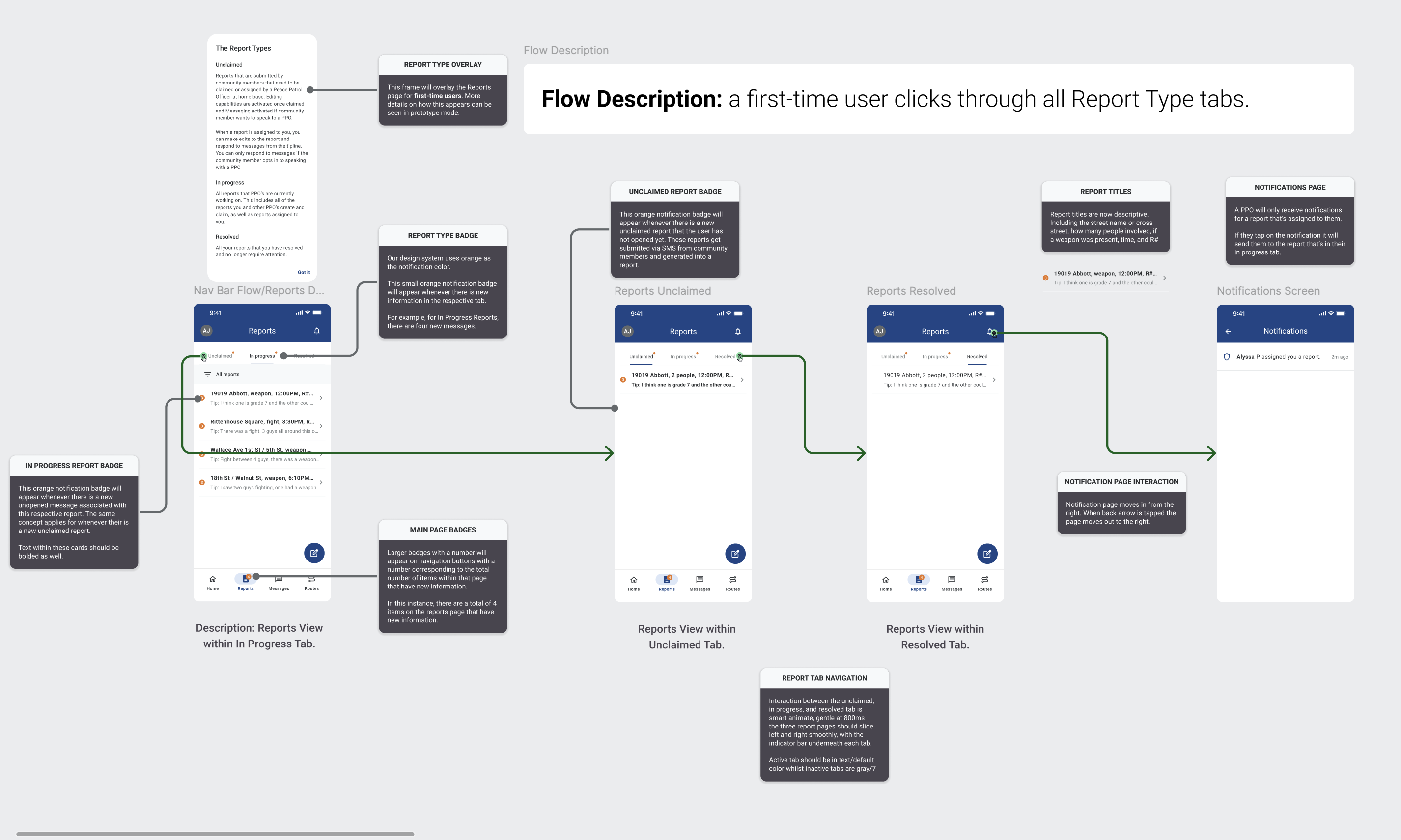
Unclaimed / In Progress / Resolved tab structure with engineering handoff notes.
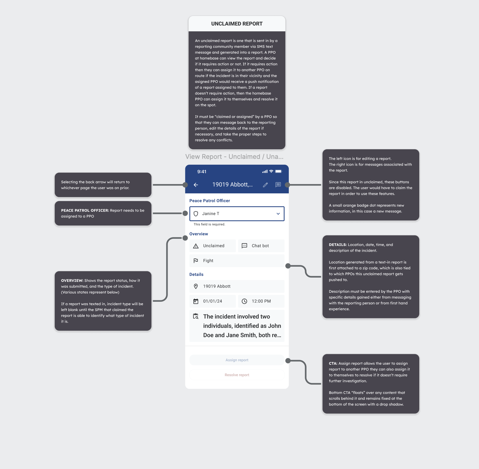
Report detail with the Select PPO assignment dropdown.
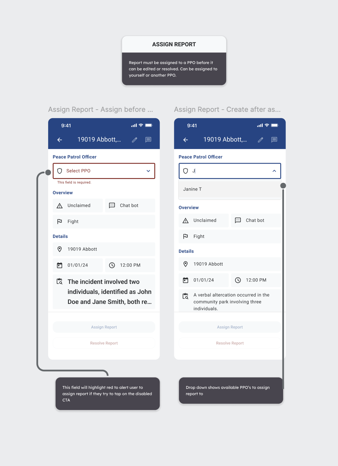
Disabled CTA before PPO is selected vs. dropdown-open state.
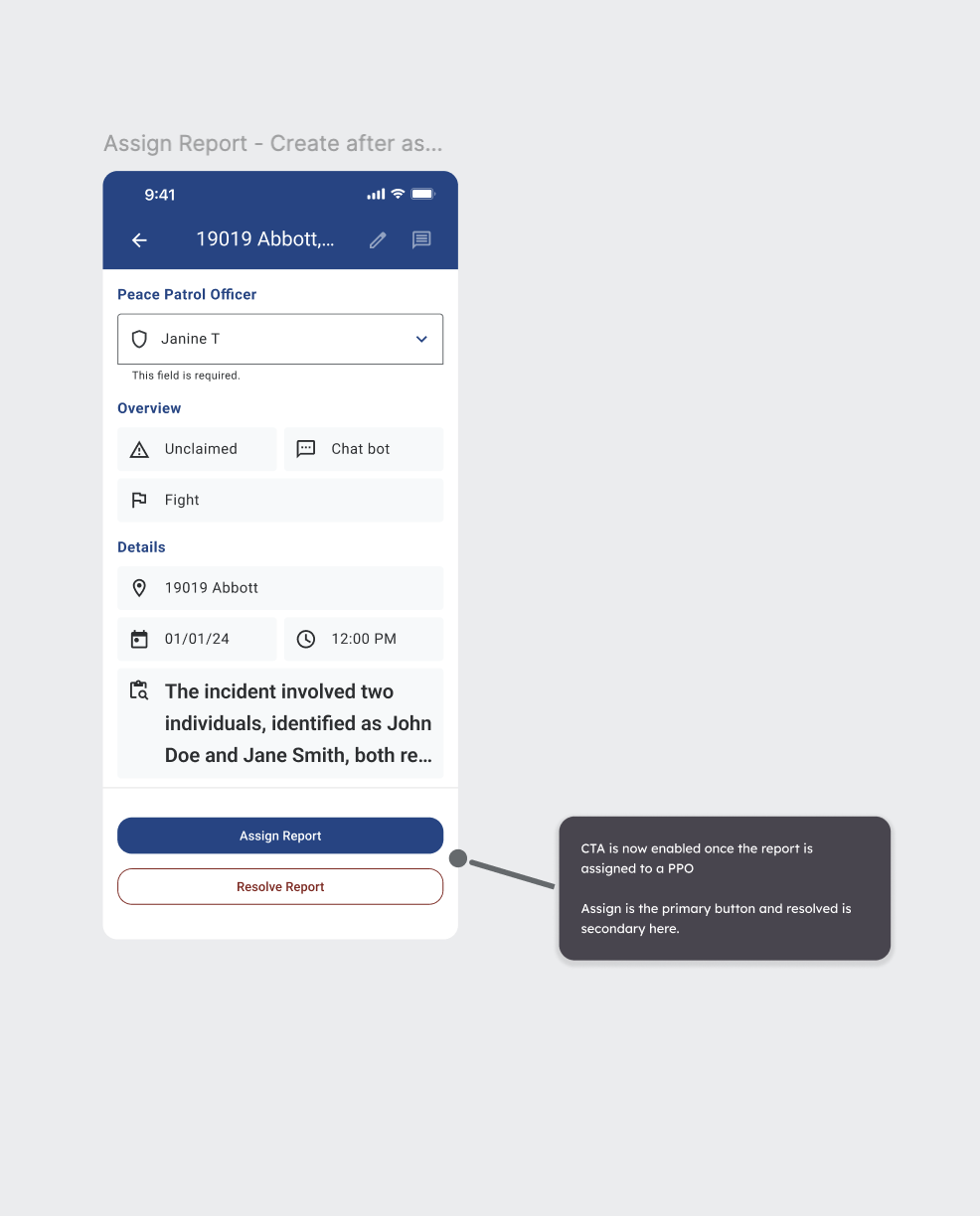
CTA enabled after assignment: Assign primary / Resolve secondary.
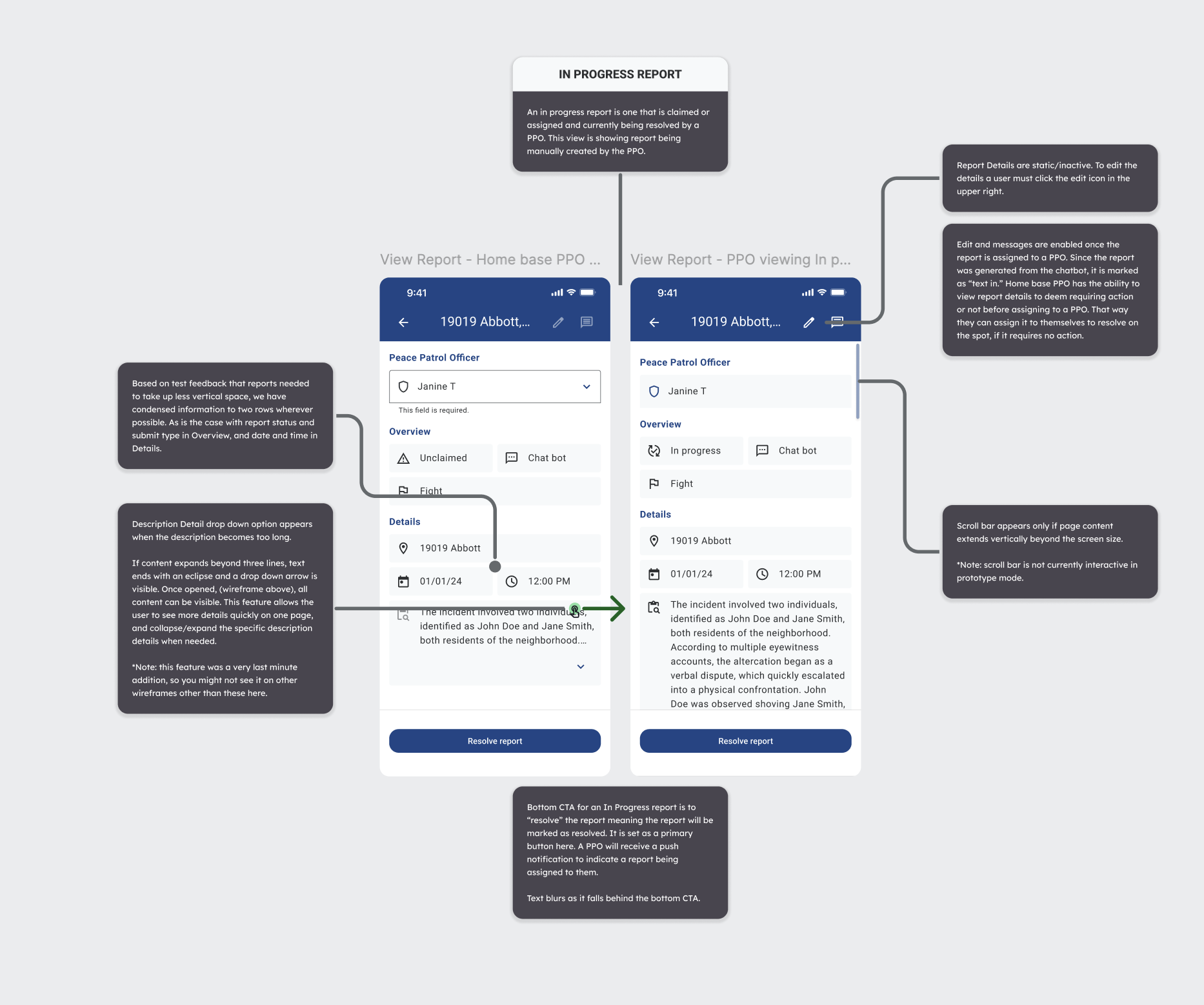
In-progress state: home-base PPO view vs. assigned PPO view.
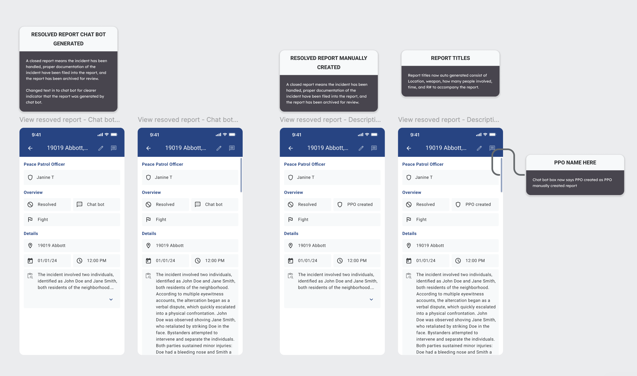
Four resolution variants: chatbot-generated vs manually-created.
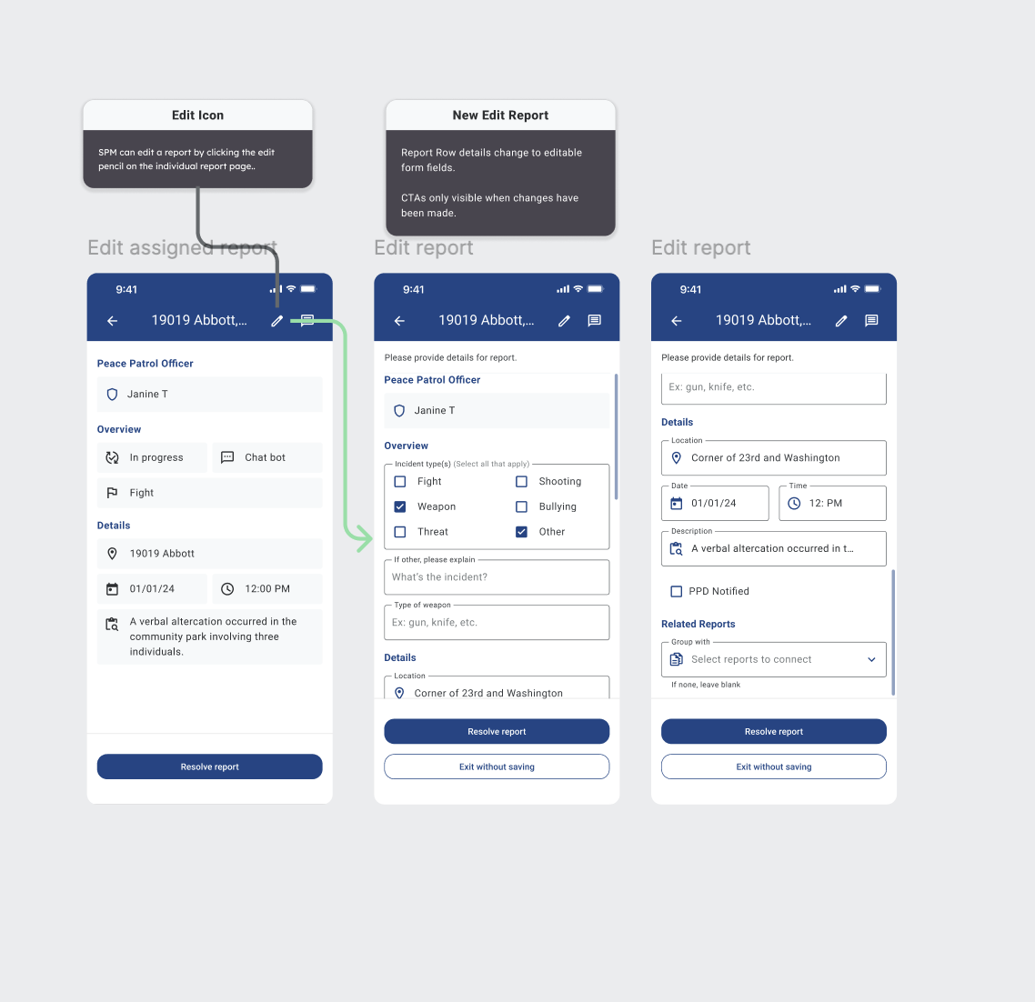
Edit flow: pencil icon to form fields with conditional CTAs.
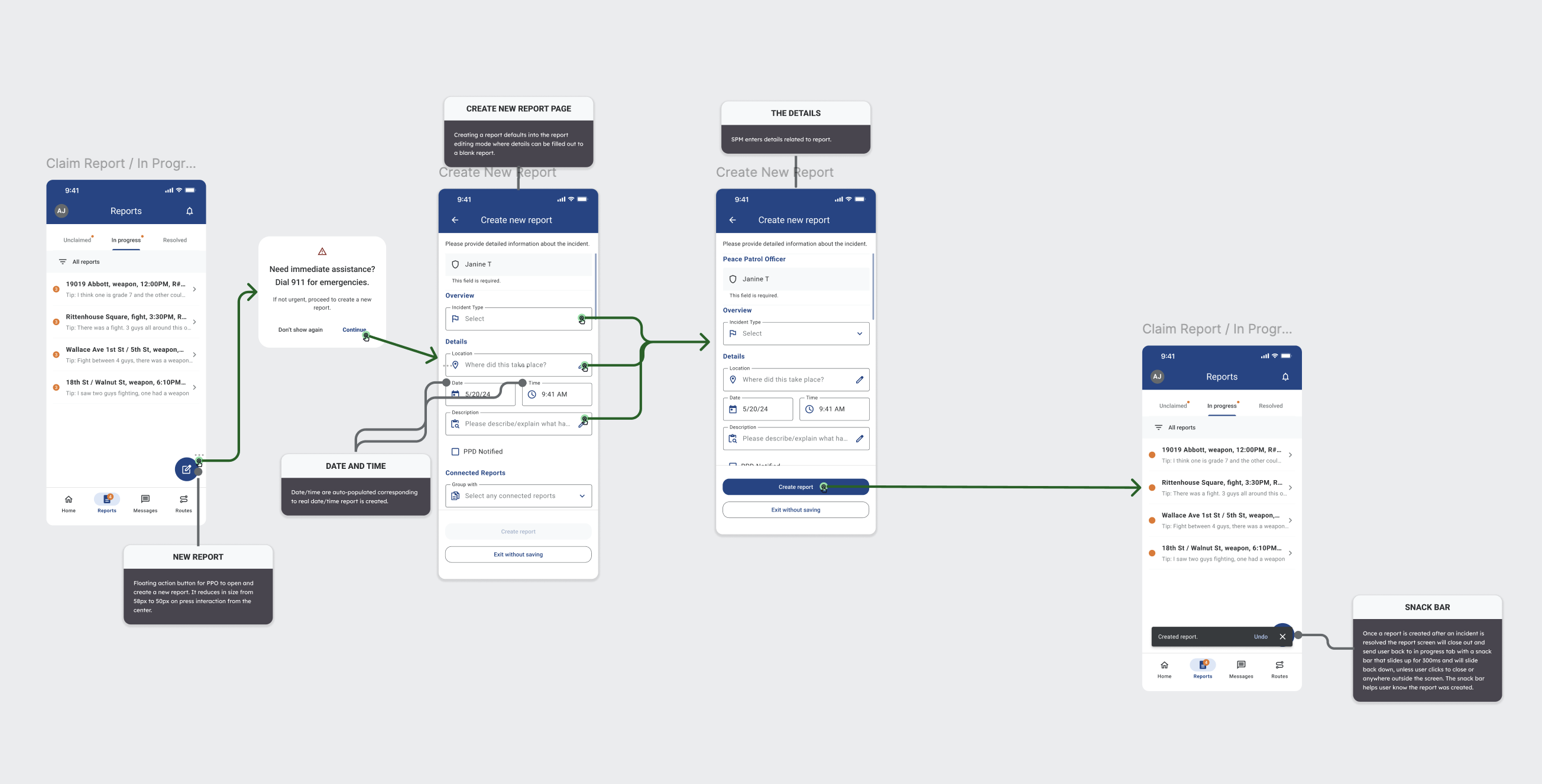
Create-new-report flow with date/time prefill and snackbar confirmation.
Three edit pages collapsed into one interface.
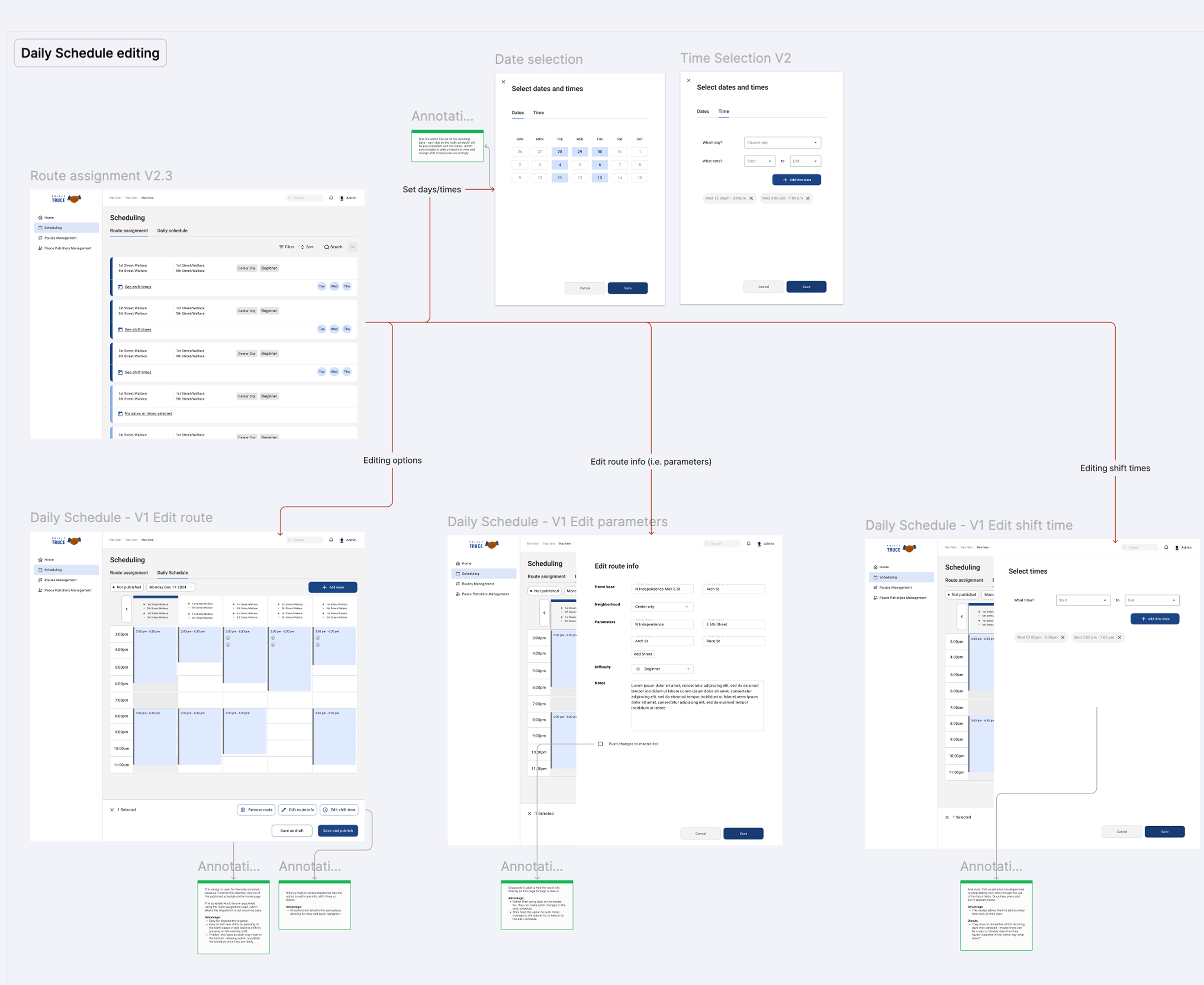
Early desktop iterations split route editing into three separate pages: Edit Route (the street path), Edit Parameters (shift metadata), and Edit Shift Time (start/end times). Dispatchers had to tab between three surfaces to make a single logical change - "move Janine's Wallace Ave patrol from 3 PM to 5 PM."
Testing surfaced the obvious problem: context-switching between three pages caused errors, especially for overlapping routes. In V2.3, I consolidated all three into a single Route Assignment interface with progressive disclosure - edit what you need, commit once.
This was the single highest-leverage desktop design call of the sprint.
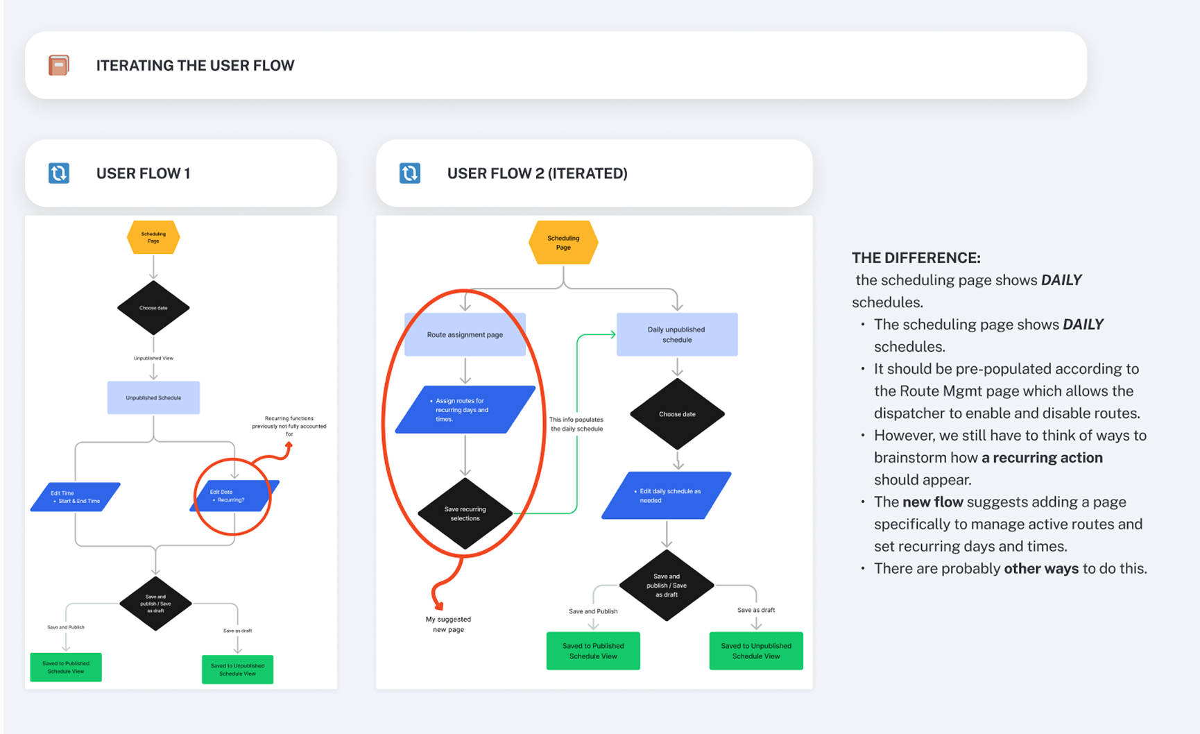
V1: three separate edit pages. V2.3: one consolidated Route Assignment interface.
Same data. Two representations. One toggle.
Some dispatchers plan by time (calendar grid). Others audit by route (list rows). Rather than picking one, we shipped both with a toggle - the same scheduling data in two representations. Color-coding emerged as a later addition after testing: a monochrome schedule was hard to scan for overlap. Soft color blocks made conflict visible at a glance without requiring the dispatcher to read every cell.
V1 monochrome
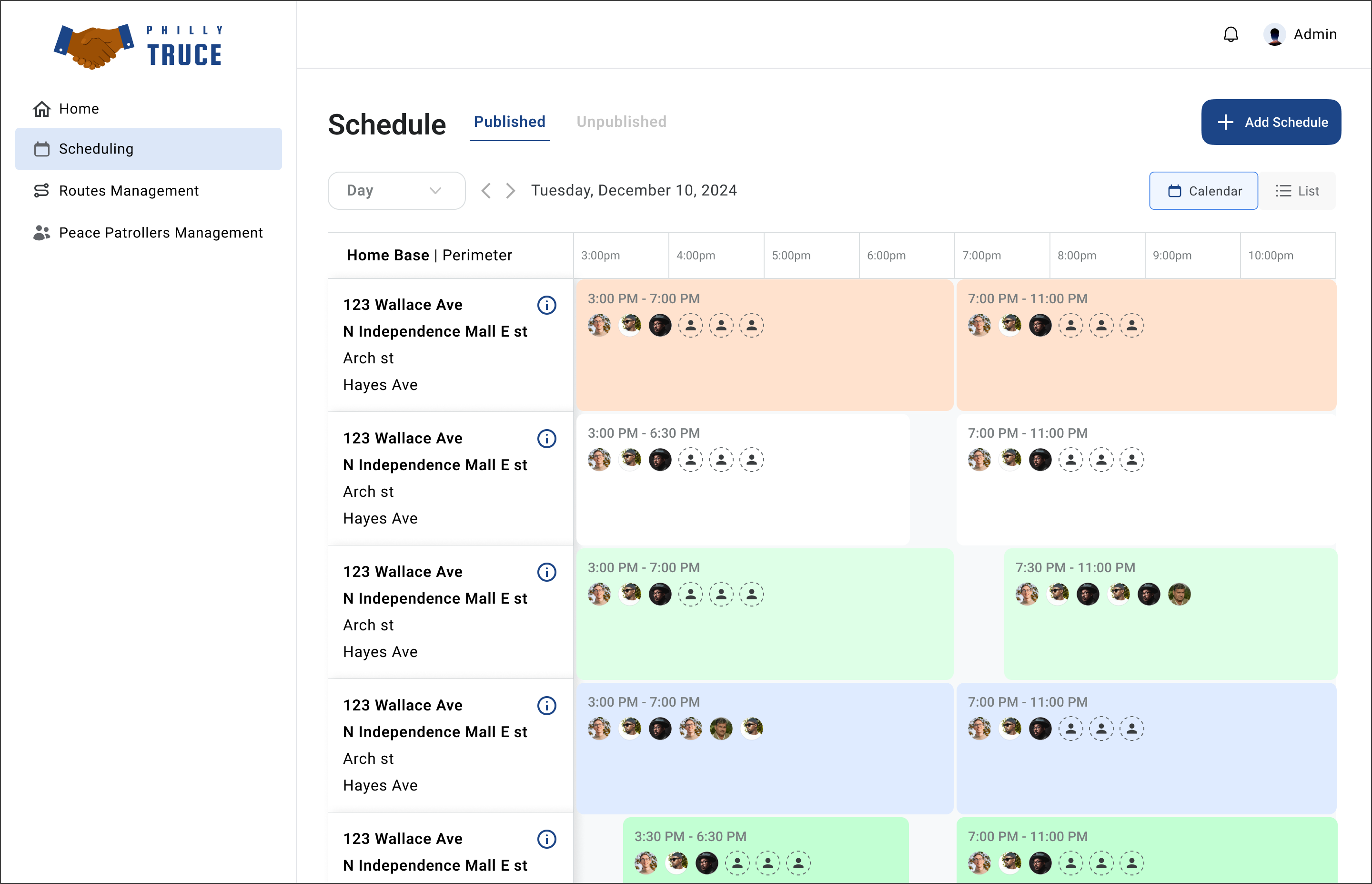
V2 with overlap-visible color
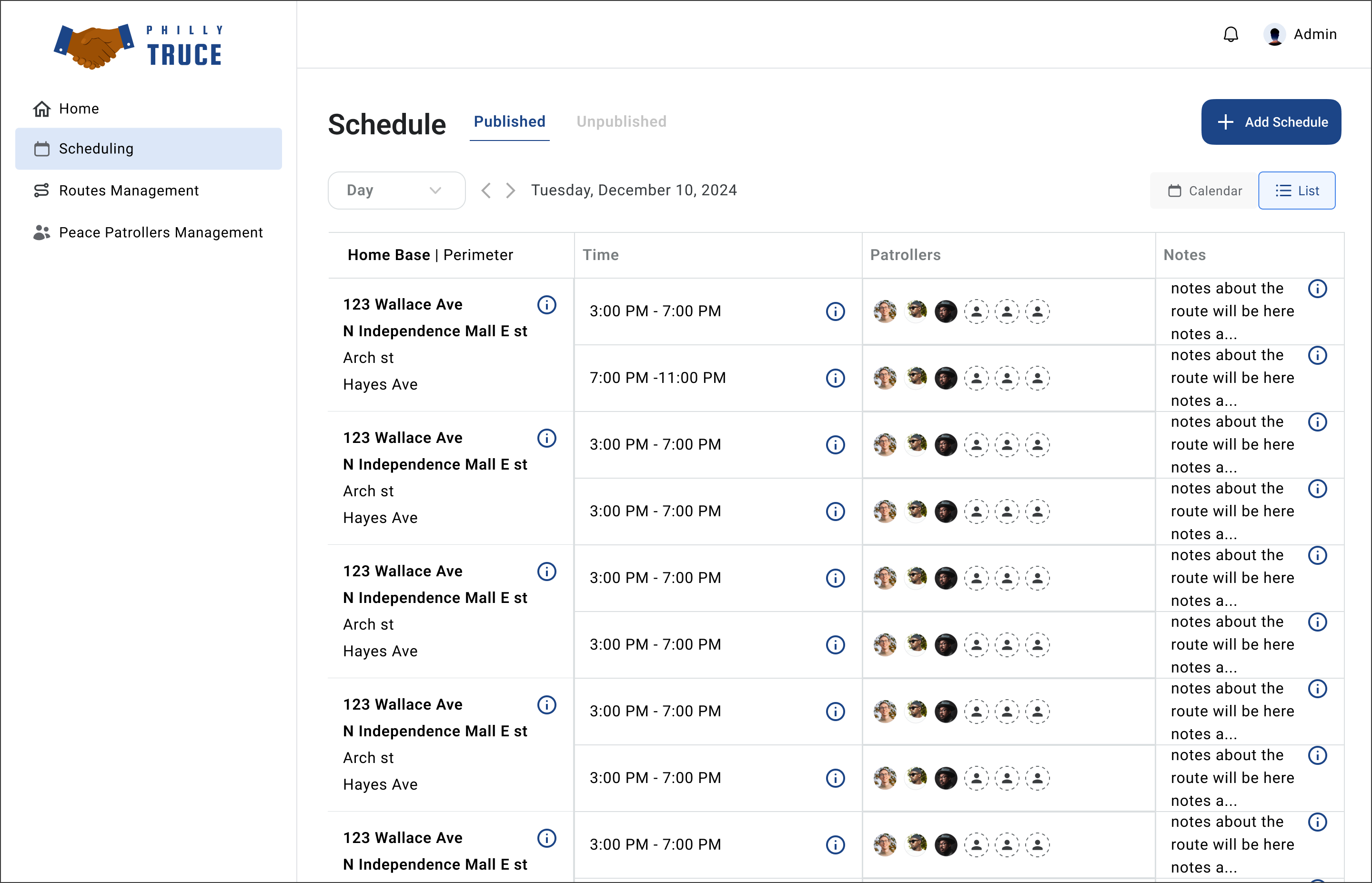
List representation of the same data
Organized around how Philly Truce already thinks.
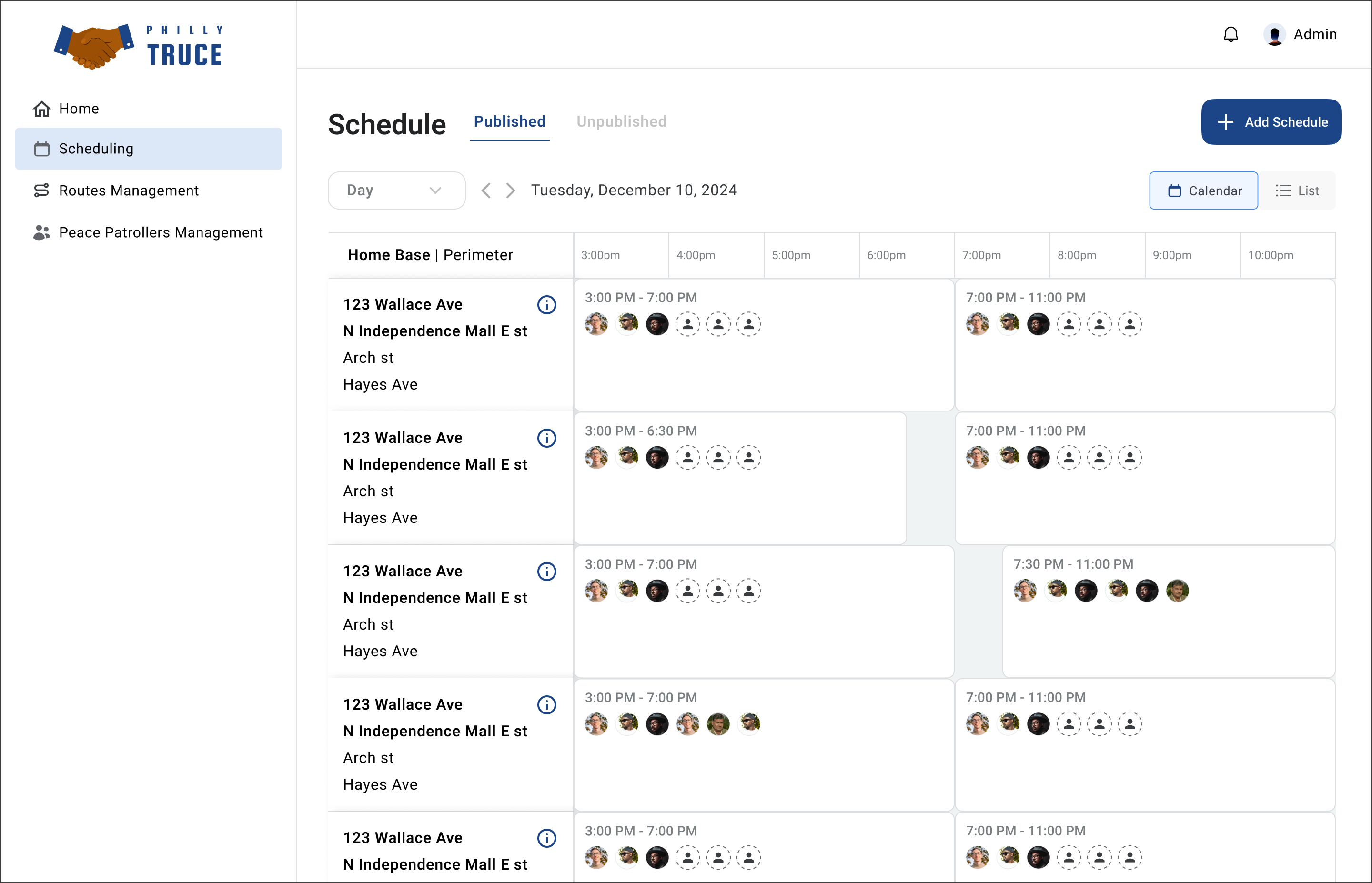
Patrols aren't organized by individual PPO - they're organized by Home Base (the anchor location, usually a park or community hub) and Perimeter (the surrounding streets). A single Home Base can have multiple perimeters covered by multiple PPOs simultaneously.
The desktop scheduling grid uses Home Base | Perimeter as the left-column organizer because that's how Philly Truce's operational leads already thought about coverage. Organizing the UI around their mental model - not our abstraction of "shifts" - made the schedule legible to them on first view.
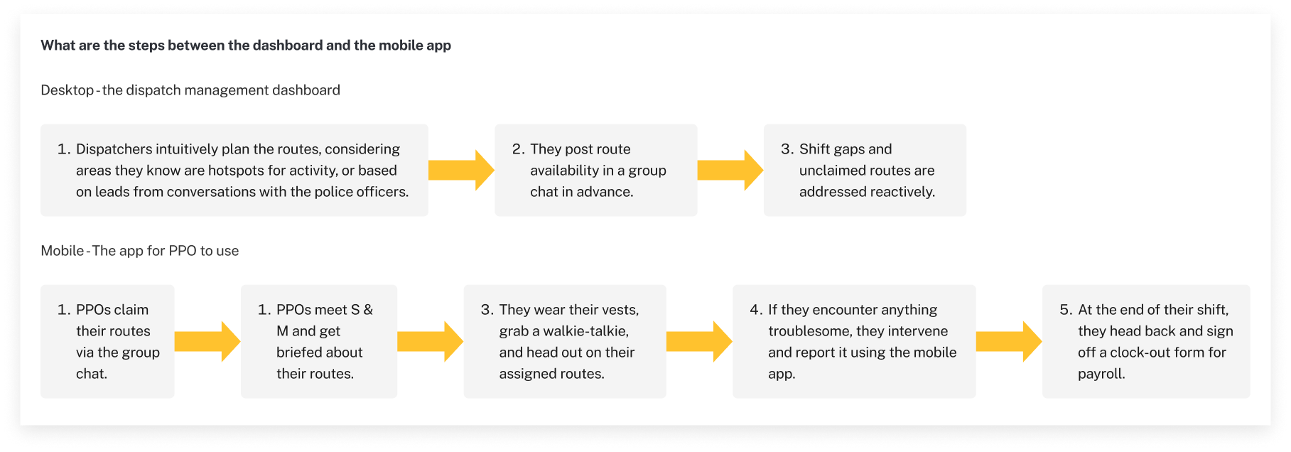
The full loop: plan on desktop, act on mobile.
The desktop-to-mobile handoff flow: dispatchers plan routes on desktop, considering hotspot areas and operational leads. PPOs receive assignments, meet supervisors, grab gear, head out. If they encounter anything on-route, they intervene and report via the mobile app - which closes the loop back to the desktop dashboard.
Chapter 02 of 02 · Final Solution
Final Solution
A mobile experience built for PPOs in the field and a desktop dashboard built for dispatchers planning coverage - sharing the same data model, with platform-specific interaction patterns throughout.
Final Solution
Login to close-out, without breaking focus.
Login to Home dashboard with pinned announcements (heat advisories, closures, construction, local events), to Reports workspace (Unclaimed / In Progress / Resolved tabs), to individual report flows for claim, assign, edit, update, and close-out, to Routes tab for viewing assigned shifts, to Messages for admin-PPO communication.
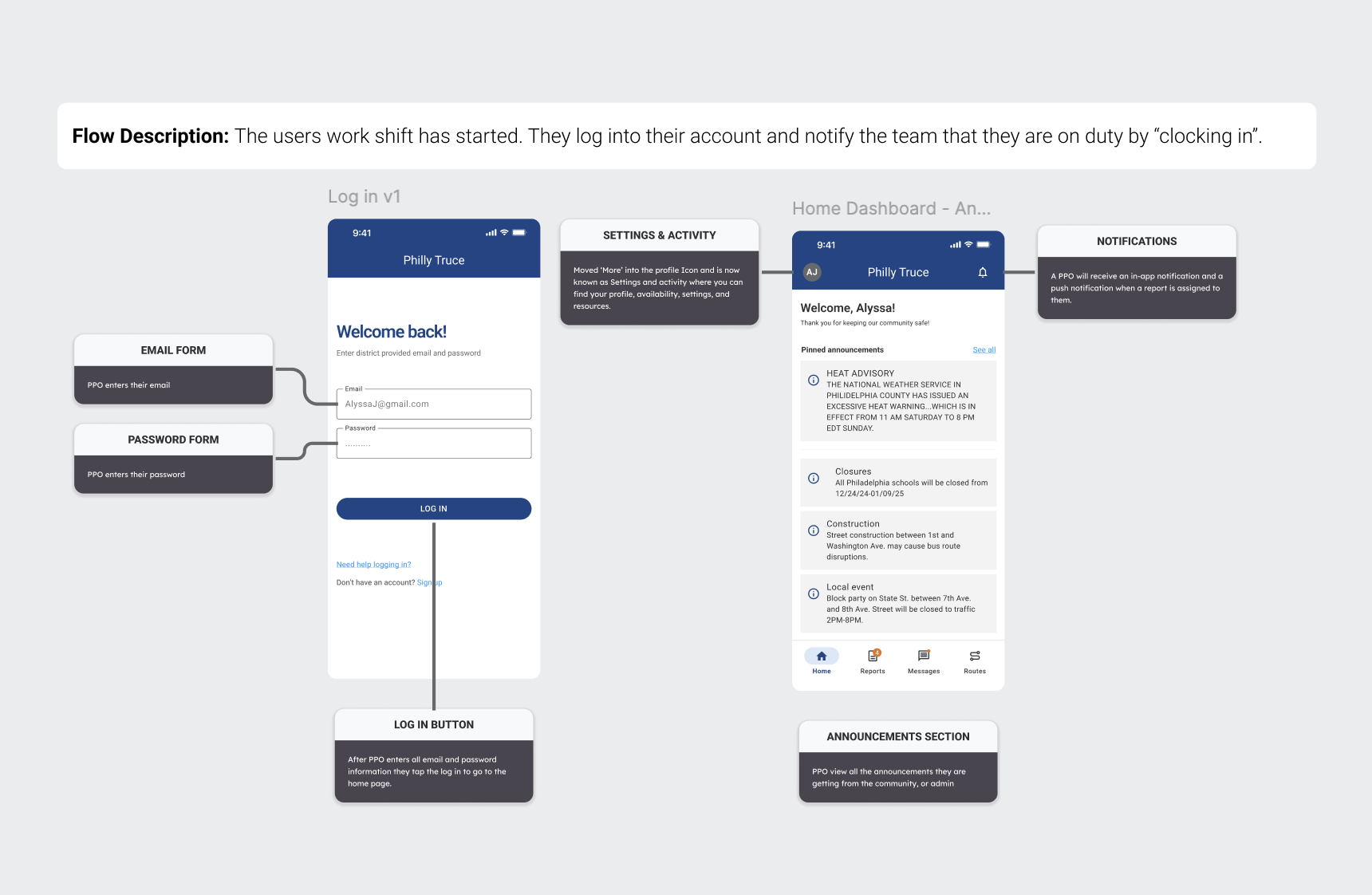
Login and home dashboard with engineering annotations: email/password forms, announcements section, bottom navigation, and notification behavior.
Scheduling as the primary surface.
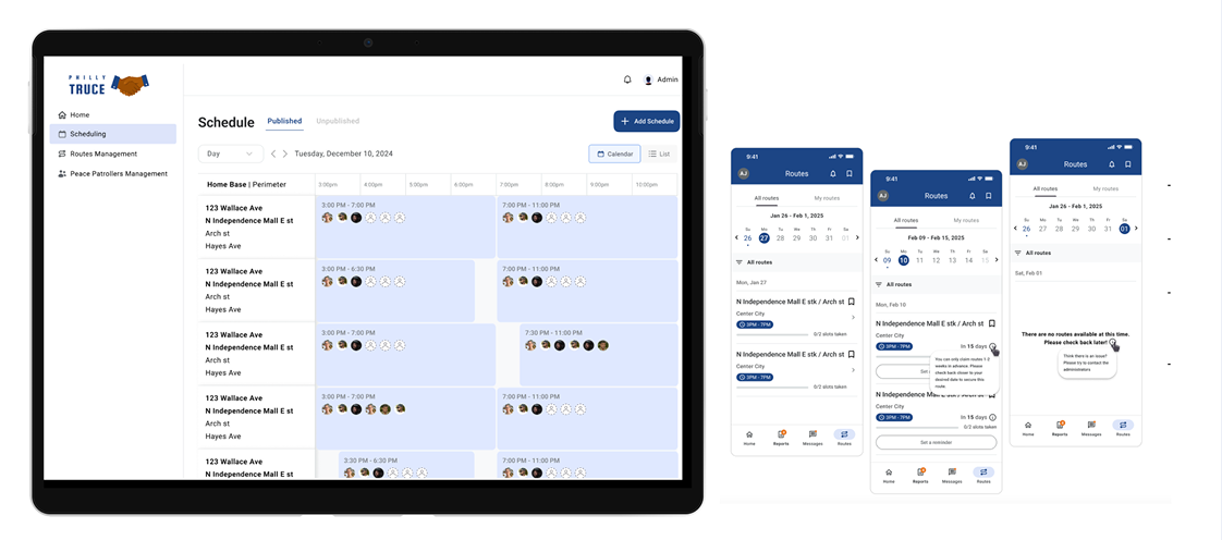
Sidebar: Home · Scheduling · Routes Management · Peace Patrollers Management. Scheduling is the primary surface for dispatchers. Published vs Unpublished tabs. Day / Week toggle. Calendar and List views. Add Schedule CTA top-right. Home Base | Perimeter organizes the left column. Each schedule cell shows route, time range, and assigned PPO avatars.
Final dispatcher scheduling dashboard: color-coded shifts, Home Base | Perimeter left-column hierarchy.
Full system in context: desktop dispatcher dashboard alongside PPO mobile Routes view.
Outcomes
What Phase 4 shipped.
Shipped in Phase 4: Mobile report lifecycle (Unclaimed to In Progress to Resolved) across four creation paths and three resolution paths · Desktop scheduling dashboard with Calendar and List views, Published/Unpublished states, and Home Base | Perimeter organization · Admin-assign and PPO-claim flows with shared data models · Route management foundation · Component libraries for both platforms · Engineering handoff annotations on every shipped screen.
Qualitative: Dispatchers validated the Home Base | Perimeter organization as matching their operational mental model. The V1 to V2.3 scheduling consolidation was cited as the change that made daily schedule editing reliable.
This was a pro-bono volunteer engagement. I don't have conversion-lift metrics or six-month retention data - that belongs to later phases. What Phase 4 delivered is a shipped mobile + desktop system, a documented design language, and a handoff package the next volunteer team can build on.
What Didn't Ship
Every cut has a written rationale.
Each has a written spec in the Phase 5 handoff package.
Reflections
Four things that shaped how I work now.
Scope is a promise, not a document. Every feature I cut got a written rationale and a handoff spec for the next phase. That discipline is the difference between scope that scales an organization and scope that abandons it.
Design around the real operational vocabulary. The Home Base | Perimeter structure works because it's how Philly Truce's leads already talk. Organizing the UI around user mental models - not our abstraction layer - was the single biggest accelerator to stakeholder sign-off.
Safety-sensitive design means fewer features, not more. Live location tracking was the most requested feature and the most dangerous for the actual users. Cutting it was the highest-leverage design call of the project. A worse version shipped on time would have been ignored or, worse, used against the PPOs it was meant to serve.
When a flow takes three screens, try one. The V1 to V2.3 scheduling consolidation wasn't innovation. It was the result of watching dispatchers flip between edit pages and accepting that three surfaces was a design failure, not a feature.
Credits