Retail campaign · Art direction & design system
Your Next Move
Decathlon's end-of-season promotion runs flat 25% off sitewide: no code, no threshold, the reduction already on the shelf price. I art-directed the campaign end to end and built the master artwork: the campaign lockup, the sale homepage, a three-send email flight, a social toolkit, the standard display kit and six animated units across three motion concepts. One graphic system underneath all of it, so the sale reads as Decathlon at 1440px and at 160px.
Role
Art direction, design system, master artwork and adaptations, front-end build
Deliverables
Sale homepage · 3-send email flight · 9 social formats · 4 IAB display units · 6 animated units
Disciplines
Campaign design, editorial typography, e-commerce merchandising, motion, HTML/CSS
Context
Concept project · Decathlon is not a client
01, The brief
- Client
- Decathlon India: 70 sports, 10,000+ SKUs, a brand positioned on accessibility rather than aspiration.
- Objective
- Drive traffic and conversion across a 48-hour sitewide promotion, and land it as a Decathlon campaign rather than generic seasonal sale furniture.
- Audience
- Everyday sportspeople and families. Price-aware, mobile-first, shopping across categories rather than committing to one.
- The mechanic
- Flat 25% off every product. No code, no minimum, no tiering: the discount is applied to the price shown.
- Deliverables
- Sale homepage at desktop and mobile, a three-send email flight, a social toolkit for feed, carousel and stories, the four standard IAB display units, and animated versions of the display and email hero.
- Mandatories
- Decathlon blue and the master logo lockup. Reduced-first price architecture with the was-price struck through. Warranty, returns and delivery reassurance present on every surface.
- Constraints
- Product cutouts supplied at 300×300. No new photography: library crops only. Type restricted to Roboto Condensed, the licensed brand family.
- Success criteria
- A campaign that survives every resize down to 160×600, and a mechanic a shopper can read in under three seconds.
02, The idea
A discount is not an idea
Every retailer discounts in the same week, at the same depth, in the same red. Lead with the number and you are competing on a field where Decathlon has no advantage. So I moved the number off centre and put the shopper's intent in its place, Your Next Move: the sale as the moment you finally buy the running shoes. The offer still carries, it just carries in the brand's voice.
Everything else in the campaign is an adaptation of the master lockup below. I resolved it once, at 1080×1080, and every other format is a resize of the same four elements in a fixed hierarchy.
Master lockup
1080 × 1080 · every other format resizes from thisMaster lockupOpen ↗
Three words, three lines. Setting "Your / Next / Move" at 0.84 leading turns a sentence into a mass. It holds its silhouette at 150px on the lockup and at 38px in a skyscraper, which is what makes the resizes recognisable rather than merely consistent.
Campaign line above, offer below. I set the hierarchy in that order deliberately. Inverted, the composition reads as a coupon: the price becomes the brand, and the equity built by the line is spent for nothing.
The image is cut, not framed. A 16% diagonal clip lets the photography collide with the type field instead of sitting in a panel beside it, and the product cutout crosses that seam so the two halves interlock.
Red is rationed to urgency. The only red on the master is the countdown chip. Holding the line on that is what lets the final email go full red and actually mean something.
03, The system
Guardrails, not guesswork
Six colours with a job each, two typographic voices, three angles and one rule about corners. I keep campaign systems this tight on purpose: a toolkit an in-house team can extend without a design review on every asset.
Colour, with permissions attached
Blue is the ground, yellow is the offer, red is the clock. Ink carries the reassurance layer (warranty, returns, delivery) so trust messaging never competes with promotion for the same attention.
Type: Roboto Condensed, two voices
Italic uppercase speaks campaign; upright uppercase states fact. Headlines lean, prices and specifications stand straight. Tracking opens as the size drops (negative at display sizes, up to 2.8px on utility labels) so the condensed cut stays readable at 10px.
The angle system
Zero radius, no exceptions. Square corners against consistent skews are what keep a promotional page reading as sports equipment rather than as a coupon site.
04, The work
Homepage
The landing surface, and the only one where the whole campaign has to hold together at once: hero, category entry points, merchandised product row, budget doors, editorial moment, urgency band. I resolved it at 1440 and then re-composed it for mobile rather than reflowing it: headline steps 122→56px, gutters 72→20px, and the six-sport strip becomes a snap scroller that keeps its parallelogram crop.
Open the live build ↗Sale homepage
Live build · the full page, and the top 2,400px to scrollDesktop · 1440Open ↗
Full pageTop to footer
Mobile · 390Scroll
Mobile is a re-composition, not a squeeze. The hero photograph moves beneath the type instead of behind it, the six-sport strip becomes a snap scroller that keeps its parallelogram crop, the product row goes feature-then-grid, and the headline steps 122px down to 56px. Gutters collapse 72 → 20px.
The page is a merchandising sequence. Campaign moment, reassurance strip, category entry, hero deal, budget doors, editorial, urgency, sale index. Each band answers the question the one above it raises, which is why the full-length view reads as one argument rather than a stack of modules.
Four decisions on the page
Detail crops at 1440Hero · the campaign moment
The type field owns the left 48%. Photography clips in behind it and the cutout crosses the seam, so the composition locks rather than splits. The offer slab sits on the baseline of the headline block, not floated below it.
Six sports · category entry
Every tile is a parallelogram. Cut at 13/87%, the six read as one moving band. Six is the ceiling at this width: a seventh drops the sport name below legible size, which is a merchandising loss, not a layout one.
Best of the sale · merchandising
One hero deal, four supporting. The 604px feature panel takes the brand blue and the yellow price slab; the satellite tiles sit on grey. The eye lands on the deal, then browses: the standard retail ladder, built into the layout rather than left to the feed.
Urgency band
The only full-red moment on the page. Placed after the product and editorial sections, so urgency arrives once the shopper already has something in mind. Leading with it converts worse and cheapens the brand field above.
Email flight
A flat promotion generates no new news on day two, so I sequenced the flight on urgency rather than on offer: land the line, answer "what should I buy", then start the clock. Hand-built at 600px on nested tables with inline styles, live text headlines with an Arial fallback, hidden preheaders carrying the mechanic, and a single-column stack below 600px.
Three sends across 48 hours
600px · scroll inside the framesSequenced, not repeated
Send one carries the campaign line and a single hero deal. Send two is a merchandising email: eight picks and three budget doors for the shopper who needs to be told what to buy. Send three drops the brand field entirely and runs on the clock.
Built for inboxes
Tables, bgcolor attributes, inline styles, one hidden preheader per send. The headline is live HTML type, so the offer still lands with images blocked: the state a meaningful share of a promotional list will actually see.
One primary action
Each send holds a single primary CTA above the fold and repeats it once at the foot. Category and budget rows are secondary paths, styled as links rather than buttons so the hierarchy stays unambiguous.
Social toolkit
Feed does the announcing, carousel does the browsing, stories do the clicking. Nine artboards off one master: same skew, same slab, same two-line hierarchy, so three exposures in a week read as one campaign rather than three ads.
Feed
4 posts · 1080 × 1080Master lockup
Deal of the day
Category
The mechanic
Carousel & stories
3 frames · 2 verticals, 1080 × 19201 / 3
2 / 3
Story · Launch
Story · Countdown
3 / 3
The mechanic earns its own post. "No code. No minimum. Just 25% off." is the only artboard with no photography and no product. The yellow ground makes the sale's one genuine point of difference the whole image: the asset I would put paid budget behind.
The carousel is a funnel. Frame one states the promise, frame two offers three sports to choose from, frame three converts on price bands, and each frame still stands alone, because most people never swipe.
Stories are composed around the sticker. Type sits inside the middle band, clear of the profile row and the CTA zone. The swipe-up block is drawn into the artboard so the composition is judged with it in place.
Display kit
Display is where a campaign system either survives or falls apart. At 160×600 there is room for the lockup, three words, the offer and a button, so I fixed the drop order in advance (lede, then item count, then countdown) and every unit resolves from the same master rather than being redrawn.
Standard IAB units
Rendered 1:1: no scaling300 × 250MPU
160 × 600Skyscraper
728 × 90Leaderboard
970 × 250Billboard
Deciding the drop order is the whole job. Fixed in advance, the small units are deliberate compositions; decided ad hoc, they become compressed versions of the big ones. The lockup, three words, the offer and the button survive to every size.
Motion
Six animated units built on three concepts rather than one loop applied six times. Each concept exists for a placement: a wipe that earns the campaign's own graphic device, kinetic type that stays sharp and light where weight matters, and a slow reveal for the surfaces where the reader has already stopped. Every unit is rendered from the same assets by script, 2× supersampled and quantised against one 256-colour palette with dithering off, and delivered at 2× for retina: the three things that decide whether a hand-rolled GIF looks sharp or soft.
00 · The film
8 seconds · 20 beats · the cut every other unit is trimmed from16 : 9 · loops seamlesslySound is off by default: turn it on inside the frame
One rule, twenty beats
The −14° skew is the only transition in the film. Nothing dissolves: a skewed slab either rips the frame away or slams a panel in, so every cut is the campaign's own graphic device rather than an effect borrowed from a template. Beats land every 0.4s, which is what makes it read as advertising instead of as a slideshow.
Locked to the track, not to a timer
The whole film is one 8.016-second clock: every layer animates across the full duration on percentage keyframes rather than chaining delays. That length is the audio bed's exact length, so picture and sound stay frame-locked across every loop, and any beat can be retimed by moving one percentage.
Built in the browser, not exported
Type, colour and product cut-outs are live DOM, so it is resolution-independent, re-cuts to 9:16 or 1:1 by changing one aspect ratio, and copy changes are a text edit rather than a re-render. The GIF units below are the same three concepts cut down to placement weights.
01 · Sweep
The −14° line is the transition: three states, two wipes
300 × 2504.8s · ×3 loops
Square · 600Loops
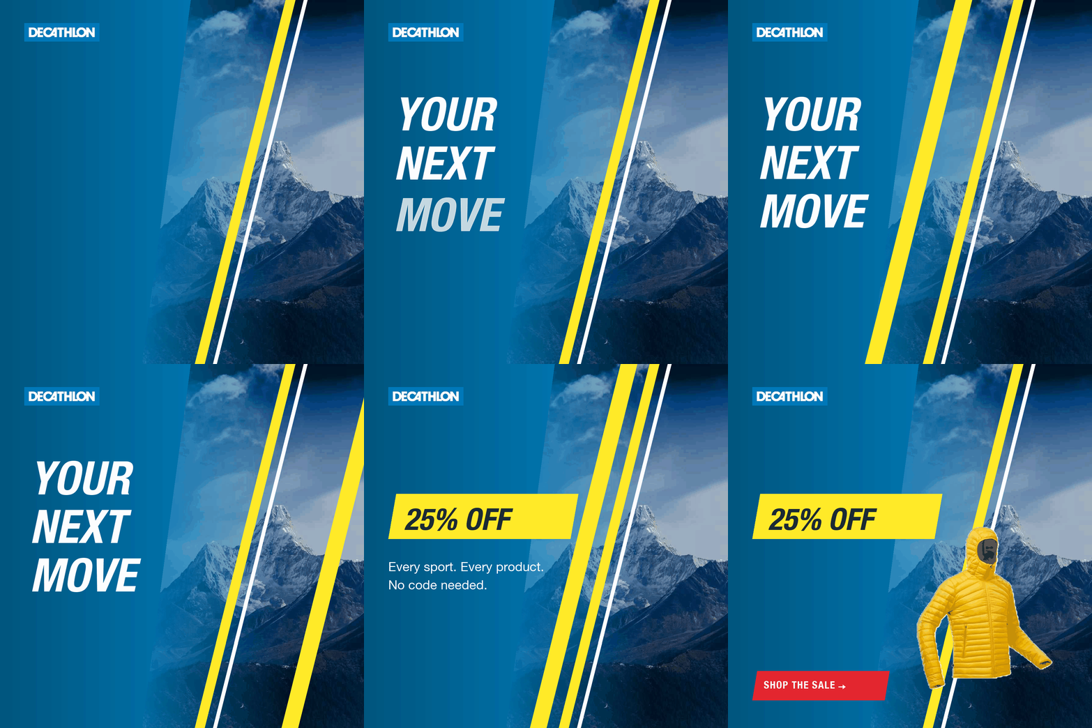
The wipe is the campaign line, doing work. A skewed yellow bar crosses the frame and the composition behind it has changed: headline, then offer, then product and CTA. It replaces a dissolve with the brand's own device, and gives three full states inside five seconds.
02 · Count
Kinetic type on flat colour: 0 to 25 as the slab grows
728 × 9045 KB at 1× · ×3 loops
Square · 600Loops
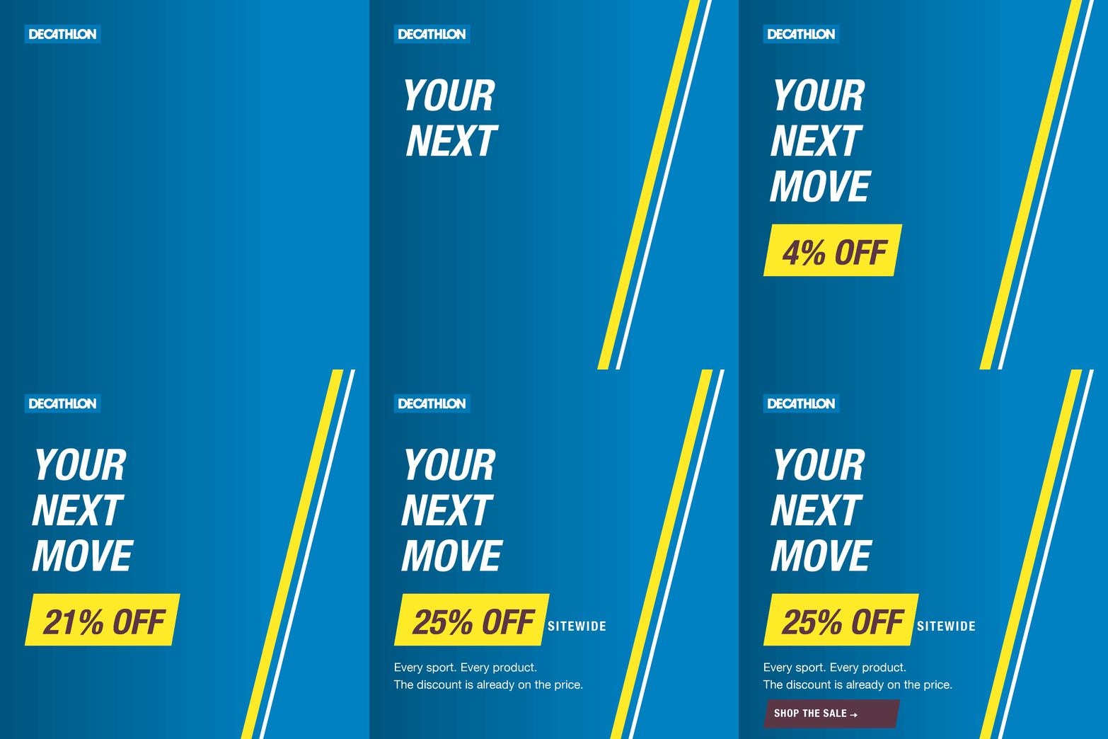
No photography, on purpose. The discount counts 0 → 25 while the slab grows to meet it, and the headline words snap in on a slight overshoot. Flat colour quantises to 32 shades with no dithering, which is why the leaderboard lands at 45 KB against half a megabyte for the photographic cuts. It is the version I would put into a weight-capped placement.
03 · Reveal
Slow push-in, product rising, type settling
160 × 6004.9s · ×3 loops

Email hero · 600 × 300Loops
Email motion has to be GIF. No client runs CSS animation reliably, so the hero animates as an image with the CTA left as live HTML underneath: clickable, trackable, still readable with images blocked. The plate is held static and only the elements move: identical background pixels are what keep the file inside a defensible send weight.
Drawn at 2×, shown at half
Every unit is rendered at twice its nominal size and placed at half, so it lands pixel-for-pixel on a retina screen instead of being upscaled into softness. Frames are quantised against one 256-colour global palette with dithering off, which keeps flat brand colour clean and type edges hard.
Delta frames, not full ones
Each frame writes only the region that changed. That is the difference between a 7 MB file and 45 KB on the leaderboard, and it is what makes a photographic 300×250 viable at 86 KB.
Timed to the standard
Display units run under five seconds and loop three times, inside the IAB 15-second ceiling, holding the end card 1.4s on lockup, offer and button. Social cuts loop continuously; production display would ship as HTML5 with these as fallback, and feed platforms take MP4.