
WHAT IS PHILLY TRUCE?
Philly Truce is a grassroots organization preventing violence by empowering community members to become trained peacekeepers.
At the heart of their mission is the Peace Patrol—a team of justice-impacted men who walk the streets, respond to conflict, and restore peace where it's needed most. They focus on de-escalation, presence, and connection before violence can occur.
“We believe the people closest to the problem are closest to the solution.”
— Philly Truce ( www.phillytruce.com )
This case study focuses on improving the digital tools that support these peacekeeping efforts—through UX research on both mobile and desktop platforms.

SPECIFICATIONS
Project Overview
Philly Truce’s mobile app plays a critical role in empowering Peace Patrollers (PPOs) to report and manage incidents. However, usability challenges in navigation, reporting workflows, and chatbot interactions made it difficult for PPOs to efficiently log, claim, and resolve incidents.
As part of the UX Research Mobile Team, our mission was to identify key friction points, validate usability, and refine interactions for a seamless mobile experience. We focused on:
Improving the incident reporting and resolution process.
Ensuring the chatbot effectively supports Peace Patrollers.
Enhancing overall usability through heuristic evaluation and testing.
As a Team Lead for Philly truce :
Defined usability test plans for the incident reporting flow and chatbot.
Conducted user testing sessions with Peace Patrollers.
Analyzed mobile interactions & pain points for better usability.
Led heuristic evaluations to assess chatbot effectiveness.
Synthesized findings into actionable recommendations for mobile design improvements.
Team :
Elakkiya
Oana Ozuna
Jovana Dubljevic
Jinyan
Timeline :
3 Months
USABILITY TESTING
Observing real user challenges
Usability Testing Goals


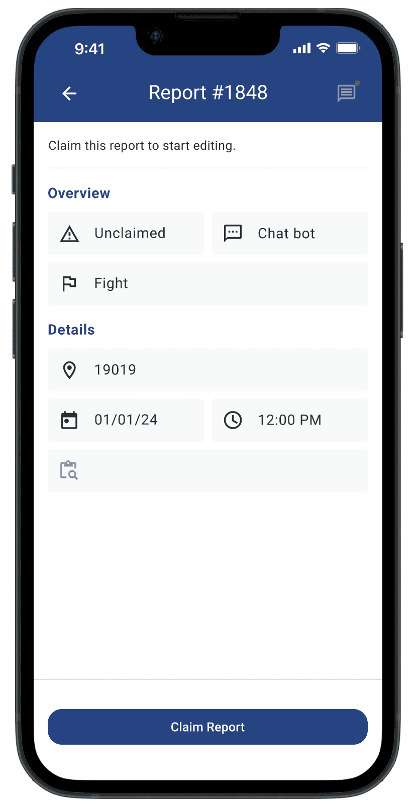
Tab Navigation – Are users able to navigate between “Unclaimed,” “In Progress,” and “Resolved” reports?
Report Workflow – Can users create, edit, and resolve reports easily?
Claiming & Updating Reports – Do users understand how to take action?
Testing Platform
To validate our design choices and gather user insights, we conducted remote usability testing using Maze. The platform allowed us to track user interactions, measure task success rates, and identify areas of confusion. This helped us refine navigation, improve workflows, and ensure a smoother user experience for PPOs.

Usability Testing Insights
Reports were placed in "Unclaimed" instead of "In Progress"
Confusion:
Users thought submitted reports should move to “In Progress.”
Fix:
Adjust logic to match user expectations.
Claimed reports lacked attribution
Confusion:
PPOs couldn’t tell who claimed a report.
Fix:
Show assigned PPO names for transparency.
Users struggled with location-based reporting
Confusion:
Not everyone knew their exact location.
Fix:
Add GPS-based location suggestions.
Too many steps when claiming reports
Confusion:
PPOs expected reports to open immediately.
Fix:
Reduce steps after claiming a report.
CHATBOT EVALUATION
Does it really help our users ?
Peace Patrol Focus Areas & Chatbot Purpose
Where Peace Patrol Operates
Peace patrol operates in 16 ZIP codes based on crime data
Particularly blocks with 10+ shootings in recent history (IE. every 2,000 days)
Data Sources: District Attorney’s office and Police reports
Who uses the chatbot? (Target Audience)
Users between 12-30 years old in low income Black & Latino communities
More women expected to use it
Concerned community members looking to de- escalate conflicts
Why Peace Patrol Operates
Philadelphia crime rates exceed national
averages (9.90 violent crimes & 51.06
property crimes per 1,000 residents)
Chatbot Purpose:
Safe & anonymous way to report potential violence
Instant response, even if peace patrollers are unavailable
Prevents retaliation by making conflicts "known", reducing escalation risks.
The chatbot was meant to guide users through conflict reporting and resolution, but early testing suggested it was confusing.
Testing the Chatbot: Two Approaches
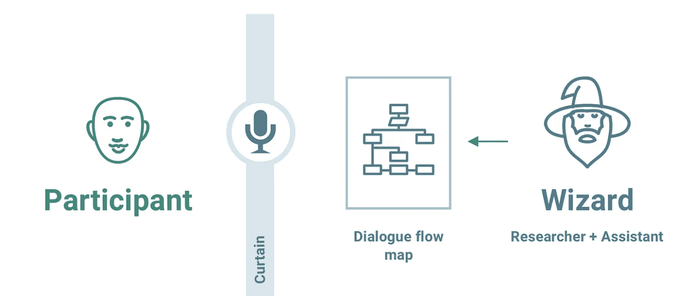
Wizard of Oz Testing (Manual Simulation)
We manually responded as the chatbot to refine conversation flow.
Adjustments were made based on how users expected it to behave.

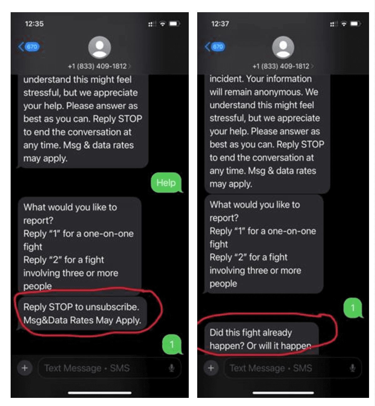
Live Implementation Testing
We tested the real chatbot deployed on Twilio to assess its usability.
Faced participation challenges due to unclear user profiles and engagement issues.
What we discovered about the Chatbot
Users struggled with unclear commands and no undo option for responses.
"IDK" abbreviation confused older users—needed to be "I don’t know" or "Unsure."
Some messages appeared out of order, making interactions feel disjointed.
No easy way to exit the chatbot or revisit previous responses.

HEURISTIC EVALUATION
Identifying UX Gaps
Why Did we Pivot from Moderated Usability Testing to Heuristic Evaluation?
Identifying Usability Issues Early – Heuristic evaluation helps identify critical usability flaws early, allowing us to address major issues and improve the chatbot . Before further testing.
Laying the Foundation for Future Testing – By refining the chatbot's usability first, future testing can focus on how well it meets the needs and expectations of target users rather than addressing basic functionality, leading to more meaningful user insights.
Feasibility and Efficiency – Inviting expert evaluators within Tech Fleet is more practical and efficient than recruiting participants from a niche target user group for moderated usability testing, making this approach more feasible at this stage
Heuristic Evaluation Results and Recommendations
Visibility of System Status - Violated
Users don’t know how far along they’re on the reporting process.
Recommendations for Content and Dev team
Let the users know when they’re halfway through the reporting process.
Match Between System and the Real World - Violated

Issue:
The abbreviation "IDK" (short for "I don’t know") may not be universally recognized.
Older users or those unfamiliar with internet slang may take longer to understand its meaning.
Recommendation for the Content team:
Replace "IDK" with more straightforward language like "I don’t know" or "Unsure" to ensure clarity for all users.
Avoid acronyms in chatbot responses to accommodate diverse audiences.
Consistency and Standards - Violated
Issues
Messages sometimes appear in an inconsistent order.
Recommendation to the Dev team:
Display the messages in a consistent order.

Recognition Rather than Recall - Passed 50% Failed 50%
Passes Heuristic:
Error messages restate the relevant question and response options, ensuring clarity.
Fails Heuristic:
Command to exit from the conversation “STOP” is displayed only once at the beginning of the conversation, which leads to users remembering and recalling the command to end the conversation
Recommendation:
Re-display "STOP" instructions to remind users they can end the conversation whenever
Limit "STOP" reminders to once every 3 messages to maintain a clean and natural flow.
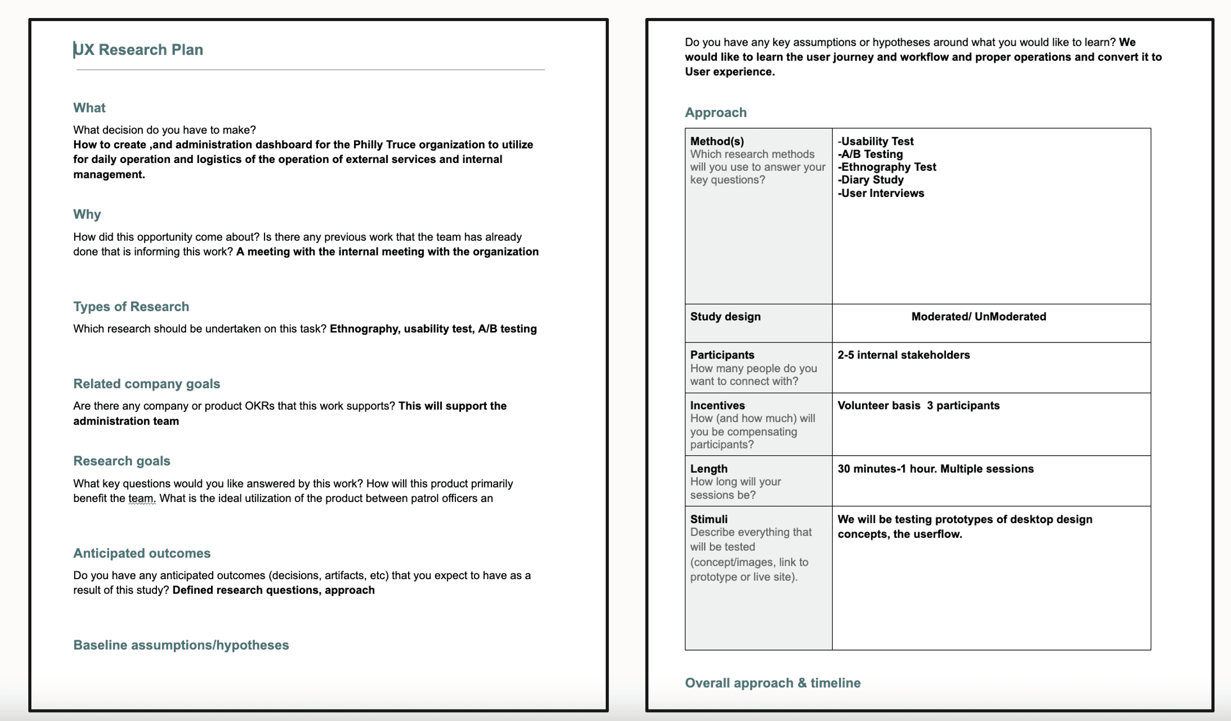
SPECIFICATIONS
Project Overview
Philly Truce is a violence prevention initiative that connects Peace Patrol Officers (PPOs) and community leaders to prevent conflicts and maintain safe neighborhood routes. However, the desktop experience lacked usability, making it difficult for administrators to assign patrols, track routes, and manage scheduling efficiently.
As part of the UX Research Desktop Team, our mission was to identify pain points, test new design iterations, and propose research-backed improvements to create a streamlined and user-friendly experience for administrators and PPOs.
As a Team Lead for Philly truce :
Conducted a stakeholder interview to understand project needs.
Developed user personas for administrators and PPOs.
Created journey maps to uncover workflow inefficiencies.
Performed a competitive analysis to benchmark best practices.
Led usability testing & A/B testing to validate proposed solutions.
Synthesized findings into actionable recommendations for the UX design team.
Team :
Anam Nasim
Keyarow
Jacob Capaldo
Helen K
Timeline :
3 Months
USER RESEARCH
Understanding User needs
Stakeholder Interview Insights
To align with business goals and operational needs, we interviewed Eddie, a key stakeholder, who provided insights into workflow inefficiencies.
Key insights from the interview:
Route assignments are manual, leading to inefficiencies.
Admins lack real-time tracking tools for route coverage and patrol shifts.
The current scheduling system is disorganized, often relying on group chats.
A job board-style interface would allow PPOs to claim shifts independently.
Admins need automated PPO hour tracking for payroll reporting.
User Persona

Key Responsibilities:
Route Management: Plans and assigns patrol routes manually, often using group chats.
Resource Allocation: Deploys PPOs based on incoming tips and handles real-time adjustments.
Payroll Tracking: Tracks hours manually and ensures timely payments.
Reporting: Monitors program efficiency and prepares insights for future planning.
Goals:
Automate scheduling and payroll processes.
Enable real-time coverage of high-priority areas with alerts and updates.
Scale operations to support more neighborhoods and volunteers.
Use data to optimize routes and response times.
Pain Points
Inefficient Systems: Relies on manual, paper-based processes prone to errors.
Limited Visibility: Struggles to track real-time patrol activity and PPO availability.
Workload: Balances multiple tasks with little operational support.
Data Tracking: Lacks historical data or analytics to guide decisions.
Journey Mapping

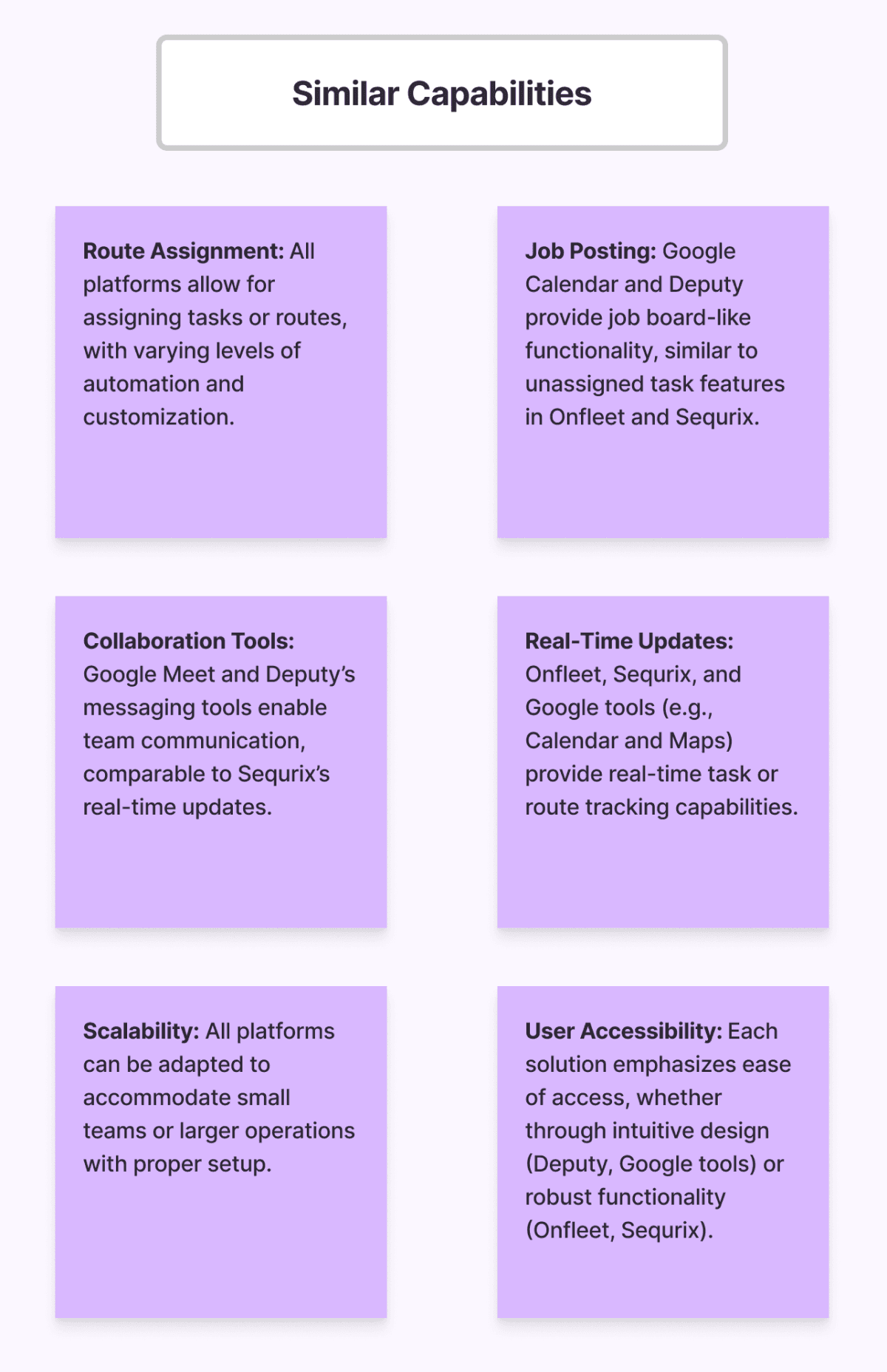
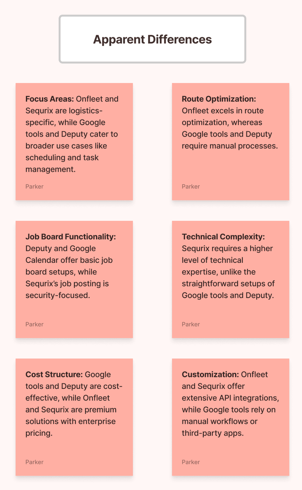
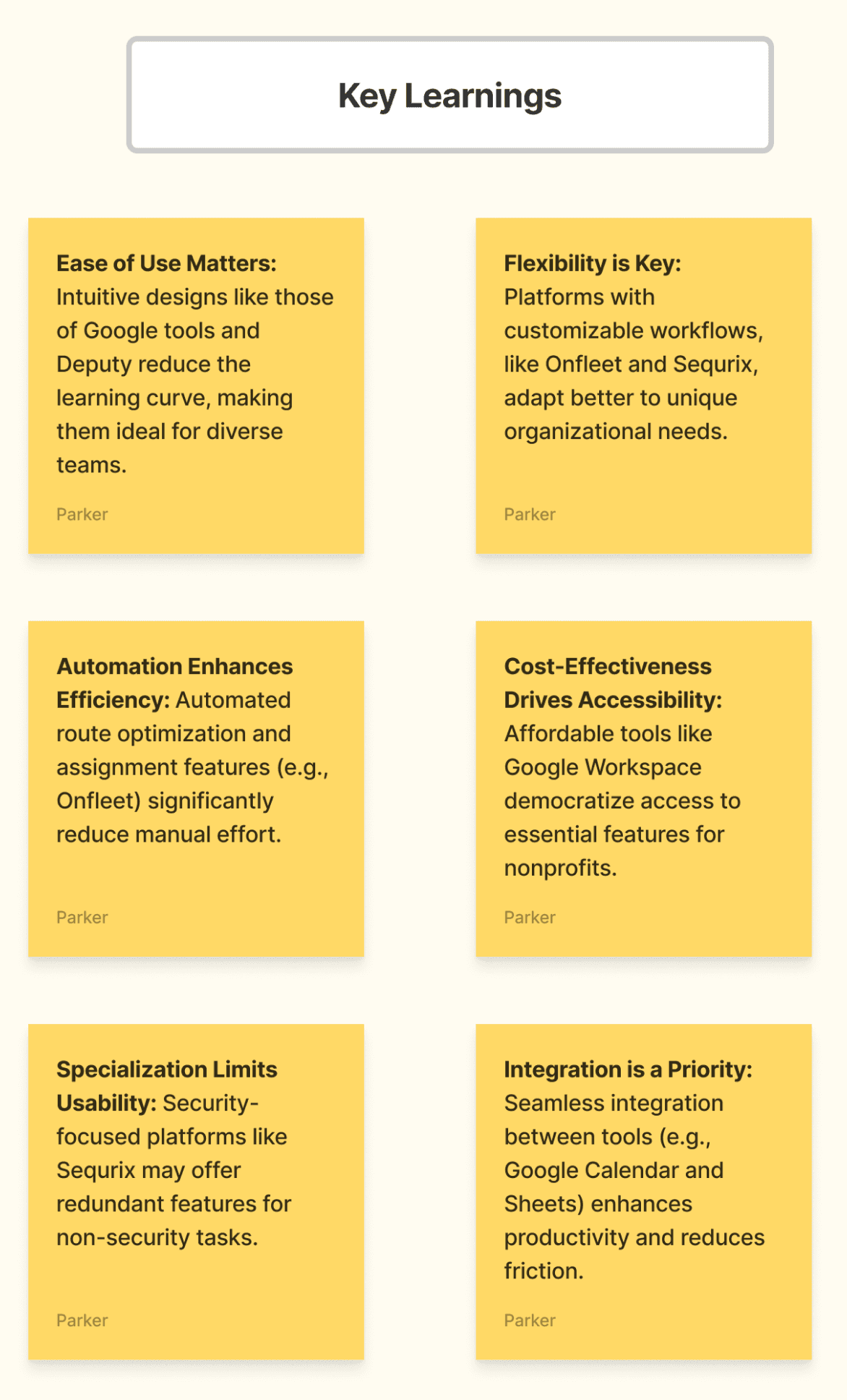
COMPETITIVE ANALYSIS
Learning from Industry Leaders


TESTING
Usability Testing & A/B Testing
Field study
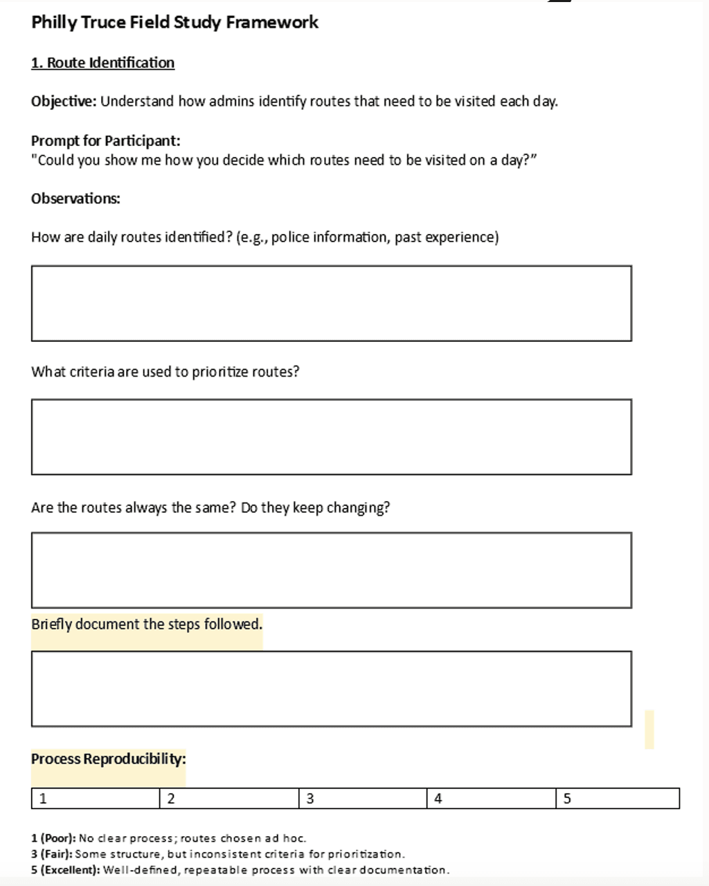
What is the Field Study?
A structured observation and interview process designed to understand how admins perform daily tasks.
Focused on workflows, tools, pain points, and decision- making.
How did we structure?
Question Prompts: Targeted questions to explore admin workflows and challenges.
Observation Points: Key tasks and behaviors to observe (e.g., route planning, payroll tracking).
Scenario Prompts: Hypothetical situations to uncover decision-making processes (e.g., handling last-minute shifts).
Reproducibility Assessment: Evaluating whether workflows are structured, consistent, and scalable.
Objectives
1. Assess the intuitiveness and functionality of key dashboard features, including navigation, data entry, and task execution.
2. Identify specific areas where users experience confusion, hesitation, or errors, particularly during key tasks like adding routes or managing Peace Patrol officers.
3. Collect actionable feedback on missing features or design gaps that could enhance user productivity and dashboard effectiveness.
4. Understand user preferences for features and workflow clarity.
Recommendations
Collaborate with UX Writers to improve clarity of labels, tooltips, and instructions across the platform.
Enhance Labeling & Context by clearly defining terms like “Route Management” and adding contextual help icons (e.g., ❓).
Streamline Notes Navigation with inline expansion and “Expand Full Notes” buttons for better readability.
Simplify Route Creation by using dropdowns and auto-filled data for landmarks, notes, and neighborhoods.
Introduce Progress Indicators in multi-step forms to guide users (where appropriate).
Improve Patroller Assignment with a dedicated flow using dropdowns or drag-and-drop interaction.
Clarify Search Functionality to ensure users can quickly find routes, officers, or reports via keyword input.
Let’s Connect
Feel free to reach out for collaboration or just say Hello, I am always excited to meet people who love design and innovation as much as I do!

Let’s Connect
Feel free to reach out for collaboration or just say Hello, I am always excited to meet people who love design and innovation as much as I do!