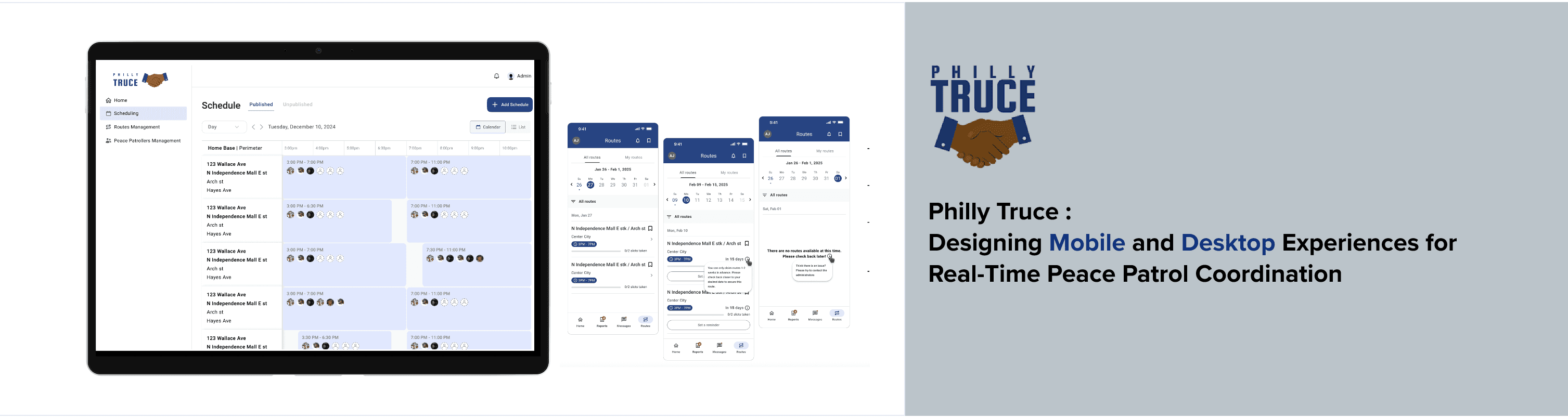
WHAT IS PHILLY TRUCE?
Philly Truce is a grassroots organization preventing violence by empowering community members to become trained peacekeepers.
At the heart of their mission is the Peace Patrol—a team of justice-impacted men who walk the streets, respond to conflict, and restore peace where it's needed most. They focus on de-escalation, presence, and connection before violence can occur.
“We believe the people closest to the problem are closest to the solution.”
— Philly Truce ( www.phillytruce.com )
This case study focuses on improving the digital tools that support these peacekeeping efforts—through UX research on both mobile and desktop platforms.

SPECIFICATIONS
Philly Truce’s desktop platform is the operational hub for administrators who manage Peace Patrol routes, assign patrollers, and oversee daily activity. However, the existing system lacked clarity, flexibility, and intuitive workflows—making it difficult for admins to track assignments, manage route details, and respond to real-time changes.
As part of the UX Design Desktop Team, our mission was to redesign the platform to be efficient, scalable, and user-friendly.
We focused on:
Streamlining scheduling and route assignment for admins.
Creating clear, consistent layouts for viewing and managing patrol activity.
Designing a scalable system that can grow with Philly Truce’s expanding needs.
Introducing visual patterns and components that make complex tasks intuitive and easy to execute.
As the Design Team Lead for the desktop platform, I was responsible for:
Leading weekly syncs with design, research, and strategy teams
Aligning with stakeholders on key admin use cases
Mapping core user flows (route assignment, scheduling, roster updates)
Running feedback sessions to refine wireframes
Translating real-world needs into intuitive design
Delivering a high-fidelity prototype for testing and handoff
Team :
Michelle Sudhakar
Jessica Teng
Youngjin Cho
Sharmeena Lalloo
Timeline :
3 Months
USER FLOW MAPPING
Making Sense of the Chaos
Before diving into screens, we clarified complex admin scenarios:
What happens when monitors drop out last-minute?
How should a new emergency route be added mid-day?
Should certain monitors see only high-priority routes?
This helped shape the logic of screens, permissions, and route assignments.
See User flow in Detail

LOW-FIDELITY WIREFRAMES
Sketching Flexible Layouts
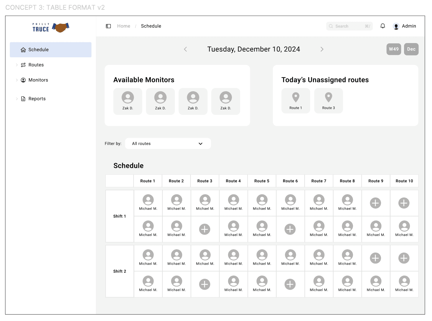
Create routes with defined start and end points, such as streets or neighborhoods.
Assign Peace Patrol officers to specific routes and scheduled shifts.
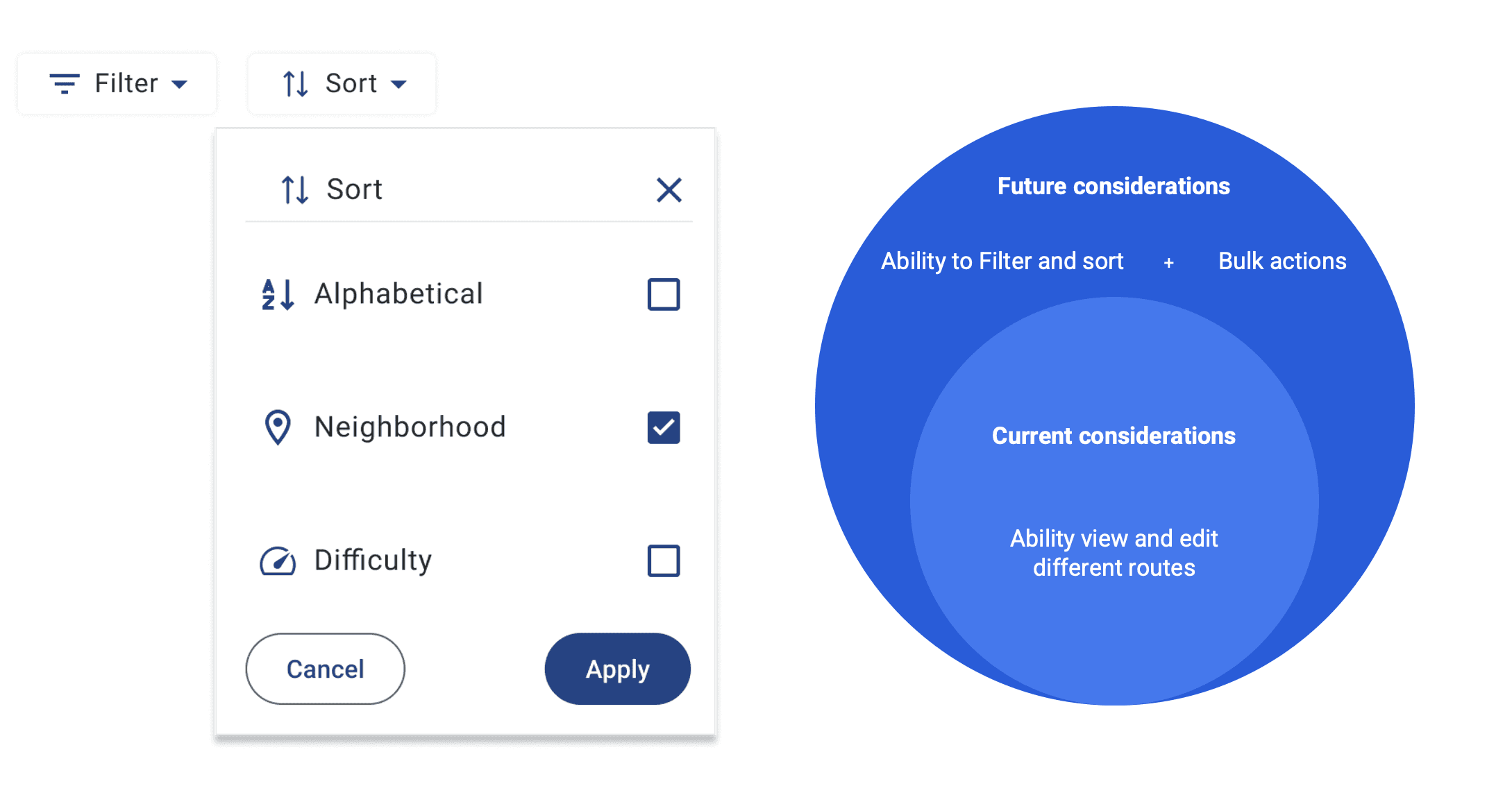
Prioritize routes manually or through automated hotspot tracking (planned for a future phase).


Team Based Design Evolution
We conducted a collaborative design review session where team members shared what they liked, what could be improved, and the rationale behind their feedback. After voting and synthesizing key insights, we iterated on the selected concept to create a refined, more aligned design direction.

Home Page Designs Calendar View


Narrowing the prospect and the challenges

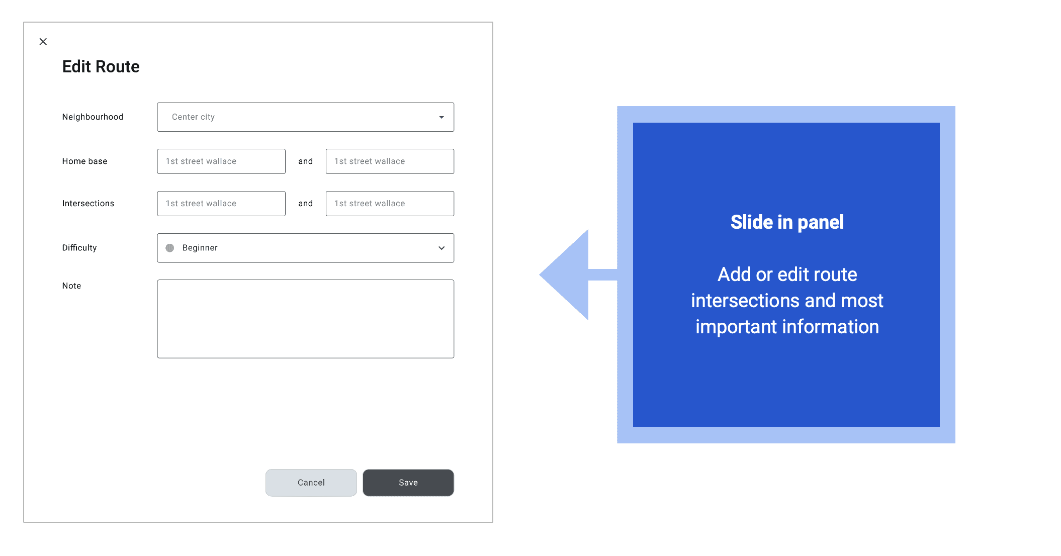
Adding and Editing Route Information
Designing for Multiple Routes
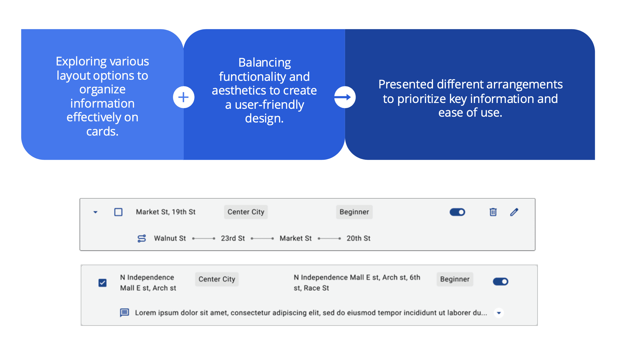
DESIGNING DATA-RICH CARDS
Balancing Visuals and Function
ITERATING FOR CLARITY
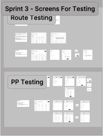
Preparing for User Testing
Last-Minute Edits, Late Nights, and Plenty of Coffee !!!!
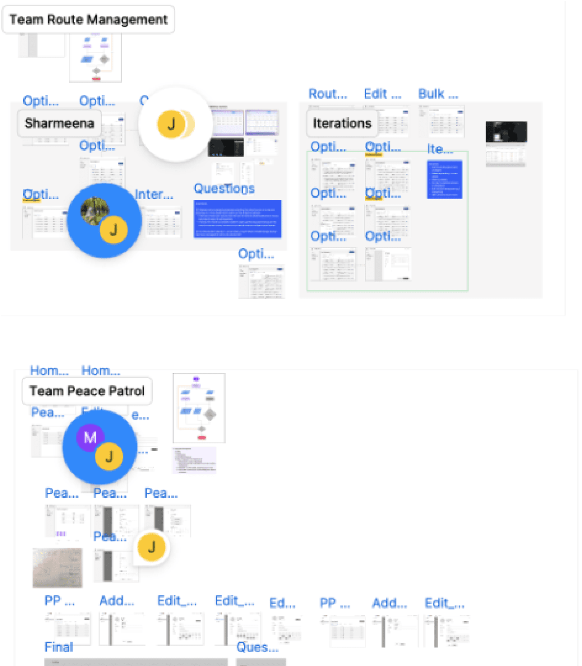
Team split into 2 groups for Route Management and Peace Patrol designs.
Team leads reviewed, aligned, and finalized designs for prototyping.
Refined the prototype up to the last few hours to meet standards for testing.
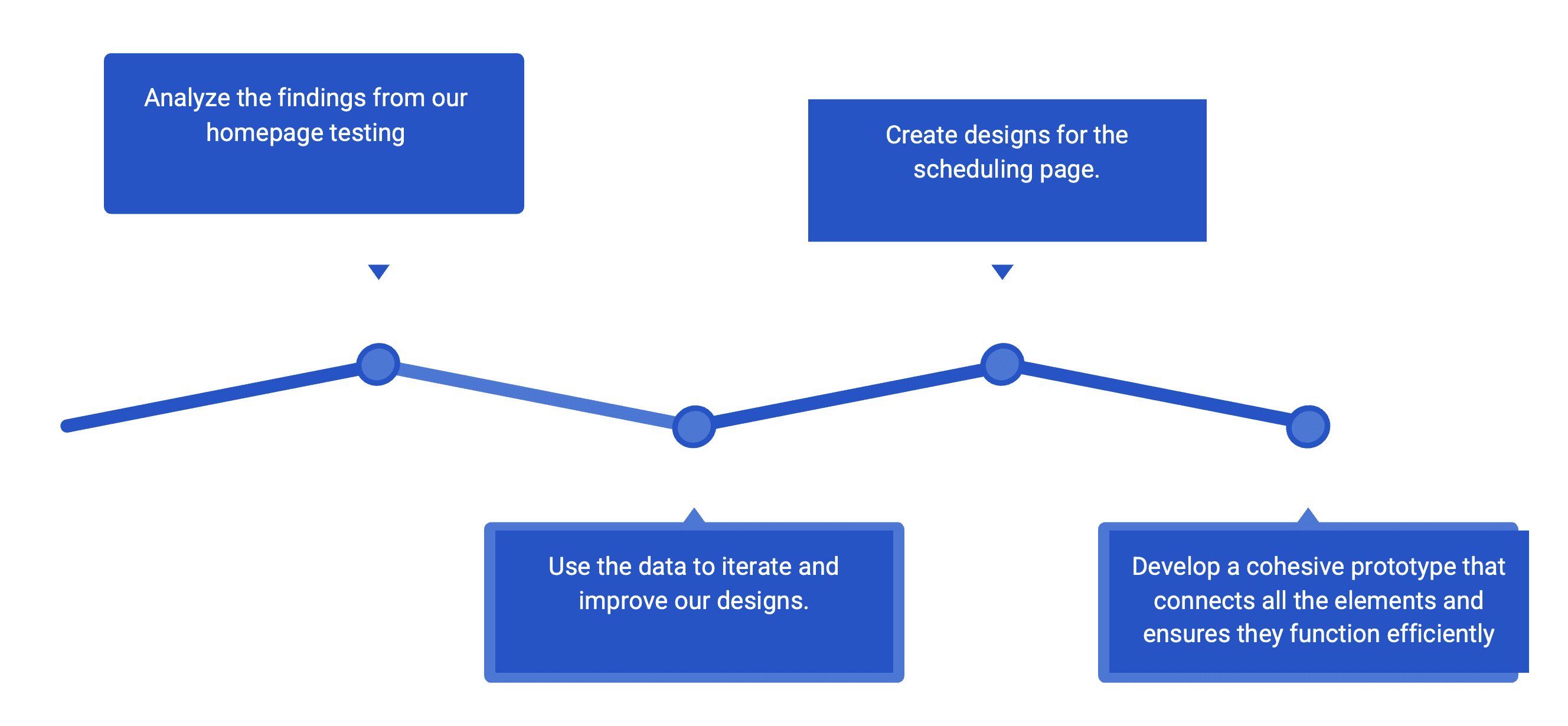
Next steps
What’s Next?

SPECIFICATIONS
Philly Truce’s mobile app is a vital tool for Peace Patrollers (PPOs) to report, track, and manage neighborhood incidents. But in its earlier state, the mobile experience lacked fluid workflows, consistent navigation, and intuitive guidance.
As the mobile design team, our goal was to redesign the experience for PPOs in the field—making it easier to create reports, view and claim routes, and complete their shifts confidently and efficiently.
We focused on:
Improving the incident report flow (IRMP)
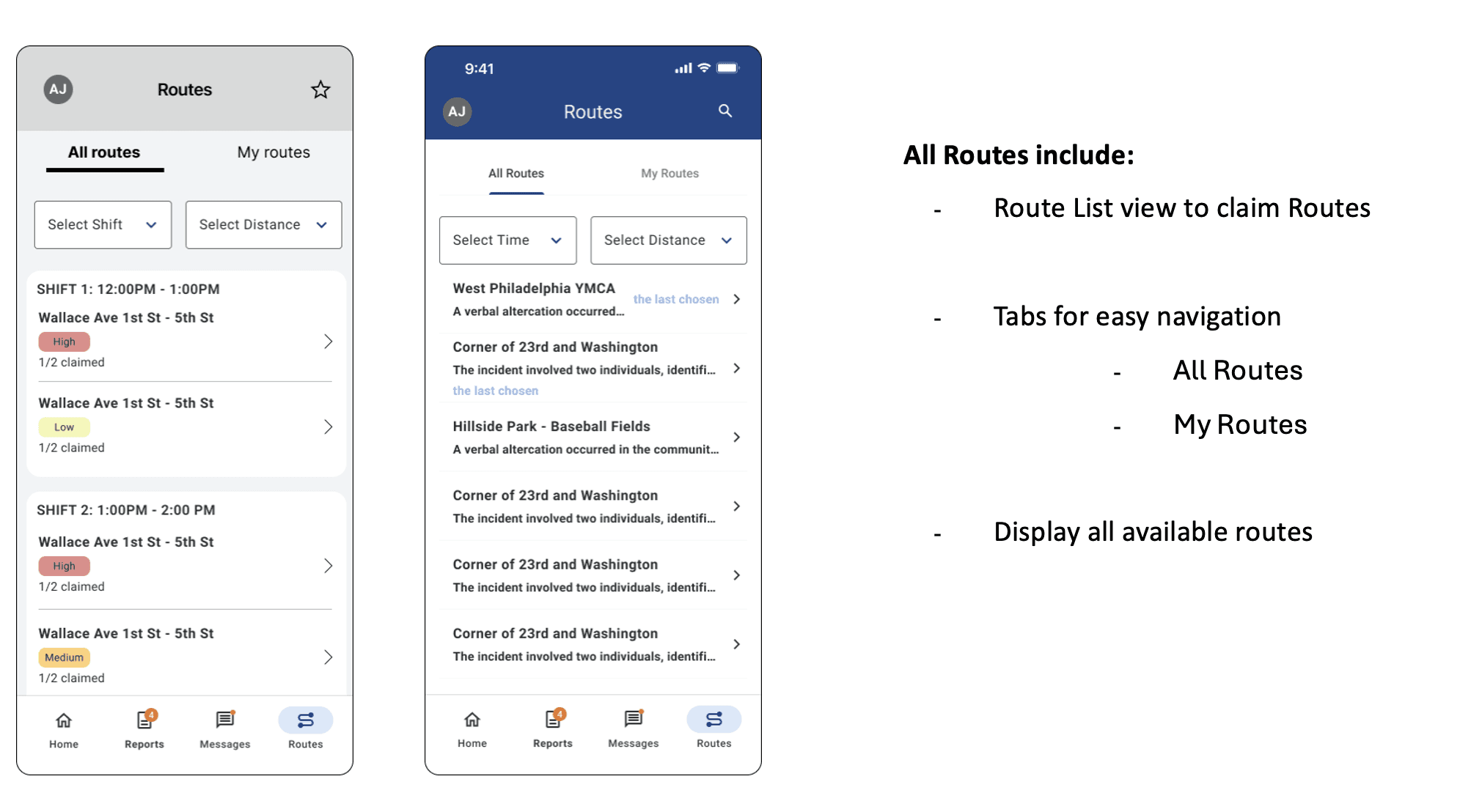
Designing a flexible and intuitive Routes system
Simplifying the navigation, patrol tracking, and end-of-shift summary
As a designer on the mobile team, I contributed to:
Designing end-to-end flows for incident reporting and route claiming
Building interactive prototypes in Figma
Collaborating in weekly critiques and design reviews
Creating components like route cards, filter interactions, and bottom sheets
Supporting handoff for usability testing and dev-ready specs
Team :
Bronson Lee
Jason Yang
Alma Halilovic
James Phuong
Timeline :
3 Months
WIREFRAME FLOWS
Building Logical Incident Paths
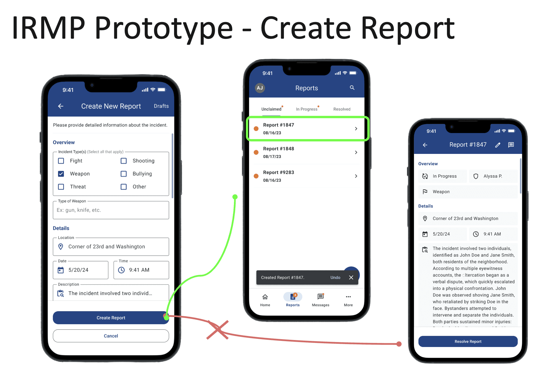
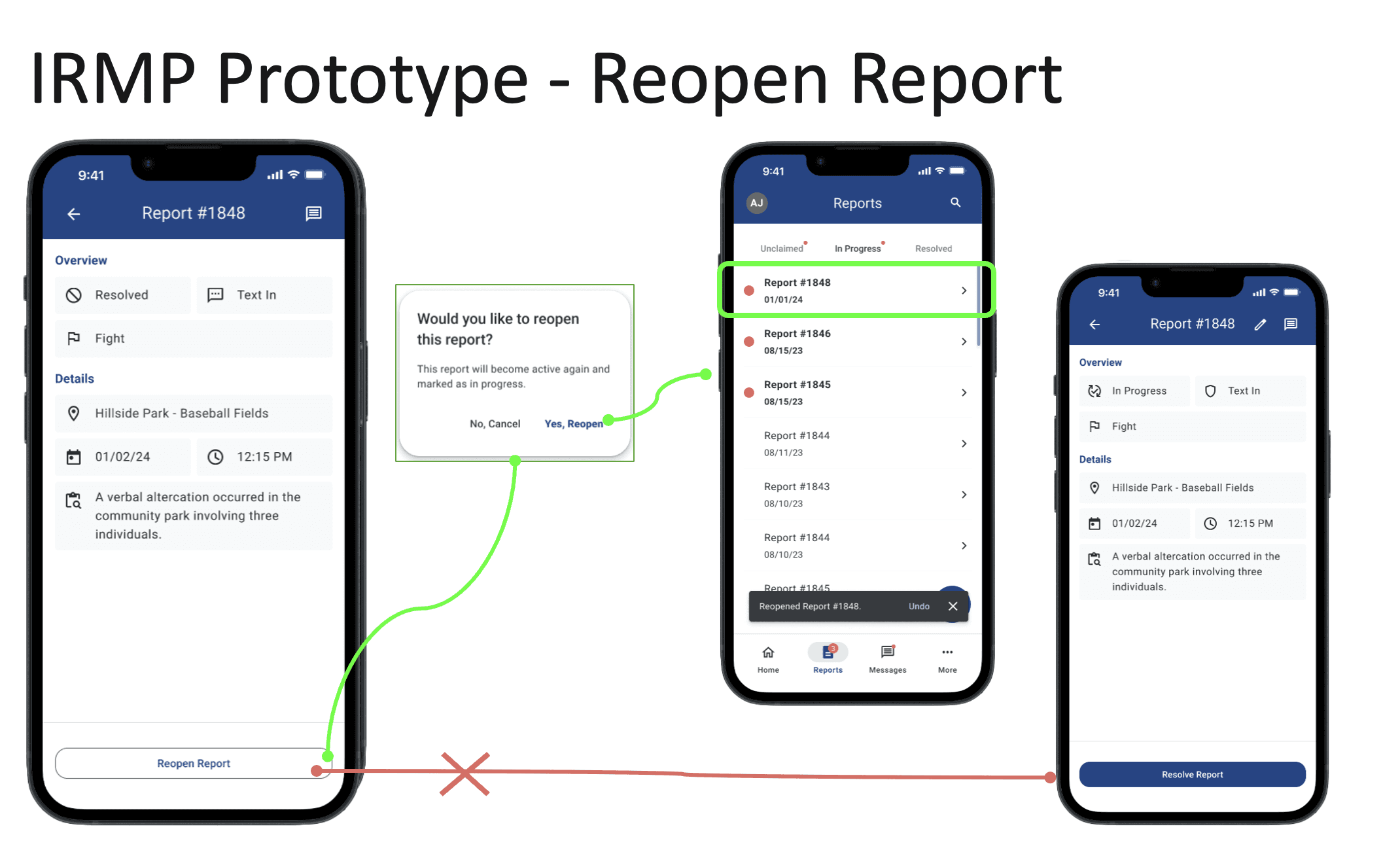
We refined the flows for:
Creating a report
Claiming a report
Editing & resolving reports
Reopening resolved incidents
Key design decisions:
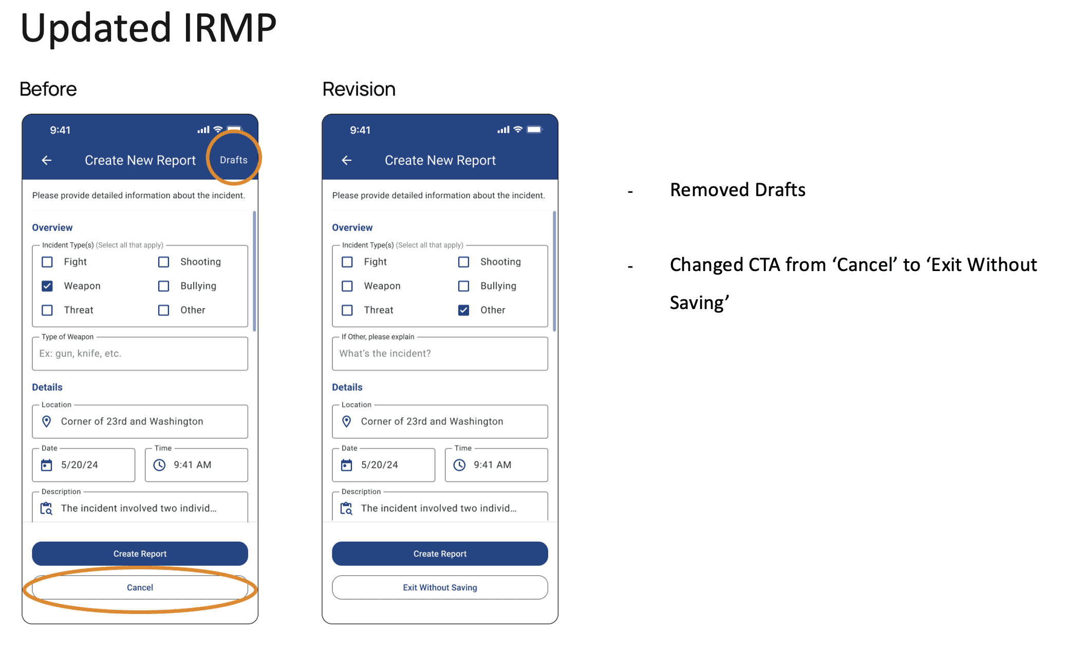
Removed "Drafts" to reduce clutter
Renamed “Cancel” to “Exit Without Saving”
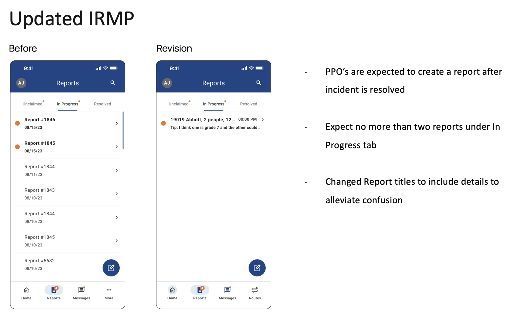
Limited "In Progress" to 2 reports per PPO
Renamed reports to include location/context


LO-FI DESIGNS
Updated low-fidelity designs


Hi-FI DESIGNS
Updated low-fidelity designs


Use date markers to indicate both today and the selected date
PPO can only access routes 1–2 weeks in advance
They can adjust the calendar to navigate one week at a time using left and right arrows
Hide secondary information within information icons to optimize space
Simplified information
Ability to message other on duty PPO’s
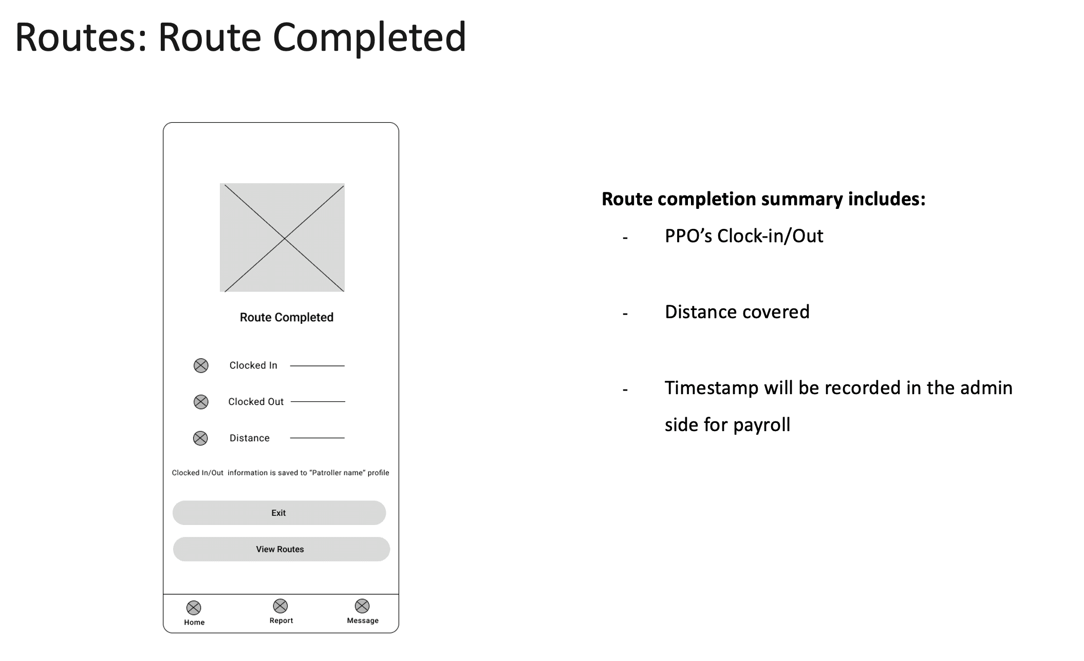
CTA’s to allow PPO easily take a break, resume, or end route
Recommendations
Have phase 5 research team test:
-Assigning incident report to a PPO
-In progress tab filter: all reports / reports by me
-Inputting your availability
-Route’s features:
-All routes
-My routes
-Route details
-Ending their route
Let’s Connect
Feel free to reach out for collaboration or just say Hello, I am always excited to meet people who love design and innovation as much as I do!
